

In the era of social media, dating apps, like Tinder, Badoo, or Match, are changing the nature of relationships by bringing people together in a rather simple way. However, these channels for establishing acquaintances sometimes seem to lag behind the times in terms of gender and sexuality topics. Since 2014, people who seek positive sexual experiences can apply to Feeld to reward their curiosity. Through their geolocation, they can contact other users who share their preferences, among about 20 sexual orientations and gender identities. Initially launched in the United Kingdom, the app is now available in more than 100 countries.
![]()
Ahead of its 10th anniversary, the platform started a rebranding, focusing on the points connected with individuality, personal growth, changeability, and trying something new. In other words, it refuses to correspond to outdated social constructs.
The brand’s new positioning determined after an identity revision is built on the fact that the app’s users mainly emphasize their personal transformation and curiosity as crucial things for their Feeld experience. According to a study conducted by the platform, there has been a fourfold increase in 2023 in search queries related to threesome relationships in the boomer category, while a third of heterosexual males changed their sexuality to be “more hetero-flexible and bi-curious”.
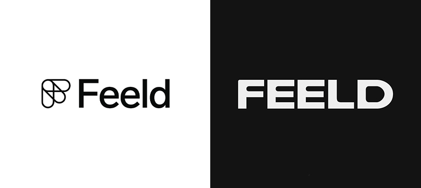
This positioning is supported by a new, efficient logo and a custom typeface developed by typographer Charlotte Rohde. Combining straight and rounded corners, the fresh wordmark gives the impression of “assertive flexibility”. While the app’s old emblem was a symbol of an innovative start-up, the new Feeld logo highlights the uniqueness and vigor of the brand, which it has acquired over its lifetime.
The visual identity is essentially based on Charlotte Rohde’s New Edge 666 typeface, which was originally designed for the feminist project Soft Power in Berlin. The glyphs of that font vary in thickness and roundness, from light and subtle to bold and dense ones. The typographer calls these options the expression of perfect switching, meaning that a person can switch from dominance to submission.

This typographic work is supplemented with a unique method of image processing applied to the most visuals, inspired by thermal mapping and aural visualization. According to the brand, they wanted to reflect the spectrum of sexual identities in its own visual identity and avoid popular cliches like rainbow stripes.
This concept led to a photo series featuring actors, dancers, and punchers to capture the moments of contact and movements. Specially processed, the images look quite abstract, but their uniqueness is revealed as we find out arms, shoulders, or hips in them.

The combination of the iconography and the typeface places the brand in a warm and intimate universe. Some elements look a bit inconsistent next to each other, but in general, the identity is rather integral regardless of the carrier. This redesign demonstrates a creative elevation within its specific segment. It’s a purposefully declared openness with a certain degree of flexibility that respects the Feeld users, who are mostly engaged in creative activities.


