

Back in 2006, the Houston Dynamo rushed into MLS, winning its inaugural season. A year later, the team repeated its success, and unfortunately, that 2007 MLS Cups winner title stays so far the last in their history. Now, ahead of its 15th anniversary, the Dynamo finds itself in deep crisis, continuously missing play-offs since 2014 (excluding 2017).
The club’s officials are trying to change the situation with a new management program, and as a sign of the hope for improvements, the Dynamo have updated their emblem, adding the words “Football Club” to their name. Additionally, a new logo for the Dynamo’s affiliate Houston Dash has also been unveiled.

While keeping its traditional colors, the Wildcatter orange and Raven black, the Houston Dynamo’s logo has changed its form from a shield to a hexagon, and according to John Walker, the club’s president, the six corners of the new insignia are a nod to the six original wards of Houston as well as the team’s inaugural season in 2006; plus, the hexagon stands for strength, stability and unity, as a Dynamo press-release says . The central feature of the crest is the interlacing “H” and “D” whose “channel” design is a reference to the city’s waterways, also known as bayous, which gave Houston the nickname Bayou City. The wordmark “Houston Dynamo FC” with its cornered letters corresponds to the logo’s form in general. In addition, the monogram and lettering are accompanied by a lightning bolt which is new in the Dynamo’s symbolism.
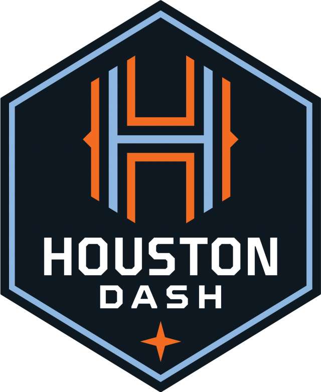
As for the emblem of the Houston Dash playing in the National Women’s Soccer League, it shares the basic design elements with the Dynamo’s emblem, that shows the affiliation between the two clubs. It similarly has a hexagonal form, a channeled “H” in the Dash’s orange and light blue and a cornered wordmark.


