

In 1920, inventor and outdoor enthusiast Eddie Bauer launched his first store under the name “Eddie Bauer’s Tennis Shop” in downtown Seattle. Now, over 100 years later, the brand bearing his name is known as a large clothing chain with nearly 400 locations in the United States, Germany, and Japan. Recently, Eddie Bauer has updated its visual identity, abandoning its traditional signature-based logo, as did Johnson & Johnson not so long ago.

The history of the retailer had some remarkable events that influenced, in a way, the brand’s new look. In 1936, Eddie Bauer invented and patented the Skyliner, a jacket specially designed with the use of goose down. Since then, goose-down clothing has become a sort of signature of the brand. Gaining popularity, Eddie Bauer down jackets, for example, were among the equipment of the American-led expeditions to Everest and the Karakoram mountains in the 1950s and 1960s.
![]()
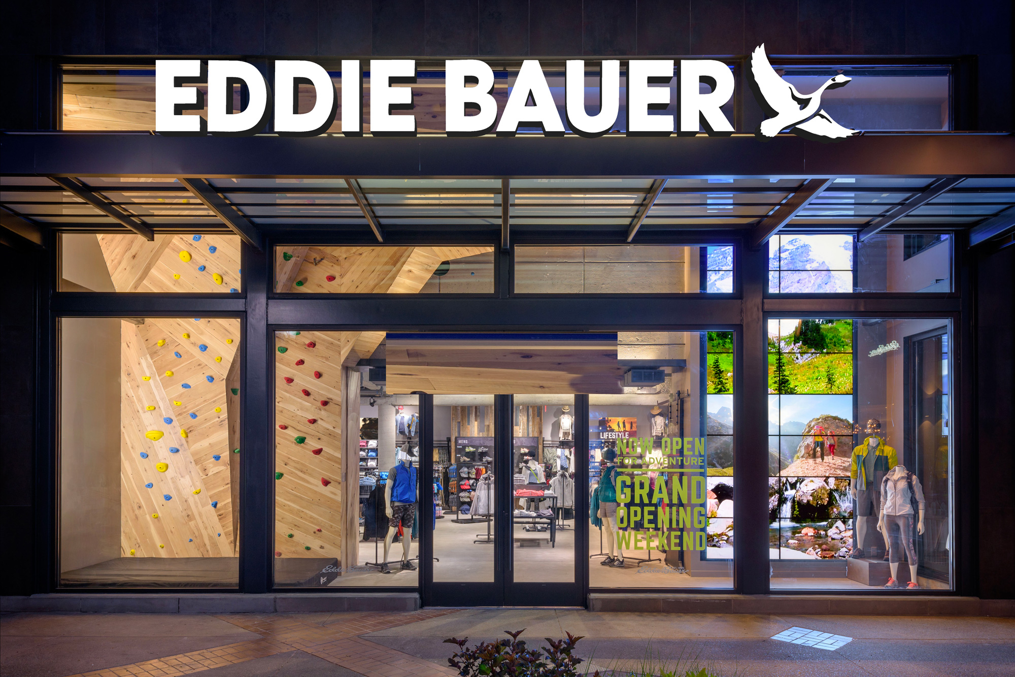
Headed by Tim Bantle as CEO since September 2022, Eddie Bauer is currently undergoing a global rebranding. This is the first significant brand overhaul of the company in many years. As part of the visual refreshment, the brand is going to replace its customary logo, which was introduced in the late 1960s, based on the original signature of Eddie Bauer himself.
So that classic logo gives way to a simple and cleaner wordmark complemented by a distinctive depiction of a flying goose. In fact, better readability was the main goal of the redesign. As Bantle said, one of the major challenges for the company’s management is “to pass this brand of great history to the next generation”. “Our kids don’t learn to read cursive in school any more”, he regretfully noted. In Bantle’s opinion, the handwritten logo now represents a potential communication barrier.

To remove this “obstacle”, the company collaborated with the Atlanta, GA-based branding agency Carrewyn Creative, which modernized Eddie Bauer’s look with a new symbol and typography. A solid and simple sans-serif font was chosen to preserve “a hand-drawn quality” inherent to the company and its historical identity, as Bantle said. The ultimate goal was to create something that would be close to both people who love to spend their free time outdoors with their families and extreme sports enthusiasts.
The company sees its goose icon as a tribute to the heritage of its founder, while linking the flying bird to the brand’s strengthening, as images of this kind are considered symbols of freedom and independence.
Before Tim Bantle took over the company, he worked with many brands like Patagonia, The North Face, and Timberland. As an experienced manager, he thought a new visual identity would improve Eddie Bauer’s recognizability across the world and attract more customers. So the modernization of the brand will hopefully be the starting point of the next stage of growth.


