

It’s hard to believe, but Johnson & Johnson has changed its logo for the first time in its 135-year history, and this seems to end the era of the reference logo branding, at least for the pharmaceutical and medical segment.
The J&J logo is an iconic sign of the era of calligraphic logos. However, the famous personal care brand apparently feels insufficient with those classical forms and relative attributes. So the company abandons the symbol inspired by the signature of one of its founders to switch to a more modern emblem corresponding with the current branding trends in the industry.
![]()
The fresh visual identity was actually created by Wolff Olins, “based on the Company’s legacy”. By modernizing key features, the brand speaks of healthcare innovation, which improves people’s lives on a completely new level.
Well, the new logo of Johnson & Johnson replaces the original version created in 1886. Say goodbye to the interconnected letters and meet a modern typeface where every character is drawn with an individual touch.
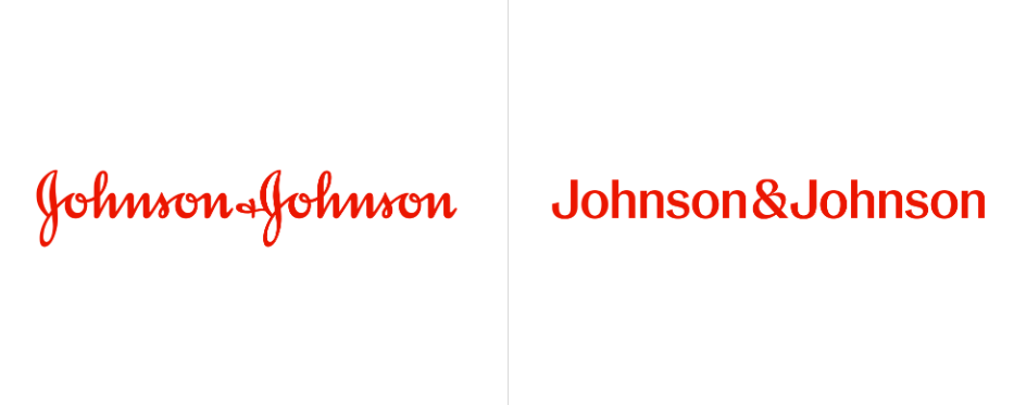
The company will use both the full and shortened versions of the logo. Besides, the brand is going to type the “J&J”in a bolder weight to display it on digital platforms and products. Johnson & Johnson has kept red as its main brand color but made it brighter. As the company’s press release goes, this hue “speaks to the ability to urgently respond to health challenges”.
Both the old and new logos of J&J are typographical. But what’s the difference? The original emblem, which derived from the signature of James Wood Johnson, gave the brand much individuality. The fact that the company leaves this heritage is probably connected with its new strategy, which includes more pharmaceutical and medical production as well as the paradigm of mass consumption in recent years.

In any case, the new symbol is equally individual, providing better readability, which is more in line with the modern tendencies of visual design for pharm & med companies. However, this reason is apparently not primarily important in this rebranding. The most dramatic reshape can be seen in the ampersand, which looks recognizable now compared to that unclear squiggle in the old version. According to the studio, the sign “captures a caring, human nature”, representing the open policy of the company.
Speaking in general, Johnson & Johnson’s drastic rebrand is quite understandable, and the new design reflects well the brand’s new priorities. But some J&J customers may still be disappointed with that, as the old logo was felt familiar and warm, associated with popular products like baby powder or shower gels. Anyway, we have to get used to the new face of the brand.


