

In 1993, a group of young and bold iconoclasts created Mountain Hardwear, a company that grew into a leading name in the outdoor apparel and equipment industry. Now, the brand embodies the spirit of adventures and discovering, uniting technology innovations and thoughtful design to meet the needs of outdoor enthusiasts all over the world, while Mountain Hardwear products can be used in versatile outdoor activities, including camping, climbing, cross-country running, and mountain sports.
![]()
To liven up its production strategy and expand its reach and celebrarte its 30th anniversary, the Richmond, CA-based company has recently carried out a complete revision of its visual identity and brand policy. The name Mountain Hardwear itself is associated with the exciting combination of the fearless spirit of adventure seekers and well-conceived outdoor equipment.
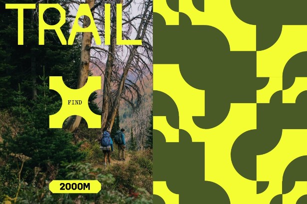
And this dynamic tension between wild nature and the human mind and responsibility became the basis of the brand’s new identity. The idea is expressed in five different outdoor domains, which are covered by the manufacturer.
The visual update by the Gretel design studio from Brooklyn, NY, started with the creation of a custom typeface, which is, in fact, a visual continuation of the company’s symbol, the nut. Based on the 205 font family, it was designed in cooperation with the SuperContinente foundry. This distinctive typeface conveys the strict precision of technology development and the calming confidence you can feel when you’re equipped with Mountain Hardwear. In it, the glyphs with beveled edges form a sort of chamfering. The design team created several styles that will be used in different graphic compositions.
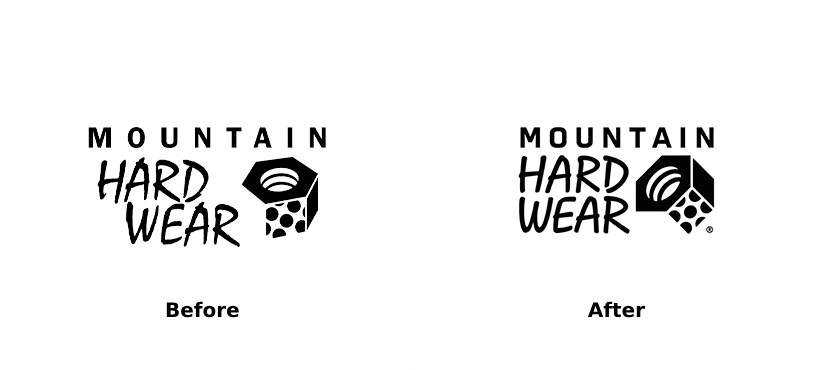
Given this typographic work, the Mountain Hardwear logo was slightly reworked to have a more modern look, keeping, however, its DNA. While the word “Mountain” now has narrower spaces between the letters, the glyphs in “Hard Wear” in the Mistral typeface, which was originally developed by the famous French graphic designer Roger Excoffon, were simplified. The brand’s symbol was geometrically rationalized to create visual stability and make an accent on the verges and corners of the nut.
All these elements are integrated into a unique artistic genre emphasizing human interconnections and emotions. The goal was to depart from the cliché of the traveling “lone wolf”’ and focus instead on general impressions. For this purpose, the brand color palette was extended beyond the trio of yellow, black, and gray. Implementing more colors is part of the strategy to differentiate and detail different product offerings.
This is also highlighted by a series of patterns and icons associated with each of the domains. Besides, the typeface can be adapted to a certain outdoor activity: the weight grows bolder where it needs more layers of apparel and equipment, like in climbing, for example.
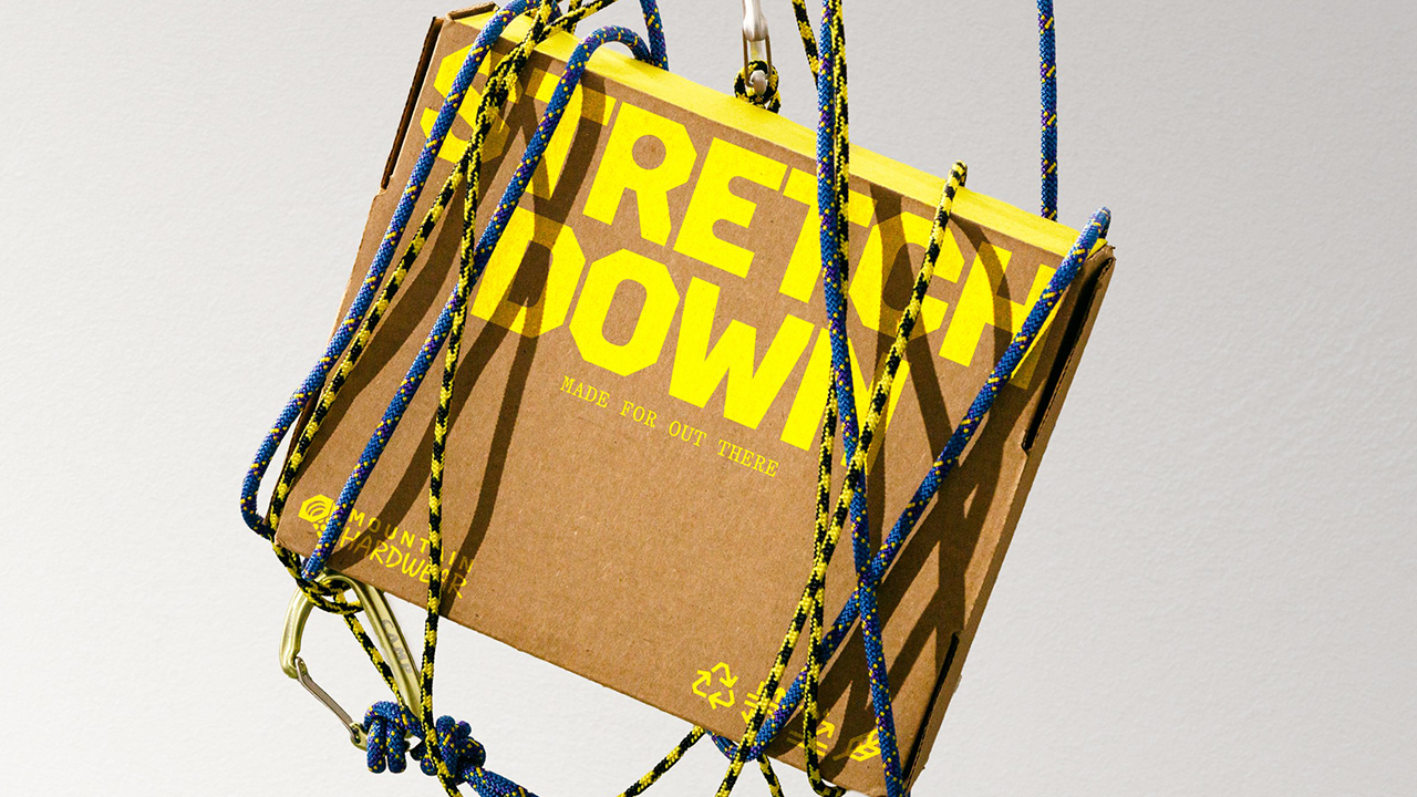
The iconography is made up of photographs created by the company itself, which is another expression of Mountain Hardwear’s renewal and assertion of its uniqueness. This artistic direction was optimized for the digital communications of the brand, which is also supported by a new website design including buttons with beveled corners and pictograms resembling the Hardwear font.


