

The sports car maker Bugatti has presented its new visual identity that is intended to show the brand’s aspiration to increase its presence in the luxury car segment. Bugatti’s facelifting, carried out by the multinational design consultancy Interbrand, also pays tribute to the roots of the French company.

As Bugatti’s marketing director Lorenz Nause says, the redesign was a serious task for the company as it needed to find a balance between creating new things, that would allow to express the manufacturer’s ambitions for the future, and saving the basic elements to continue the visual tradition of Bugatti.
The new Bugatti branding is based on the brand’s iconic EB symbol and blue color which is new for the company’s identity and alludes to the history of French motorsport. The EB monogram will be used as a logo. Being a simpler sign, it is more suitable for the modern ways of promoting. According to Interbrand’s creative director Jens Grefer, the “EB” as an identifier of Bugatti will add some adaptability, responsiveness, and flexibility to the brand.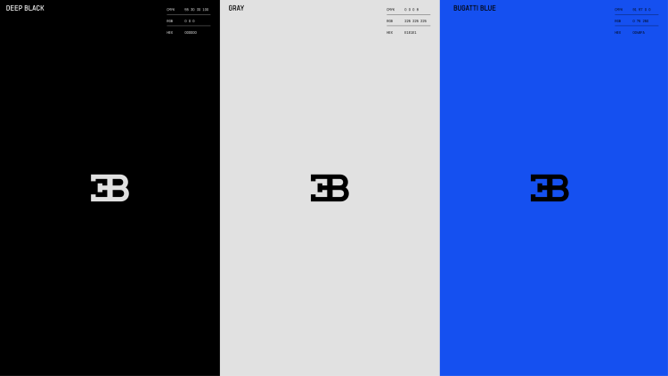
Bugatti’s new color palette dominated by a bright hue of blue will make the visual identity more expressive. Complemented with gray and “deep black” conveying a vibrant but mature and sophisticated tone, the gamma will be featured in the automaker’s promotional materials which will also include custom typography. The new sans-serif typeface, which is intended to be used mainly in capital letters, is designed to modernize Bugatti with a “unique typographic character”.

This design will mark Bugatti’s new sectors, like the Bugatti Lifestyle, a luxury merchandise collection. Besides, the brand has further plans to surprise its customers. And the “ultra-exclusive” Espresso bar recently opened at the Bugatti Mayfair dealership in London is a good example of the company’s future renovations. The new look is expected to be completely presented at Bugatti events which will be held this year.


