

Dating back to 1946, Aldi is a popular discount brand across Europe, offering food products at low prices. Aldi stores are also open in the US, Australia, and China. But few people know that there are two separate companies behind this name.
The first Aldi store was launched in Essen, Germany, by brothers Karl and Theo Albrecht, based on their mother’s company named Albrecht Lebensmittel. Expanding their family business after WWII, the Albrechts proved to be successful, as the company initially offering fixed prices, then introduced discount coupons and promotion programs. Ultimately, the brothers lowered the prices of all types of goods, reduced the number of brands to sell, and increased their product rotation.
When Karl and Theo were still operating a single business, their company originally had a logo that represented a nameplate with “Albrecht” in a bold font as well as “Karl” (as he was the elder brother and the company’s head) and “Lebensmittel” (food) in a smaller size. Later, they removed the thinner inscriptions.

The brand Aldi as such was launched in 1960, but at the same time, the Albrecht brothers decided to split the business into two sub-brands: Aldi Nord and Aldi Süd. Theo took over the Northern company with its head office in Essen, while Karl became the head of the Southern brand, headquartered in Mülheim. It’s not known for sure what caused this separation, but some information points out a disagreement between the brothers over cigarette sales at their stores.
The split extended to the brand’s international expansion. Thus, Aldi Nord operates on most markets in Western Europe and Poland, while the stores of Aldi Süd are available in Austria, Switzerland, Italy, Slovenia, Hungary, the United Kingdom, and non-European countries.
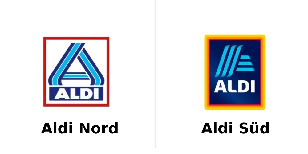
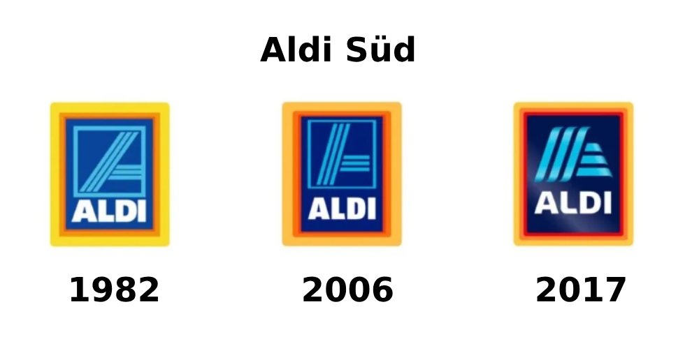
While being two separate companies that, however, belong to a common business group, Aldi Nord and Aldi Süd have different identities. Although it’s hard to trace the evolution of both designs, we can have a look at the current versions and some previous iterations.
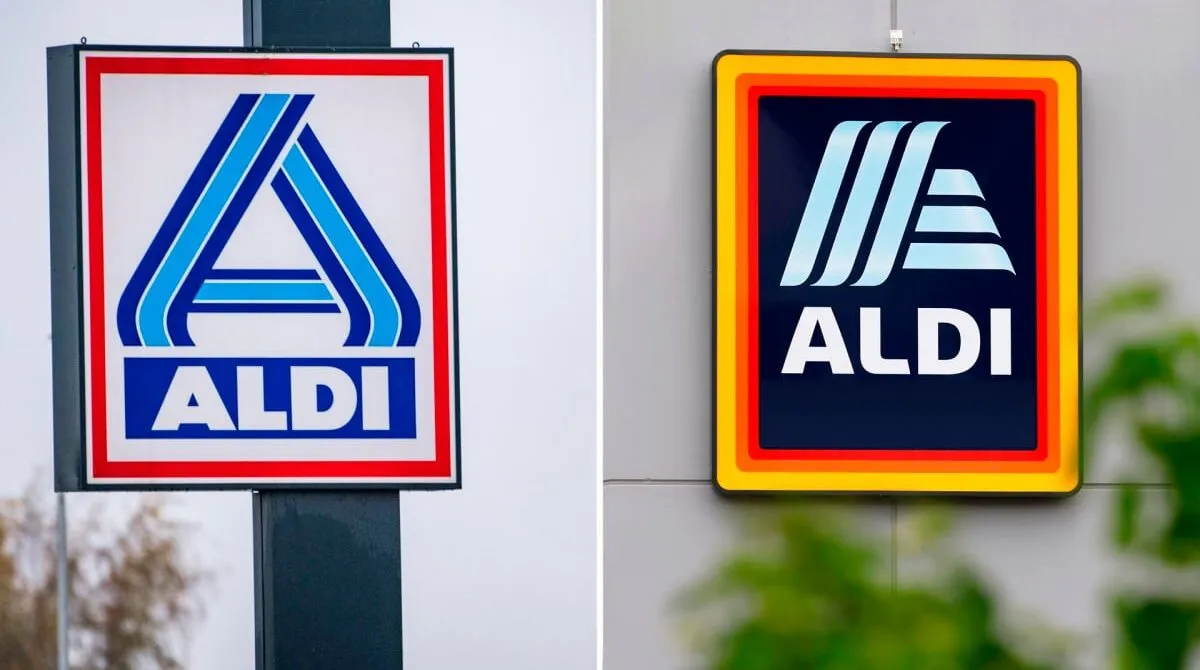
The Aldi Nord logo features a capital “A”, somewhat rounded on each side, and the brand’s name below, which is likely designed in a custom font. The icon and wordmark are displayed on a white background within a red frame as a reminiscence of the similar bordering in the Albrecht Lebensmittel emblem and the old Aldi logo with white letters on a blue background. It’s also worth mentioning the striped structure of the “A”, using two shades of blue.

Aldi Süd’s logo seems to have been built on the same patterns as that of Aldi Nord, although the design is different from its sibling brand. Like in the Northern logo, an “A” is the lead character of the emblem. Designed to look more dimensional, the letter is made of three vertical and three horizontal stripes, with a blue gradient and slightly wrapped ends. The Aldi wordmark is similarly placed in the logo’s lower part, executed in a sans-serif font that is distinguished by rounded letterforms. The border is drawn with three lines in yellow, red, and orange.
Not all the Aldi Süd stores, however, use the same logo. In some countries, the brand adds the word “Süd” below the “ALDI”, in the same typography but in a smaller size.
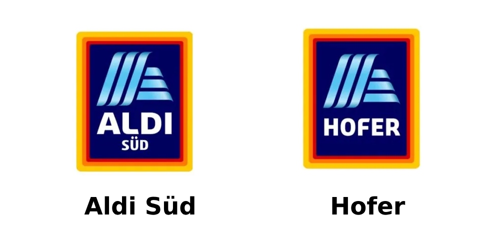
In 1967, Aldi Süd acquired the Austrian food retailer Hofer, which, like Aldi, implemented a discount business model. Despite keeping its name, that chain adopted the Aldi logo, but with “Hofer” instead of “Aldi”.
Along with this, the Aldi group owns one more franchise in the United States, named Trader Joe’s. However, that company enjoys its own identity, independent from Aldi.


