

Since 1888, the food brand Manischewitz has been represented in American stores as an iconic example of high-quality traditional Jewish kosher products. What began as a small Jewish bakery in Cincinnati, Ohio, has grown into the leading distributor of kosher food in the United States. The company owes its success to the automated process of making matzo, which was invented by its founder, Dov Behr Manischewitz. As the Jewish community nears the Pesach celebration, where bread holds significance, the brand has introduced a new identity to reaffirm its festive and timeless spirit.
![]()
Despite the brand’s previous recognition among loyal customers, it appeared to lose appeal with the newer generation. In order to attract young individuals interested in Jewish cuisine and modernize its image, Manischewitz teamed up with Jones Knowles Ritchie, a renowned “food design” agency.
The updated visual identity is characterized by a vibrant and inviting individuality, featuring a color palette ranging from yellow to brown, with orange serving as the primary color that ties all hues together. The versatile brand system offers six distinct visual compositions tailored to various formats and mediums.
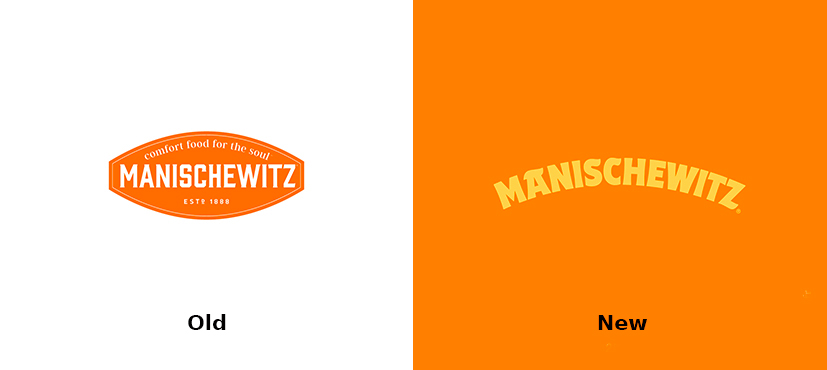
Custom typography assists the brand in crafting clear and engaging visuals through a semi-serif typeface, used in unique rounded lettering, including the Manischewitz logo. Combinations of different widths and thicknesses enhance the arched design intended to be a recognizable brand feature.
Manischewitz’s visuals incorporate whimsical illustrations of family moments in the kitchen and enticing photographs of dishes, catering to all age groups with humorous depictions for the youth and more serious visuals for older people. Reminiscent of New Yorker cartoons, this strategic touch subtly connects with Manischewitz’s audience, who may also be readers of the New Yorker.

The new graphic language highlights typographical arrangements that showcase the font’s uniqueness. By incorporating these elements, the brand maintains a cheerful and approachable demeanor to raise awareness of Jewish culture through culinary delights.

Significant enhancements were made to the packaging, featuring a bold orange design that enhances the presentation of dry and unleavened products like matzo. Manischewitz’s other offerings stand out for their vibrancy, creativity, and playful elements, crafted to establish a distinctive and appealing presence in the market. They are intended to cater not only to existing brand enthusiasts but also new customers who are sure to be captivated by treats such as matzo ball soup, delectable gefilte fish, or the irresistible crunch of perfectly fried latkes.


