

Launched in 2012, Zapier is a product that allows end-users to integrate the web application they use and automate workflows. In other words, it serves as a kind of translator between different application programming interfaces and helps improve worker productivity as it saves time, automating recurring tasks. To celebrate its 10th anniversary, the IT brand has updated its visual identity, which better expresses the functionality and utility of the technology.
![]()
Although Zapier’s rebranding is not flashy and not too exciting, as the company’s creative director Michael Jeter says, the new design “serves as a base for the whole business and opens countless doors to inspire the users of the service”.
Getting rid of the asterisk which was used as a separate symbol, Zapier has completely reworked its logo, adding a new sign – the underscore, which apparently inherited its orange color from the previous branding. Being just a short line, it, nevertheless, is a starting point for a design system that evolves into a user-focused story of the brand. In this way, the new symbol creates a simpler expression approach to tell about the opportunities given by Zapier.

While orange stays the main brand color, it was updated to “international orange”. “We are an orange brand. Our color palette is intended to support the storytelling of the orange platform”, Jeter explains. Apart from orange, the gamma was complemented with a series of secondary colors – Earth, Moss, Night, Lavender, and others.
Zapier’s new typography includes a custom typeface called Degular, which is used for the Zapier wordmark, as well as the serif GT Alpina font by the Grilli Type foundation. Degular is quite an expressive font with strong individuality. It resembles more the Means font designed for MailChimps than the neutral Circular used by Cabfy and Google.
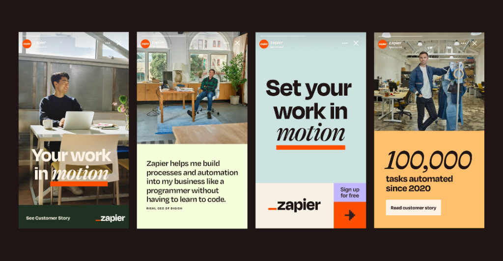
Jeter says that its “human cheerfulness” is balanced by readability and maturity. The font’s individuality can be flexed to different weights. “It feels like Zapier”, Jeter added.
Zapier’s new branding doesn’t look like something from another world. However, such a design leap is quite remarkable. The new identity is not only an aesthetic adornment but also an instrument that supports the brand’s communication with its other assets to rely on.


