

Health is the most valuable thing we have, and we can only entrust it to companies that we are one hundred percent sure of. So it is very important for companies working in the medical field to inspire trust and show their reliability and professionalism in every possible way. And, of course, one of the important elements of “persuasion” here is visual identity. The right logo will emphasize professionalism and reflect care for customers, but it must remain readable and modest.
A logo for medical-related companies should convey an atmosphere of care and emphasize the professionalism and experience of specialists. Medical logo should be light, and cause pleasant associations. Here you should not overload the composition of small details, and it is important, on the contrary, to make the emblem as readable as possible. As for the color scheme, most brands from this sphere use one of three colors: blue, green, or red. Blue is associated with reliability and safety, green is the main symbol of health, and red most often means urgent care.
Today we have gathered the logos of the most popular medical brands, in order to see which design tricks and trends work best for convincing people to use their products and services.
Abbott Laboratories
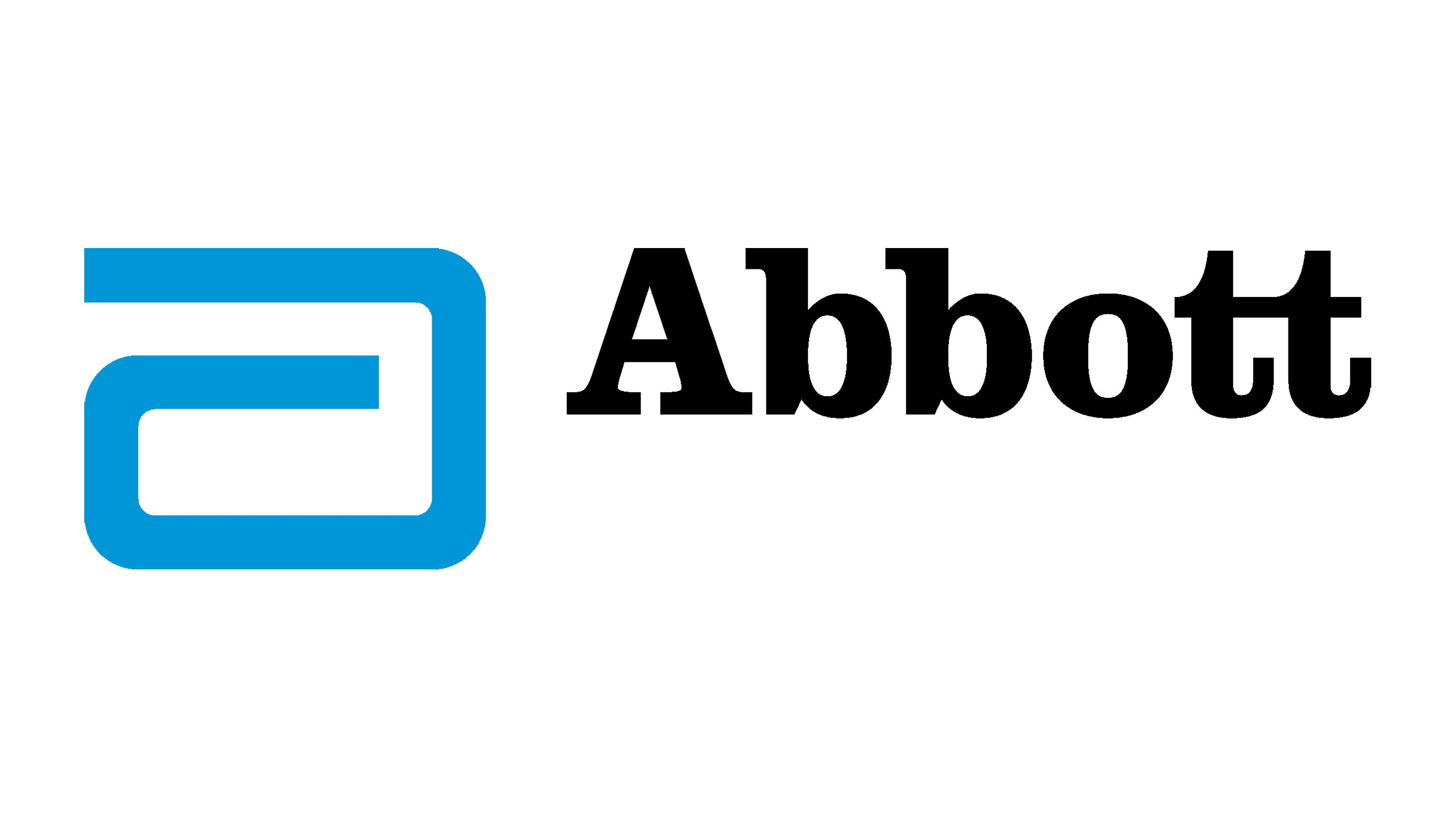
The logo of the Abbott Laboratories company is one of the most recognizable insignias in the world’s medical industry. It is super laconic yet has everything for the successful image: a contrasting color palette, composed of light blue and black, a unique emblem, made of just one line, and a stable logotype, which evokes a sense of confidence and professionalism. The emblem of the company is a stylized lowercase letter “A” drawn in blue, the color, most often used by pharmaceutical and medical brands, as it stands for reliability And defeat and looks sterile and fresh.
GE Healthcare
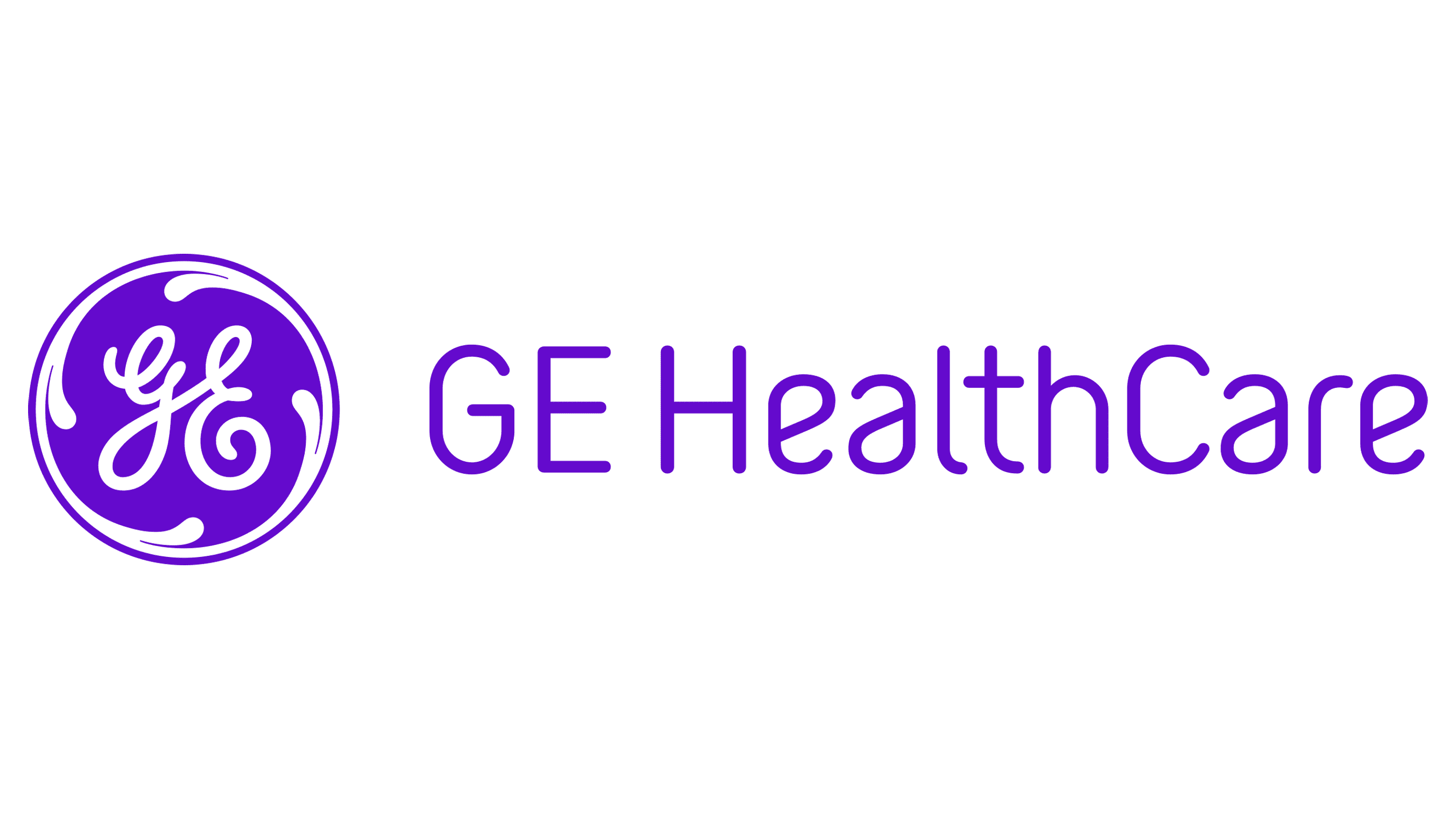
The GE Healthcare visual identity is very elegant and tender. It evokes a sense of caress and beauty, warmth and empathy. The chosen light purple and white color palette represents creativity trustworthiness, reliability, and safety, which are the most important qualities for companies working in the healthcare segment. The logo of the company is composed of a medallion with a fancy curved GE monogram written in bold white lines against a solid purple background with an ornate white frame; and a clean lightweight lettering in purple, written on a transparent background in a smooth and fine sand-serif typeface.
Novartis
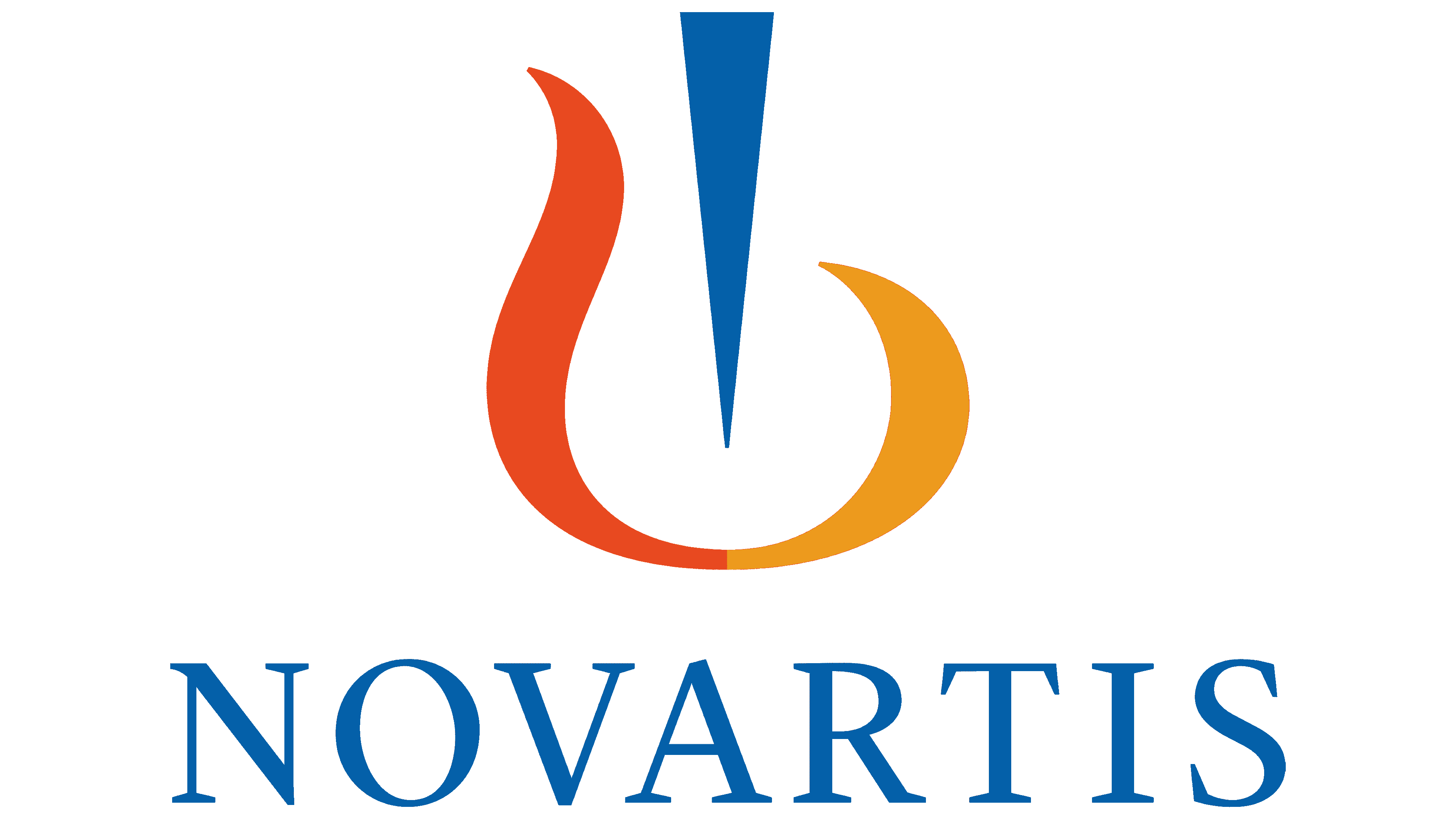
The Novartis logo is minimalistic and bright, designed in the best modern marketing trends. It is a bright blue uppercase wordmark in a distinctive serif typeface, underlining an elegant emblem, formed by three elements — the orange and red smooth merged strokes and a vertical narrow triangle pointing down in the same shade of blue as the inscription. The abstract geometric emblem looks like a harp, which detracts from the medical focus of the company and shows it from an unexpected perspective.
Pfizer
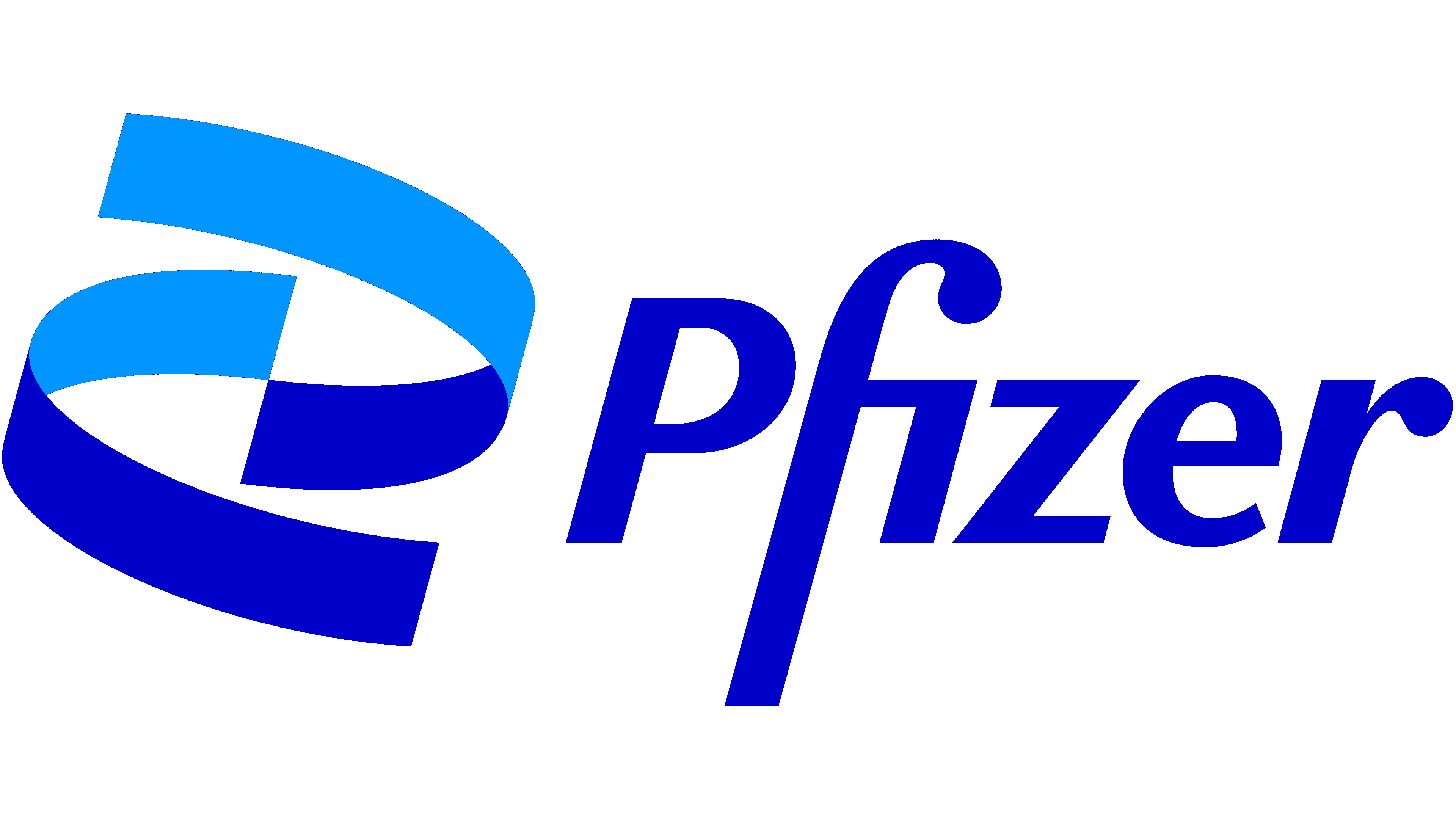
The visual identity of the world-famous Pfizer company is set in a blue-and-white color palette, which is the most common choice for medical and IT companies, as it evokes a sense of safety, protection, and reliability. The logo is composed of a laconic abstract graphical part in two shades of blue, and a custom recognizable lettering, with the merged “F” and “I” and an absence of the dot above the last. Another peculiarity of the inscription is in the emboldened rounded “hats” of the “F” and the “R”, which add symmetry and balance to the badge. As for the graphical part of the logo, it is a composition of two arched ribbons in deep and light shades of blue, turned to the center.
Sanofi
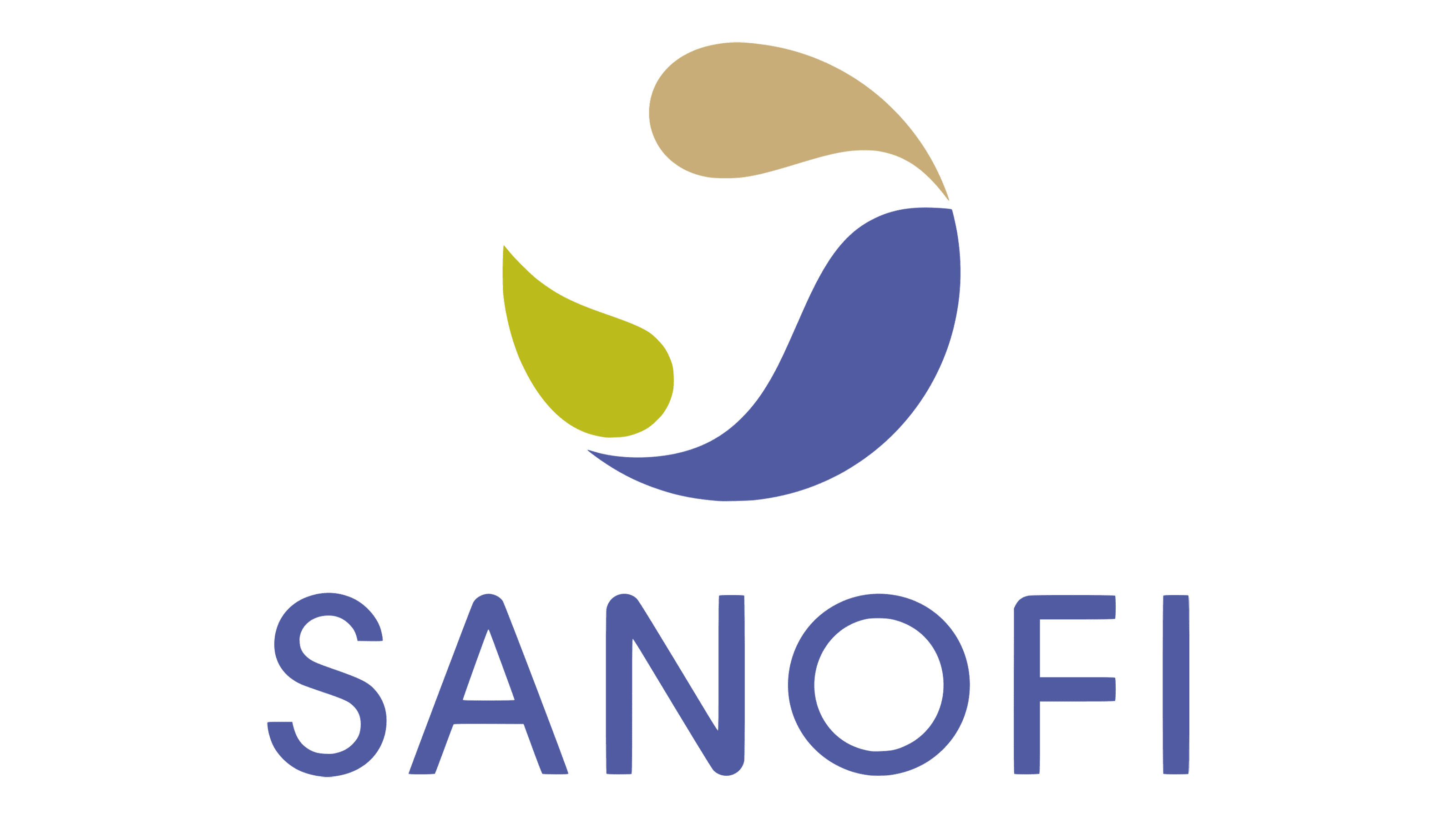
The logo of the Sanofi company is extremely delicate and tender, which represents the attitude of the brand to its clients and its caress. The badge is composed of an emblem, which is a roundel, formed by three smooth drop-like figures in soft and light shades of beige, blue, and green, which on a white background make up a contour of a dove; and the lettering, written under the graphical part of the logo in the uppercase of a traditional sans-serif typeface, with the softened angles and straight cuts of the bars. The blue, used for the wordmark, is the same as the one, the largest part of the emblem is colored in.
Band-Aid
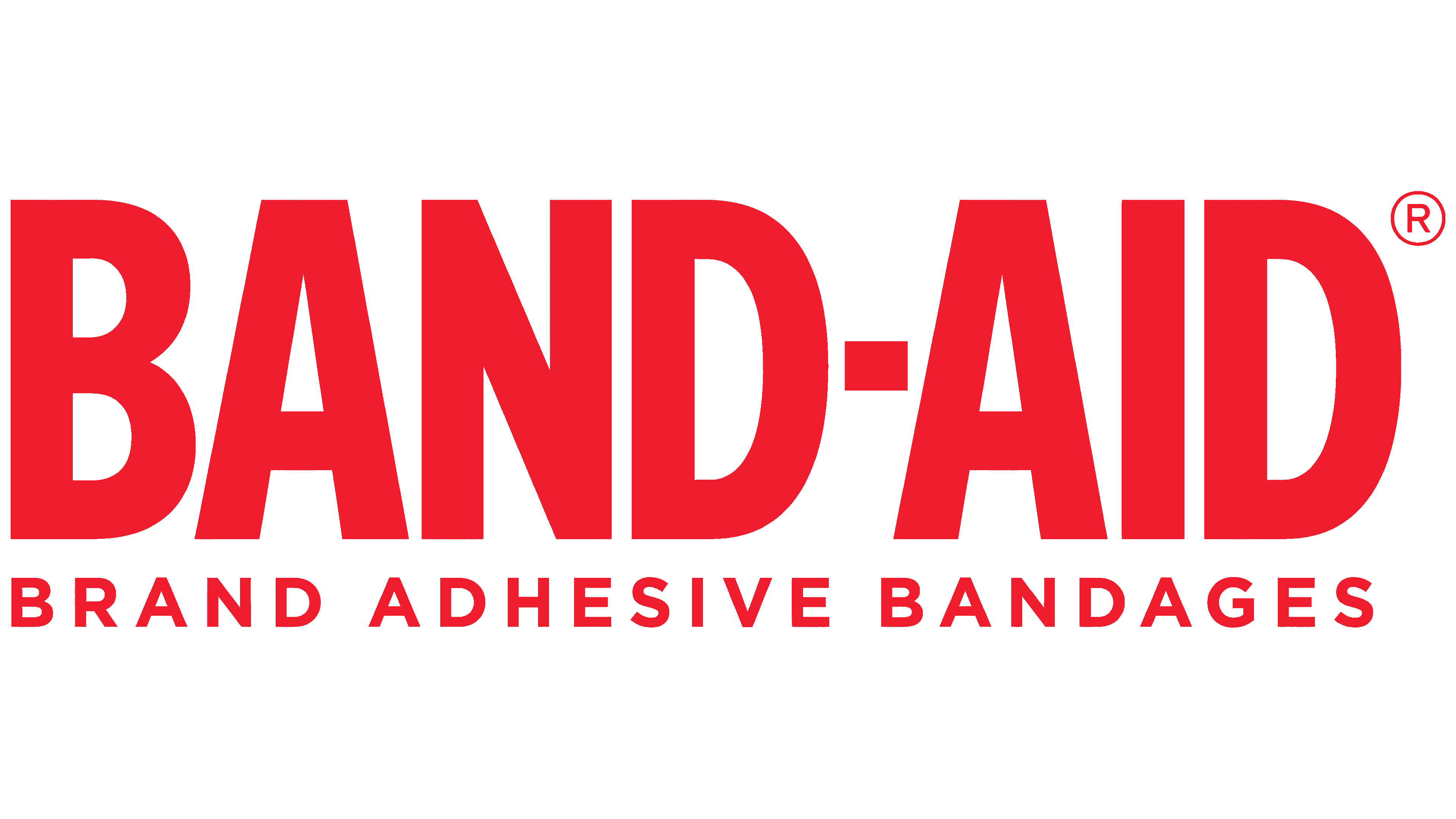
The Band-Aid logo is a striking and immediately recognizable symbol in the medical industry. The design features a bold red uppercase wordmark, “BAND-AID,” set against a white background, emphasizing the brand’s focus on visibility and immediate recognition. Below the main wordmark, the phrase “BRAND ADHESIVE BANDAGES” is neatly aligned in a smaller, uppercase sans-serif font, reinforcing the product category. The use of red in the logo signifies urgency and attention, which is crucial for a brand associated with first-aid and quick solutions to minor injuries. The simplicity of the design ensures that it is easily identifiable, reflecting the brand’s long-standing reputation for reliability and effectiveness in wound care.
Johnson & Johnson
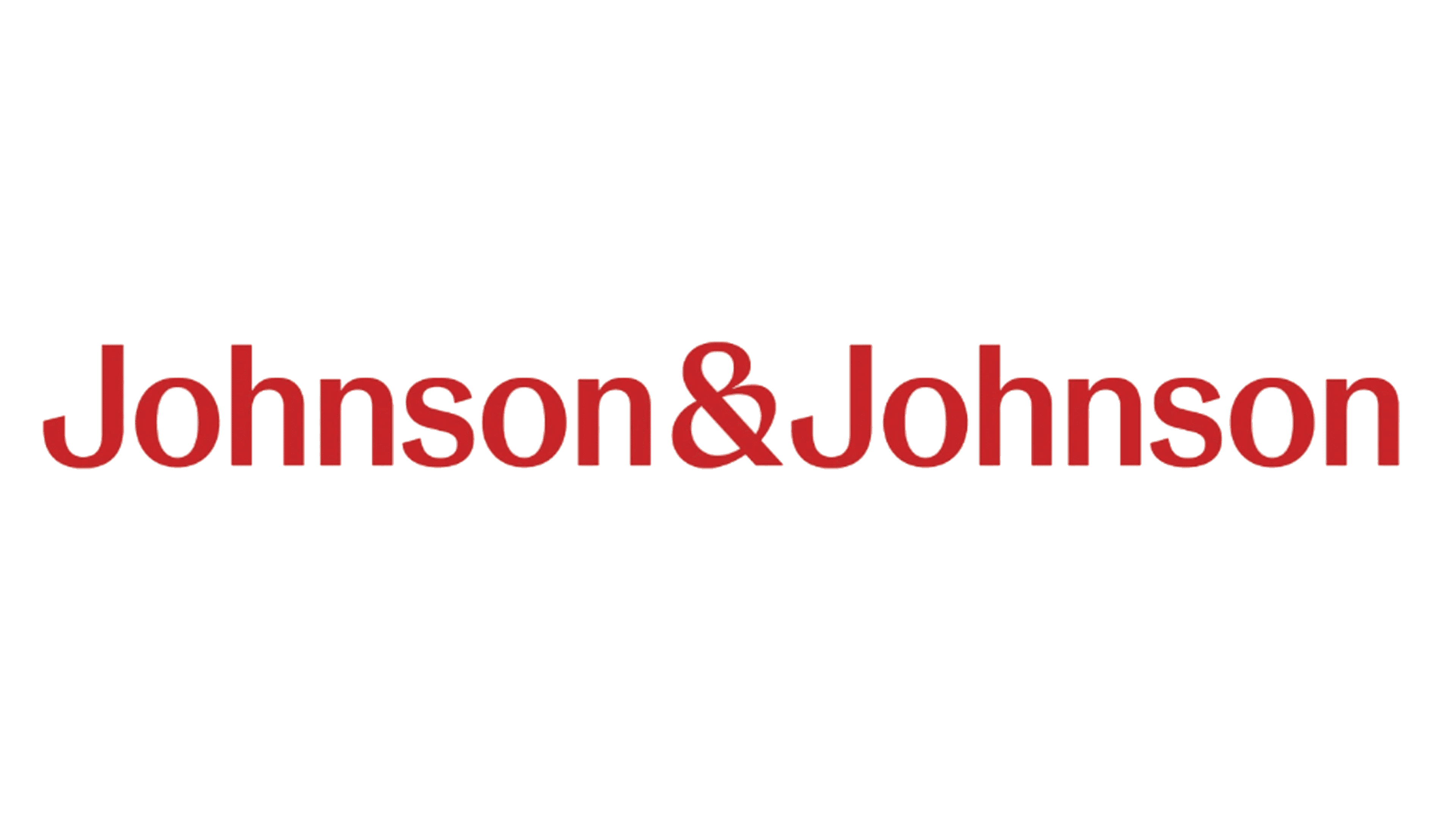
The Johnson & Johnson logo epitomizes the company’s commitment to health and wellness. The logo features the brand name in a distinctive red cursive script, which evokes a sense of heritage and trust. The color red is associated with care and compassion, aligning with the company’s mission to improve health. The use of a script typeface suggests a personal touch, reflecting the brand’s history of family-oriented products. This simple yet elegant design stands out in the medical industry, symbolizing quality and care that the company has been known for over a century.
AmerisourceBergen
The AmerisourceBergen logo represents a modern and professional image in the healthcare distribution sector. The logo features the company name in a bold, uppercase sans-serif typeface, colored in a deep purple that conveys stability and reliability. The clean lines and contemporary design reflect the company’s forward-thinking approach and commitment to innovation in the pharmaceutical distribution industry. The simplicity of the logo ensures clarity and easy recognition, reinforcing AmerisourceBergen’s position as a leader in its field.
Smith & Nephew
The Smith & Nephew logo combines modernity with a touch of warmth. The logo consists of the company name in a lowercase, rounded sans-serif typeface colored in a vibrant orange. Accompanying the wordmark is an abstract floral symbol, also in orange, which adds a sense of care and nurturing. The use of orange suggests enthusiasm and creativity, which aligns with the company’s mission to provide innovative medical solutions. This approachable and friendly design helps establish Smith & Nephew as a trustworthy and progressive brand in the medical device sector.
Elevance Health
The Elevance Health logo is a testament to clarity and forward momentum. It features the company name in a bold, blue uppercase sans-serif typeface, with a subtle, stylized arrow integrated into the letter “E” to symbolize progress and growth. The use of blue conveys trust, dependability, and professionalism, essential attributes in the healthcare industry. The modern design reflects the company’s commitment to advancing health solutions and supporting patient care. This logo’s clean and professional appearance positions Elevance Health as a leader in its field.
Becton, Dickinson and Company (BD)
The Becton, Dickinson and Company logo, commonly known as BD, is a blend of modernity and precision. The logo includes a stylized orange sunburst graphic, suggesting innovation and energy, paired with the initials “BD” in a bold, blue sans-serif typeface. The color combination of orange and blue conveys a sense of reliability, trustworthiness, and a forward-thinking approach. This visually striking and professional design underscores BD’s reputation as a global leader in medical technology.
Novavax
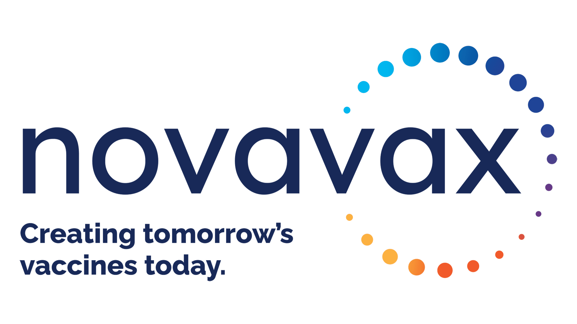
The Novavax logo is sleek and contemporary, perfectly reflecting its cutting-edge approach to vaccine development. The logo features the company name in a modern, lowercase sans-serif typeface colored in navy blue, conveying trust and stability. Accompanying the wordmark is a series of multicolored dots arranged in a circular pattern, symbolizing the company’s innovative and comprehensive approach to vaccine research. The tagline, “Creating tomorrow’s vaccines today,” further emphasizes Novavax’s commitment to advancing healthcare solutions. The logo’s clean and dynamic design effectively communicates the company’s forward-thinking ethos.
Tylenol
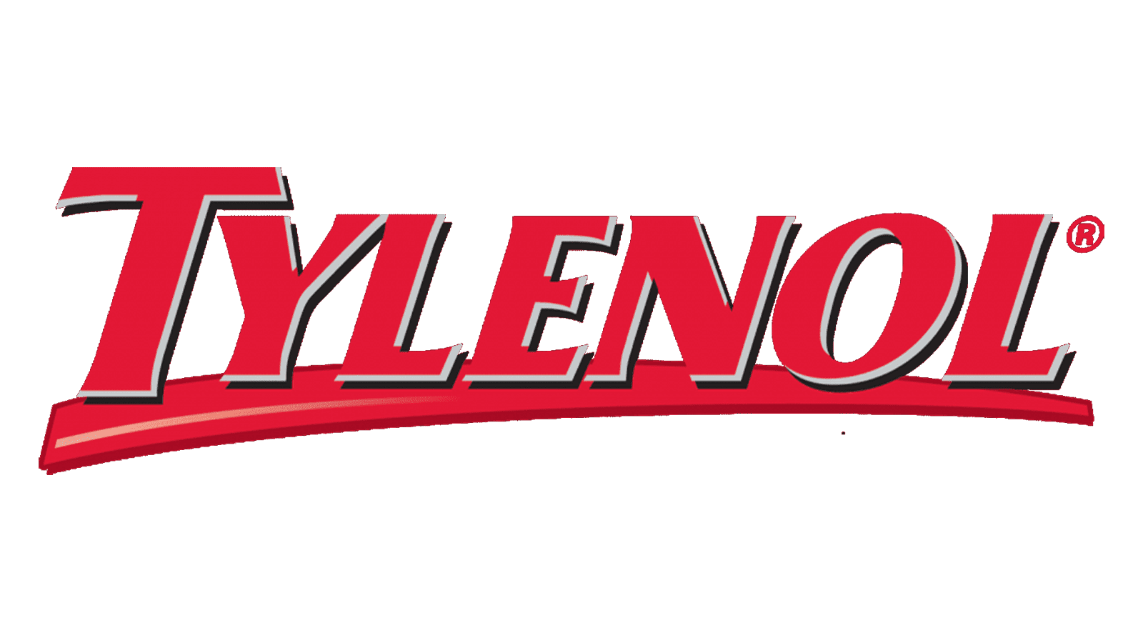
The Tylenol logo is a robust and easily recognizable emblem in the pharmaceutical industry. It features the brand name in a bold, red uppercase serif typeface, with a distinctive upward swoosh underlining the wordmark. The red color denotes urgency and reliability, suitable for a brand associated with pain relief. The dynamic design of the logo suggests rapid action and effectiveness, reinforcing Tylenol’s reputation as a trusted remedy for pain and fever. This straightforward yet powerful logo ensures immediate brand recognition, highlighting Tylenol’s commitment to providing quick and reliable relief.
Siemens Healthineers
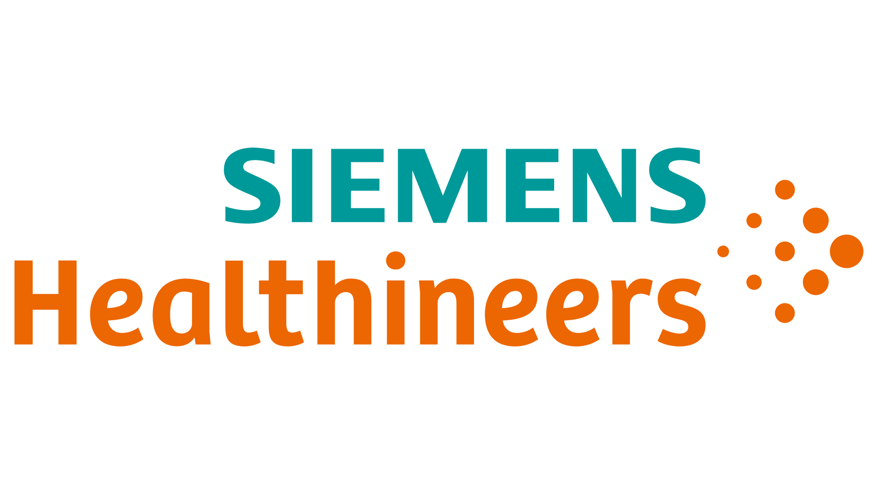
The Siemens Healthineers logo is a vibrant and dynamic representation of the company’s innovative spirit in the medical technology industry. The design features the company name split into two colors: “SIEMENS” in a bold teal uppercase sans-serif font and “Healthineers” in a bright orange lowercase typeface, emphasizing the human-centric approach of the brand. The orange dots forming a progressive arc to the right of the text add a sense of movement and forward-thinking. This combination of teal and orange symbolizes a blend of stability, trust, energy, and creativity, encapsulating Siemens Healthineers’ commitment to advancing healthcare.
Moderna
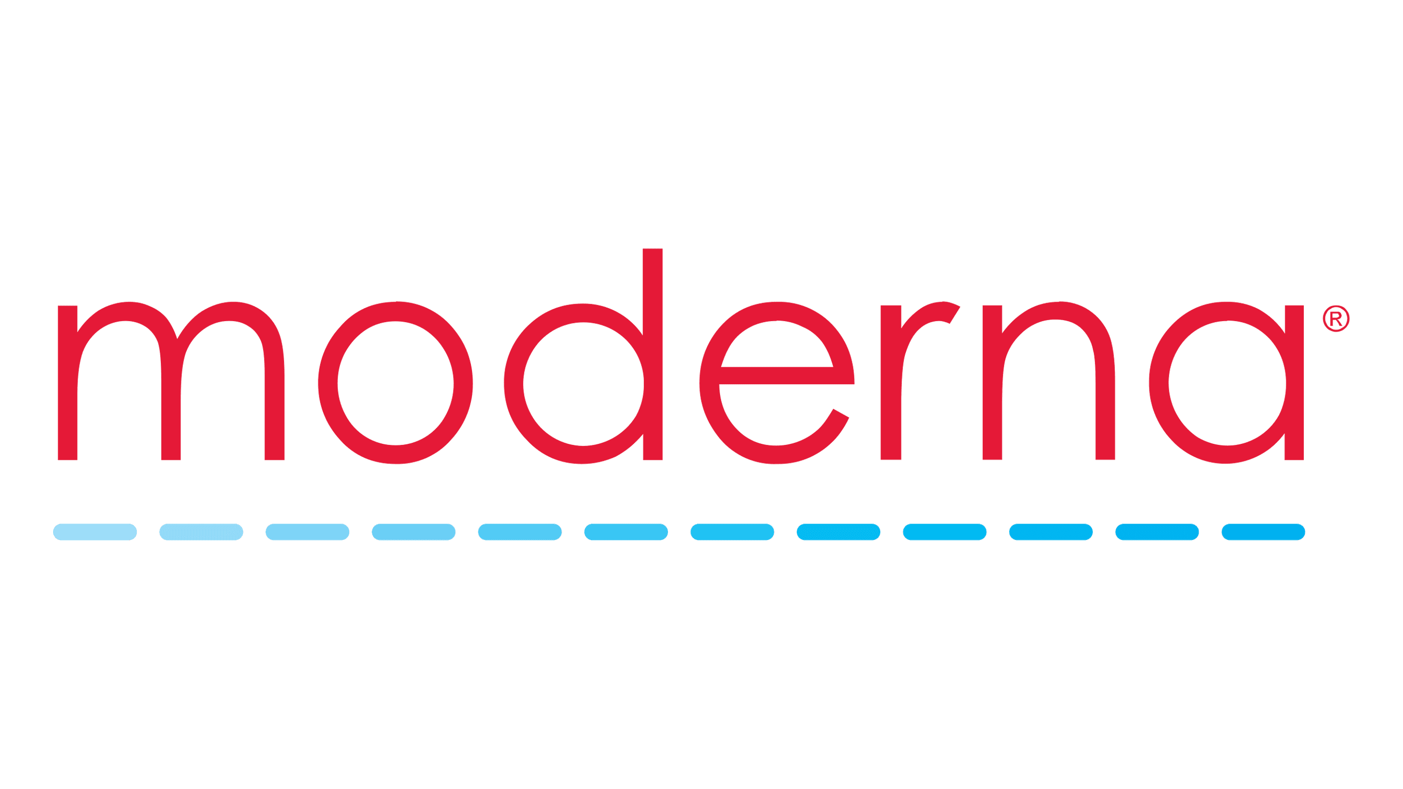
The Moderna logo is a sleek and modern emblem reflecting the company’s cutting-edge advancements in biotechnology. The design showcases the company name in a striking red lowercase sans-serif typeface, which conveys a sense of urgency and innovation. Beneath the wordmark, a series of blue gradient dots create a dynamic underline, suggesting progress and continuity. The color red signifies passion and energy, while the blue gradient dots add a touch of technological sophistication. This logo effectively communicates Moderna’s forward-thinking approach and its dedication to creating transformative medical solutions.
Fresenius Medical Care
The Fresenius Medical Care logo embodies precision and reliability, key attributes of the company’s services. The design features a bold, uppercase sans-serif typeface in deep blue, accompanied by a stylized shield formed by three chevrons pointing downward. The chevrons symbolize protection, support, and the company’s commitment to patient care. The choice of blue conveys trust and professionalism, reinforcing Fresenius Medical Care’s reputation as a dependable provider of healthcare solutions. This logo’s clean and structured appearance underscores the company’s focus on quality and innovation in medical care.
AstraZeneca
The AstraZeneca logo is elegant and contemporary, perfectly reflecting the company’s position in the biopharmaceutical industry. The logo consists of the company name in a distinctive plum-colored serif typeface, which exudes sophistication and stability. The clean and straightforward design ensures easy recognition and conveys a sense of reliability and trustworthiness. This color choice suggests a blend of creativity and scientific rigor, highlighting AstraZeneca’s commitment to delivering innovative medical solutions and improving patient outcomes worldwide.
Cardinal Health
The Cardinal Health logo combines simplicity with a touch of elegance, symbolizing the company’s role in the healthcare sector. The design features the company name in a clean, black lowercase sans-serif typeface, conveying professionalism and reliability. Above the wordmark, a series of red, stylized lines form an abstract bird in flight, suggesting agility and forward momentum. The red color represents energy and passion, while the black text provides a stark contrast, ensuring clarity and easy recognition. This logo effectively communicates Cardinal Health’s dedication to delivering comprehensive healthcare services and solutions.
Medtronic
The Medtronic logo is a bold and modern representation of the company’s dedication to medical technology innovation. The design features the company name in a deep blue uppercase sans-serif typeface, which conveys trust, reliability, and professionalism. The simplicity and strength of the wordmark ensure easy recognition, while the choice of blue reflects the company’s commitment to integrity and excellence in healthcare solutions. This straightforward yet powerful logo underscores Medtronic’s position as a leader in the medical device industry.
Alcon
The Alcon logo is a testament to simplicity and clarity, reflecting the company’s focus on eye care. The design features the company name in a bold, blue uppercase sans-serif typeface, which exudes professionalism and trust. The simplicity of the logo ensures it is easily recognizable, while the blue color conveys a sense of stability and dependability. This clean and straightforward design effectively communicates Alcon’s commitment to providing high-quality eye care products and services, reinforcing its reputation as a trusted leader in the field.
Draegerwerk AG & CO KGAA
The Draegerwerk logo, often shortened to Dräger, is a modern and distinctive emblem in the medical and safety technology sector. The logo features the company name in a bold, navy blue uppercase sans-serif typeface, with the unique inclusion of two dots above the “a” (umlaut), which add a touch of the company’s German heritage. The deep blue color signifies trust, reliability, and professionalism. The clean and robust design ensures easy recognition and underscores Dräger’s commitment to providing innovative and dependable safety and medical solutions.
Zimmer Biomet
The Zimmer Biomet logo represents precision and innovation in the orthopedic medical industry. The design features a distinctive blue “Z” inscribed within a circular frame, symbolizing completeness and excellence. Accompanying the emblem, the company name “Zimmer Biomet” is written in a sleek, modern gray uppercase sans-serif typeface, reflecting professionalism and reliability. The combination of blue and gray conveys a sense of trust, stability, and technological advancement, underscoring Zimmer Biomet’s commitment to enhancing the quality of life through innovative medical solutions.
OneTouch
The OneTouch logo is vibrant and approachable, embodying the company’s dedication to improving diabetes management. The design features the brand name “OneTouch” in a lively green uppercase sans-serif typeface, exuding health, growth, and vitality. Below the wordmark, the tagline “every touch is a step forward” is written in a lighter green, reinforcing the company’s mission to make a positive impact on users’ lives. The simple, rounded design elements convey a sense of ease and accessibility, making the logo both memorable and reassuring for consumers.
Olympus
The Olympus logo is a bold and recognizable symbol in the medical and optical industries. The design features the company name in a deep blue uppercase sans-serif typeface, which conveys trust and reliability. Below the wordmark, a distinctive yellow line tapers towards the center, symbolizing precision and focus. The combination of blue and yellow suggests professionalism and innovation, reflecting Olympus’s commitment to providing high-quality medical and optical solutions. This straightforward yet impactful design ensures immediate brand recognition, highlighting the company’s long-standing reputation for excellence.
Boston Scientific

The Boston Scientific logo is elegant and sophisticated, reflecting the company’s leadership in medical device innovation. The design features the company name in a refined navy blue serif typeface, which exudes trust and authority. The clean and classic look of the logo ensures clarity and easy recognition, reinforcing Boston Scientific’s commitment to providing reliable and cutting-edge medical solutions. This simple yet distinguished design effectively communicates the company’s dedication to improving patient outcomes and advancing healthcare technology.
AbbVie
The AbbVie logo is modern and sleek, perfectly capturing the company’s innovative spirit in the biopharmaceutical sector. The design features the brand name in a lowercase, deep navy blue sans-serif typeface, which conveys trust, professionalism, and forward-thinking. The rounded edges of the letters add a touch of approachability, balancing the serious and scientific nature of the company’s work with a sense of accessibility and care. This clean and contemporary design highlights AbbVie’s commitment to developing advanced medical therapies and improving patients’ lives.
Baxter International
The Baxter International logo is a robust and dynamic representation of the company’s global presence in healthcare. The design features the brand name in a bold, navy blue uppercase sans-serif typeface, which conveys strength, reliability, and professionalism. The slightly slanted letters add a sense of movement and progress, reflecting Baxter’s commitment to advancing healthcare solutions. This straightforward yet powerful design ensures immediate brand recognition, emphasizing the company’s dedication to delivering high-quality medical products and services worldwide.
Medline Industries
The Medline Industries logo is simple yet impactful, reflecting the company’s focus on quality healthcare products. The design features the company name in a bold, uppercase white sans-serif typeface set against a deep blue background, which conveys trust and reliability. The star-like emblem above the wordmark symbolizes guidance and excellence, reinforcing Medline’s commitment to leading the way in the healthcare industry. This clean and professional design ensures easy recognition and communicates the company’s dedication to providing superior medical supplies and solutions.
ResMed
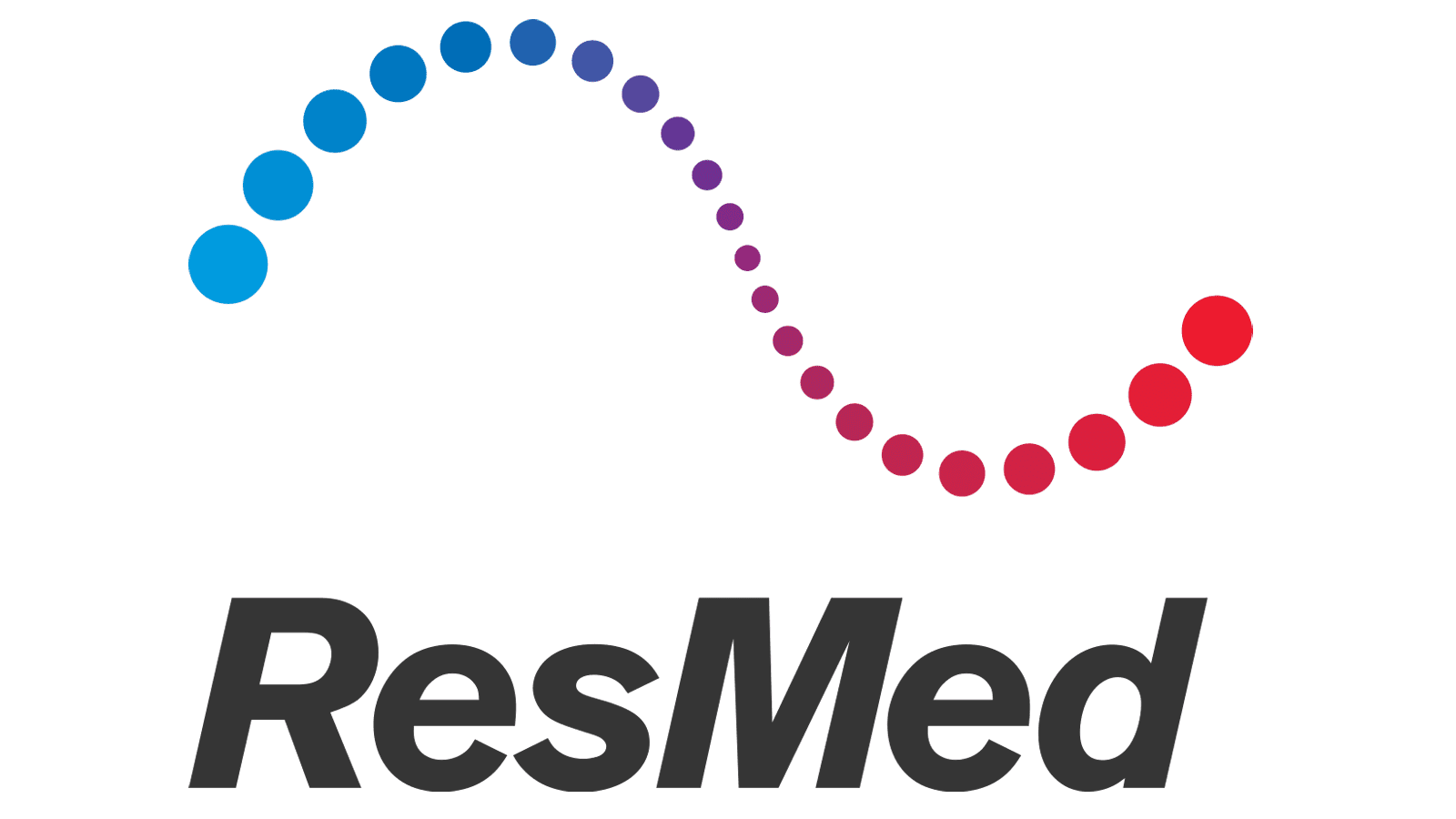
The ResMed logo is a vibrant and modern emblem that reflects the company’s innovative approach to sleep and respiratory care. The design features the brand name in a bold, dark gray lowercase sans-serif typeface, which conveys professionalism and reliability. Above the wordmark, a series of colored dots in a wave pattern transition from blue to red, symbolizing the company’s focus on improving breathing and overall health. This dynamic and visually appealing design effectively communicates ResMed’s commitment to enhancing the quality of life through advanced medical technology.
Gilead
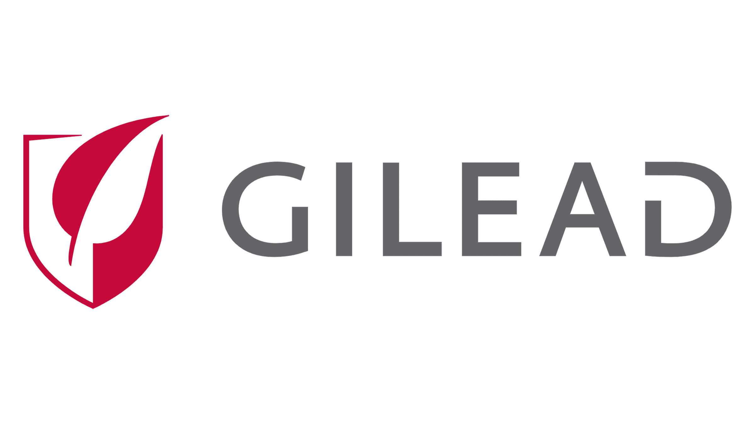
The Gilead logo represents the company’s dedication to innovative medical solutions with a modern and clean design. It features a stylized shield, symbolizing protection and reliability, with a prominent red leaf at its center, indicating growth and health. The bold, sans-serif typeface of the word “GILEAD” is in a muted grey, reflecting professionalism and trustworthiness. The leaf’s upward tilt suggests progress and dynamic growth, aligning with Gilead’s mission to develop life-saving therapies. This simple yet effective design communicates the company’s commitment to improving patient lives through scientific advancements.
Terumo
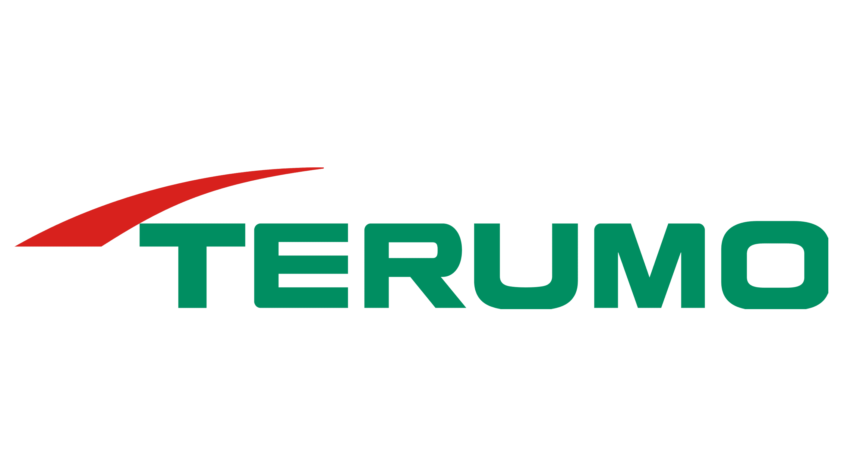
The Terumo logo combines a sleek and professional look with a touch of dynamism. It showcases a green, bold sans-serif typeface for the company name, projecting stability and trust. Above the name, a red arc swoops forward, symbolizing innovation and progress. This arc adds a sense of movement and forward-thinking to the design. The choice of green and red reflects Terumo’s focus on health and vitality, while the clean and modern typography underscores the company’s commitment to quality and precision in medical technology.
BioNTech
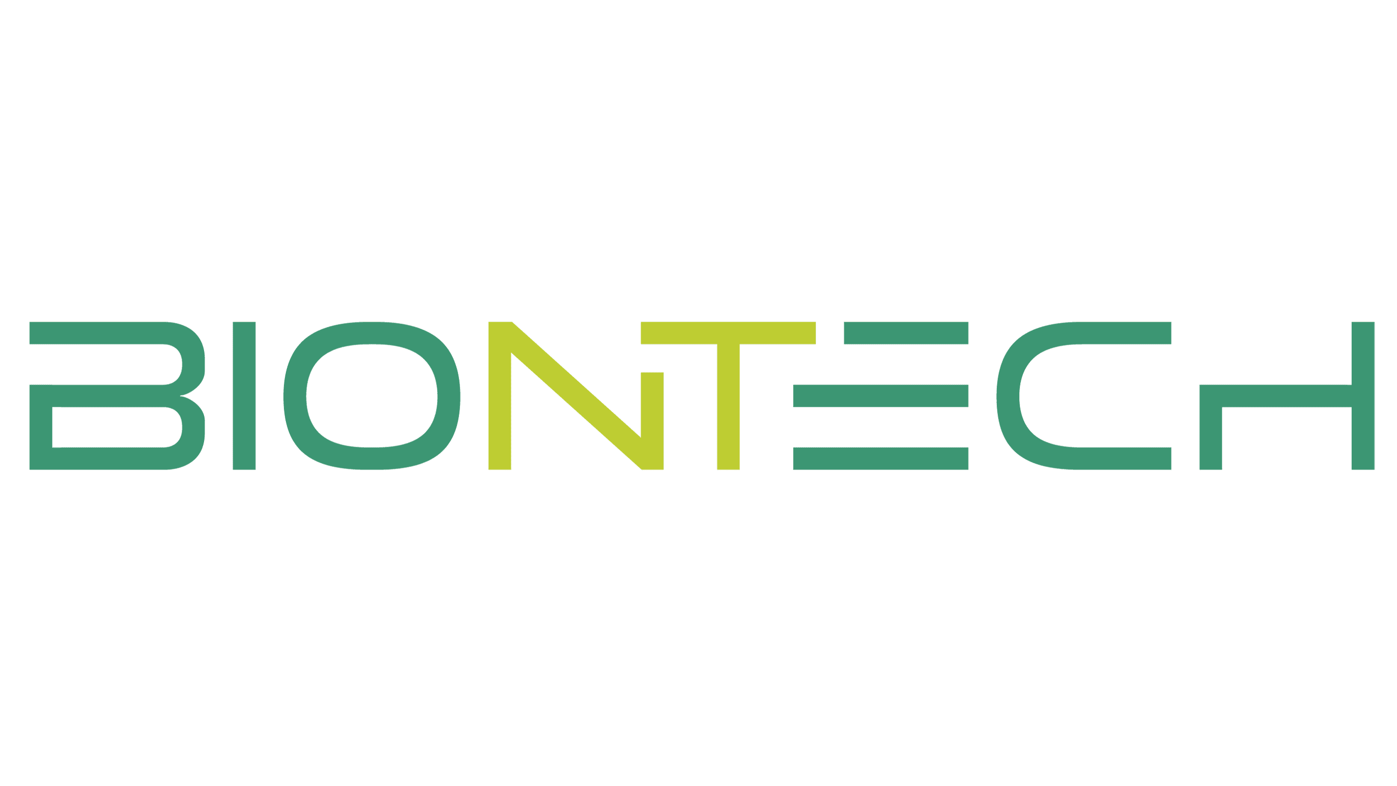
BioNTech’s logo is a contemporary representation of the company’s cutting-edge approach to biotechnology. The name “BioNTech” is displayed in a unique, modern typeface with a mix of light and dark green hues, symbolizing growth, innovation, and the natural world. The seamless integration of the letters and the strategic use of color gradients convey a sense of forward motion and progress. This design encapsulates BioNTech’s mission to harness the power of science and technology to develop transformative therapies and vaccines, highlighting their role as pioneers in the biotech industry.
Danaher Corporation

The Danaher Corporation logo is a sophisticated blend of modernity and innovation. It features a sleek, stylized emblem in shades of purple and blue, resembling a dynamic ribbon in motion. This emblem is accompanied by the company name in a bold, black, sans-serif typeface, exuding professionalism and strength. The gradient effect in the ribbon signifies progress, innovation, and the company’s continuous evolution. The overall design reflects Danaher’s commitment to breakthrough technologies and impactful solutions across its diverse portfolio of businesses.
Vital Proteins
The Vital Proteins logo is straightforward yet impactful, designed to resonate with health-conscious consumers. It features the company name in a bright, vibrant blue uppercase typeface that exudes energy and vitality. The simplicity of the logo underscores the brand’s focus on transparency and purity in its product offerings. The slightly arched arrangement of the text adds a subtle sense of uplift and positivity, aligning with the brand’s mission to promote overall wellness and healthy living through high-quality nutritional products.
Cooper Companies
The Cooper Companies logo combines a professional and approachable aesthetic. It features a spherical emblem with watercolor-like textures in shades of blue and green, symbolizing the global reach and diverse impact of the company. The company name is displayed in a clean, sans-serif typeface, with “Cooper” in a dark grey and “Companies” in a matching blue. This color scheme represents trust, stability, and health. The artistic globe element highlights the company’s commitment to innovative solutions and its focus on improving lives worldwide.
McKesson Corp
The McKesson Corp logo is a bold representation of the company’s prominence in the healthcare sector. It features the company name in a strong, blue uppercase typeface, conveying reliability and authority. A distinctive orange square punctuates the “M,” adding a touch of vibrancy and modernity. The clean lines and balanced design reflect McKesson’s commitment to efficiency and innovation in healthcare distribution and services. The logo’s straightforward yet impactful design embodies the company’s dedication to delivering comprehensive and trustworthy healthcare solutions.
Teleflex Inc
The Teleflex Inc logo is a modern and sleek design that represents the company’s innovative approach to medical technologies. It features the company name in a bold, navy blue sans-serif typeface, projecting professionalism and stability. The unique aspect of the logo is the stylized “T,” which incorporates a dynamic, flowing design element that suggests flexibility and forward motion. This element underscores Teleflex’s commitment to advancing medical solutions and enhancing patient care. The overall design is clean, contemporary, and reflective of the company’s cutting-edge product offerings.
Hoya Corporation
The Hoya Corporation logo is a minimalist and modern representation, utilizing a bold, blue typeface that conveys professionalism and trust. The distinctive feature of the logo is the creative integration of a horizontal line cutting through the “H,” suggesting a lens or optical element, which is fitting given the company’s focus on precision optics and healthcare solutions. This clean and simple design effectively communicates Hoya’s commitment to clarity, innovation, and technological advancement in the medical and optical industries.
Edwards Lifesciences
The Edwards Lifesciences logo embodies a classic yet sophisticated aesthetic. The logo features a stylized monogram “E” set within a structured grid of intersecting lines and shapes in a refined grey color. This geometric arrangement suggests precision and meticulous attention to detail, aligning with the company’s dedication to life-saving technologies and medical devices. Below the emblem, the company name “Edwards” is presented in a serif typeface, adding a touch of elegance and tradition. The overall design reflects the company’s heritage and its forward-thinking approach in the medical field.
Align Technology
The Align Technology logo is modern and approachable, reflecting the company’s innovative spirit. It features the company name in a sleek, lowercase sans-serif typeface in a dark grey hue, exuding a sense of modernity and professionalism. A small blue dot above the “i” adds a pop of color and serves as a visual focal point, symbolizing precision and attention to detail. This clean and contemporary design underscores Align Technology’s mission to revolutionize orthodontic care through advanced technology and patient-centric solutions.
Steris PLC
The Steris PLC logo is a blend of simplicity and professionalism, designed to convey reliability and expertise in medical equipment and services. It features the company name in a classic, serif typeface in a dark grey color, which adds a touch of sophistication. To the left of the name, a stylized emblem of blue horizontal lines resembling waves or sterilization indicators suggests cleanliness, purity, and the company’s focus on healthcare and hygiene. This design effectively communicates Steris’s commitment to providing high-quality medical products and services.
Intuitive Surgical
The Intuitive Surgical logo is sleek and modern, emphasizing the company’s cutting-edge approach to robotic-assisted surgery. It features the company name in a light grey, uppercase sans-serif typeface, which conveys precision and professionalism. A small, distinctive yellow dot above the “I” in “Intuitive” adds a touch of warmth and innovation, symbolizing the company’s focus on pioneering new technologies. The minimalist design reflects Intuitive Surgical’s commitment to advancing surgical procedures through intuitive and innovative solutions.
Abreva
The Abreva logo is vibrant and dynamic, designed to resonate with consumers seeking effective cold sore treatments. The company name is displayed in a bold, lowercase sans-serif typeface in a deep blue color, which evokes trust and reliability. Surrounding the text is a series of dots in a gradient from orange to yellow, forming a circular pattern that suggests healing and relief. This lively and approachable design effectively communicates Abreva’s promise of fast-acting and reliable treatment for cold sores.
Coloplast AS
The Coloplast AS logo is clean and modern, reflecting the company’s dedication to healthcare solutions. It features the company name in a bold, blue sans-serif typeface, which conveys professionalism and trust. To the left of the name, a distinctive emblem of a circle with horizontal lines suggests unity, harmony, and the company’s focus on providing cohesive healthcare products. This simple yet effective design highlights Coloplast’s commitment to improving the quality of life for patients through innovative medical solutions.
Straumann
The Straumann logo is bold and contemporary, symbolizing the company’s leading position in dental implantology. It features the company name in a strong, black sans-serif typeface, projecting reliability and authority. To the left of the name, a stylized “S” composed of green and white segments creates a dynamic visual element that suggests growth and innovation. This modern and impactful design effectively communicates Straumann’s dedication to advancing dental technology and improving patient care.
Proactiv
The Proactiv logo embodies simplicity and modernity, using a clean, lowercase sans-serif typeface in a neutral grey color. This choice reflects the brand’s straightforward and effective approach to skincare. The minimalist design conveys a sense of calm and reliability, aligning with Proactiv’s mission to provide trusted solutions for acne treatment. The logo’s unembellished style underscores the brand’s focus on clear and accessible skincare products, ensuring that the visual identity is both approachable and professional.
Merck
The Merck logo is a strong representation of the company’s longstanding commitment to health and innovation. It features the company name in bold, black uppercase letters, which convey authority and reliability. To the left, a distinctive teal and white emblem composed of intersecting circles and semi-circles suggests harmony and balance, symbolizing Merck’s integrated approach to pharmaceutical development. This modern and cohesive design reflects the company’s dedication to scientific excellence and its mission to improve global health through advanced medicines and vaccines.
Stryker Corporation
The Stryker Corporation logo is bold and contemporary, designed to reflect the company’s innovative spirit in medical technology. It features the company name in a striking, black sans-serif typeface, with unique angular cuts that add a sense of dynamism and forward motion. The simplicity of the logo emphasizes Stryker’s commitment to delivering cutting-edge healthcare solutions with precision and reliability. This modern design effectively communicates the company’s focus on enhancing patient care through advanced medical devices and technologies.
Hero
The Hero logo is modern and impactful, featuring the company name in a bold, black sans-serif typeface. The use of lowercase letters and a period at the end adds a unique and friendly touch, suggesting approachability and confidence. This straightforward and powerful design aligns with Hero’s mission to provide reliable and effective healthcare products. The logo’s simplicity and clarity make it easily recognizable, reinforcing the brand’s commitment to making healthcare accessible and trustworthy.
Centrum
The Centrum logo is vibrant and dynamic, perfectly capturing the brand’s focus on comprehensive health and wellness. It features the company name in a bold, black sans-serif typeface, exuding strength and reliability. Below the text, a gradient bar transitions through a spectrum of colors, from red to purple, symbolizing the wide range of vitamins and minerals included in Centrum’s products. This colorful element adds a sense of vitality and energy, reflecting the brand’s mission to support overall health and well-being through balanced nutrition.
Conclusion
Medical services are an area where brand names are as simple and intuitive as possible. Potential customers are more likely to choose a brand that reflects professionalism, reliability, and quality in its logo. For a company from the medical field to arouse confidence with its logo, it is enough to follow simple canons. And today we were able to make sure that the most popular and reputable medical brands do just that. We can say the same about the color scheme – our expectations were fully met.


