Band-Aid is the name of the Johnson & Johnson brand of adhesive plasters, which was established in the 1920s. Today it is one of the most famous brands of bandages in the world, distributed in pharmacies and supermarkets across the globe.
Meaning and history

Band-Aid, founded in the United States in 1920, today is not just a brand of patches, but an international term for antibacterial patches and plasters. Owned by Johnson & Johnson, Band-Aid has its products available all over the globe and is considered one of the most reliable brands in its category.
The invention of Band-Aid is a credit to a Johnson & Johnson employee whose wife was constantly injuring her hands and always needed help dressing her wounds. Thanks to one woman’s bad luck and her husband’s care, today the whole world can’t imagine doing without Band-Aids.
Experts have proven that using Band-Aid patches allows wounds to heal twice as quickly as with conventional products. Today the brand produces different types of Band-Aid patches suitable for different types of skin injuries.
What is Band-Aid?
Band-Aid is the name of the brand, which belongs to the world-famous Johnson & Johnson Corporation, engaged in the production of body care products, production of medicines. Band-Aid specializes in the production of antiseptic patches, which protect the skin from bacteria in wounds, cuts, and blisters.
1920s – 1930s

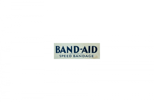
The original Band Aid logo was executed in a bright yet strict blue and white color palette, with three lines of lettering placed on a white horizontally stretched rectangle. The name of the brand was set on the upper line, written in the uppercase, and executed in a clean geometric sans-serif typeface with strict neat lines and distinct angles. As for the additional lettering, it used a more lightweight and traditional font, looking professional and simple.
1930s – Today
The visual identity of one of the world’s most famous adhesive bandages produces is bright yet minimalist. Once created at the beginning of the brand’s history, it has only been slightly modified and cleaned throughout the years. The company still keeps the original color palette and concept of the logo.
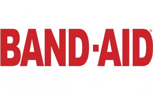
The Band-Aid insignia consists of a bold red wordmark in all capitals, where the thick letters are executed in a calm traditional sans-serif typeface and are accompanied by a light and delicate tagline in the same red color.
The tagline, saying “Brand Adhesive Bandages” is also written in a sans-serif but with slightly extended letters and thin lines. In the previous versions the tagline was colored blue, and earlier it was replaced by a thick horizontal underline in the same blue shade.
The today’s Band-Aid logo is executed in red and white, and can sometimes be complemented by “Johnson & Johnson” nameplate in their iconic font, in red or blue.
The logo of the brand is very simple, yet it shows the company as professional and evokes a sense of authority and expertise, along with power and confidence. This timeless visual identity will always work well and be actual, as the bright colors and clean lines are the choices one can not be mistaken with.
Font and Color
The stable geometric lettering from the primary Band-Aid logo is set in the uppercase of a bold modern sans-serif font with slightly narrowed contours of the characters. The closest typefaces to the one, used in this insignia, are, probably, Helvetica Now Text Condensed Black, or Embarcadero MVB Cond Black SC.
As for the color palette of the Band-Aid visual identity, it is based on just one shade — deep and medium-dark red, which is a color, that represents confidence and professionalism, and at the same time shows the brand’s main target — caring for the customers’ health.


