Medtronic is a medical device company working mainly in the United States. It is an American-Irish registered company. It transferred its legal registration from the U.S. to Ireland following the acquisition of Irish–tax registered Covidien in 2015. As a result, the Wall Street Journal named Medtronic the largest U.S. corporate tax inversion executed between 2013 and 2016. The number of employees reaches roughly 105,000. The brand works in 140 countries and territories.
Meaning and history
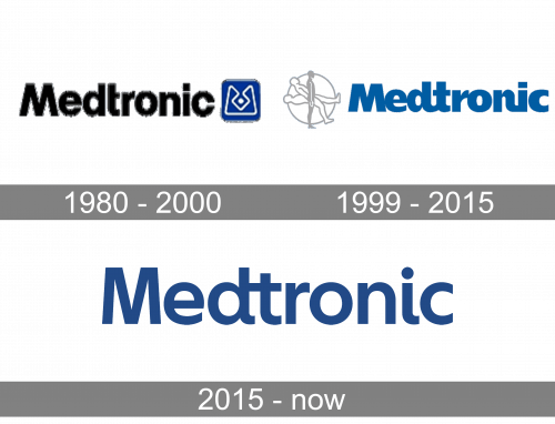
The transformation of the Medtronic logo has included the transition from a “serious” and clean style to more friendly rounded shapes that lacked legibility. Eventually, it adopted a typeface that was both clean and “human”.
1980 – 2000
What is now a successful public limited company started in 1949 as a medical equipment repair shop. It was established in Minneapolis by Earl Bakken and his brother-in-law, Palmer Hermundslie.
One of the oldest logos was based on a stylized “M”. The glyph was drawn using a thin white line and placed inside a blue box with rounded corners. More importantly, it looked like a depiction of one of the devices the brand produced.
To the left, the wordmark could be seen. It featured the name of the company set in a clean sans. It had a minimalist and business-like style providing excellent legibility. The only thing that stood out was the “T”. Due to the lack of the left part of its horizontal line, it occupied less space. As a result, the type looked more functional – as if the designers wanted to say: “There’s nothing unnecessary, only what is really needed”.
1999 – 2015
This version had a fundamentally different style – more rounded, more human. We mean the “human” theme literally – the emblem features a person in three positions. In the background, the person is lying down. Then, he or she is positioned diagonally. Eventually, there is a side view of a person standing. Apparently, this symbolizes the transition from being sick in bed to a normal, healthy life – a transition, in which products made by Medtronic can play a major role.
The wordmark, which is now placed to the right of the emblem, looks dramatically different from the previous version. The letters have grown bolder, more rounded. There are links between some of them, like in a cursive script (for instance, between the “d” and “t”). Also, some of the glyphs touch each other. As a result, the lettering has lost some of its legibility. That’s not to say that it is absolutely illegible, of course, but the previous version was still cleaner.
What is Medtronic
Medtronic plc. consistently tops lists of the world’s largest medical device companies. In the fiscal year 2020 it reported a revenue of $28.913 billion.
It’s not that easy to say whether the update was worth it. On the one hand, the human touch is more pronounced, both due to the typeface and the emblem. On the other hand, the updated Medtronic logo isn’t as clear and business-like, and it also works worse when scaled down.
2015 – present
The designers took the essence of the previous logo and presented it in a more minimalist way. This version is by far easier to grasp. To begin with, the emblem is gone. While this means that the logo has lost some of its optimistic meaning and doesn’t symbolize hope anymore, this move also means that the design is less cluttered.
Colors and font
The type was made slimmer in 2015. On the one hand, you can still see the rounded ends, which convey the “individual and humane approach” (as they resemble handwritten glyphs). Yet, the letters have become better legible – it takes less time to “decipher” the wordmark now.
Although each logo update has affected the palette, the brand has been consistent in using blue as the main color of the Medtronic logo.


