AbbVie is a biopharmaceutical company formed as a spin-off of Abbott Laboratories. One of the company’s primary missions is to develop new approaches to dealing with all kinds of health conditions, both chronic and acute. It is headquartered in Lake Bluff, Illinois, United States, but its products are sold in over 170 countries around the globe.
Meaning and history
The AbbVie logo is utterly simple, yet it has a unique touch. It might be interesting to compare it to the visual brand identity of its sister company, Abbott Laboratories.
2013 – present
In 2011, news started to spread that Abbott Laboratories was going to be reorganized into two independent companies. One of them would preserve the original name and would produce a diversified product range, from medical devices to nutrition. The second company would be named AbbVie and would focus on the research-based manufacturing of innovative pharmaceutical products. Both the companies were to become publicly traded.
However, it was only in early 2013 that the reorganization was effective. AbbVie was listed on the New York Stock Exchange and received an official logo.
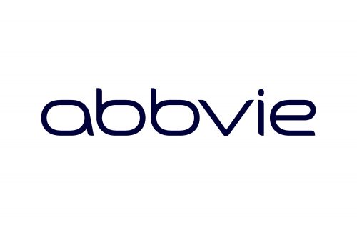
The logo showcases the name of the brand in a minimalist sans. The letters are highly legible, but look unusual. How have the designers who worked on the logo managed to achieve the effect?
Firstly, they slightly changed the regular proportions of letters. The glyphs are a bit wider than usual. The majority of them are based on an ellipse standing on its wider part.
What is AbbVie
AbbVie describes itself as a research-driven biopharmaceutical company. The staff includes over 48 thousand employees, many of whom are scientists and researchers.
Also, the designers worked on the ends of the glyphs. They combined rounded angles with acute angles in an unpredictable fashion, creating a stylish look. Because of such ends, it may appear that the glyphs have been drawn by hand using a brush. There are thin parts where the imaginary brush touched the paper starting the glyphs and where the brush stopped the contact with the paper. These thin starts and endings softly merge into the wider lines forming the bodies of the letters.
The shape of the letters also supports the “handwritten” impression. While they aren’t as casual as handwritten glyphs often are, their shape is far from regular fonts. Interestingly, the letters are formed in such a way that the brush didn’t have to go over the same parts twice. This also makes it unlike regular handwritten letters, because here, the lines left by the pen or brush often overlap.
Another notable detail about the AbbVie logo is that all the characters are lowercase. That’s slightly unexpected for a company that stylizes its name using a capitalized letter in the middle. We can assume that, had the designers capitalized any glyphs, it would have spoiled the overall impression, which is smooth and simple.
Comparing the logo with that of Abbott Laboratories, you can come to the conclusion that they look utterly different. The rather old-fashioned and traditional serif type looks nothing like the modern font in the AbbVie wordmark.
Apparently, the plan was to use the fonts as a way to state the difference between the companies. The “dated” type of the Abbott Laboratories wordmark alludes to the company’s heritage and more than 125-year history, whereas the modernistic font in the AbbVie wordmark implies it is focused on innovation and isn’t afraid to blaze a trail.
Color
The blue in the AbbVie logo is so dark that it looks black. This results in high contrast with the white background, which is key for any logo that is so minimalist and geometric.


