Anthem, Inc. is among the major providers of health insurance in North America. It boasts a long history of mergers and acquisitions. It has changed its name and changed hands more than once. The company’s roots can be traced back to Indiana companies Mutual Hospital Insurance and Mutual Medical Insurance established in 1946.
What is the symbol of the Anthem?
The symbols of the Anthem company are a solid blue cross with a white contoured Da Vinci man, and a solid blue crest with an iconic serpent, used by almost all the healthcare organizations in the world. These two emblems represent the essence of the company, adding a touch of reliability and trustworthiness to the composition and reflecting the titles of activity of Anthem.
Meaning and history

While the Anthem Inc logo might seem rather simple, this simplicity is deceptive. The design team has chosen an optimal combination of colors and shapes in an attempt to convey the company’s status and connote its core benefits offered to the consumers.
What is Anthem INC
Anthem, Inc. has been known as the biggest for-profit managed health care company in the Blue Cross Blue Shield Association. As of June 2021, it was ranked 29th in Fortune 500.
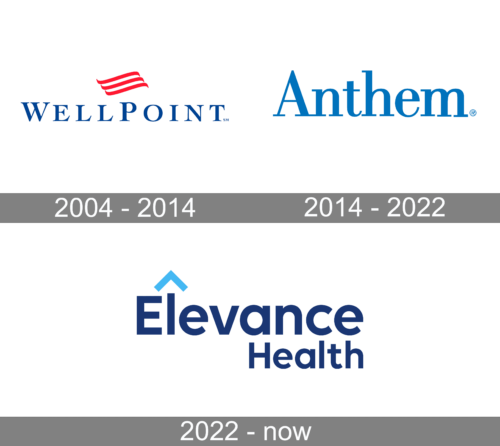
2004 – 2014 (WellPoint.Inc)
In the fall of 2004, Wellpoint, Inc. was formed. It had a distinctive logo, which, in a way, can be regarded as a predecessor of the Anthem Inc visual identity. If you take a look at the blue wordmark set in a neat and traditional serif type, you’re bound to feel this similarity.
This font has rather wide glyphs, although they are based not on the square but the rectangle standing on one of its narrow sides. Above the wordmark, there’s a vivid red accent, an emblem reminiscent of a flag.
2014 – 2022 (Anthem)
In late 2014, WellPoint, Inc. was officially renamed Anthem. However, by this time, the company had already used this name to sell its plans in many states. For instance, in California, the plans were available under the Anthem Blue Cross brand, residents of Georgia knew the same products as Blue Cross Blue Shield of Georgia, while residents of New York could buy them under the Empire Blue Cross Blue Shield brand.
As a result, the transition to the new logo went rather smoothly, without hordes of confused users loathing the update as it happens with some other companies. According to the company’s president and CEO Joseph Swedish, the update was supposed to easier communicate the brand’s values and simplify the way it connects with associates, consumers, etc.
The basic version of the Anthem Inc logo looks sleeker and cleaner than that of its predecessor. There’s only the wordmark set in a muted blue color. It is a bit lighter than the shade used in the WellPoint logo.
The type is still a serif one, but the logo is more compact due to narrower glyphs. Also, all the letters are lowercase, except the initial.
2022 – Today
In 2022 the Anthem company was rebranded into Elevance Health, which was followed for a complete redesign of its visual identity. The new logo of the company is composed of a two-leveled lettering in bold geometric sans-serif font, with the dark blue characters placed against a plain white background and accompanied by a small triangular roof in a light shade of blue, placed above the lowercase letter “L” in the “Elevance”.
Colors and font
According to the Anthem logo guidelines on the corporate website, the default version of the design is one-color blue (PMS 300) or a four-color equivalent. This variant might be used over white or light backgrounds or on a light photographic background.
Alternatively, there are one-color gray or black versions, which can be used on a white or light background. The reversed variation is also possible if the default one isn’t legible enough due to the dark background.
The fact that the designer team that stood behind the project used a serif type can be explained by their desire to convey the “reliability” message. We should bear in mind that the past few decades are undoubtedly the time of streamlined sans serif typefaces. They are still perceived as something new in comparison with serif fonts.
So, a serif font on the Anthem Inc logo is perceived as safer, something that has stood the test of time. Not only the serifs, but even the variation in the thickness of the stroke contributes to this effect (modern fonts often tend to consist of lines of equal thickness). When it comes to health insurance and, more broadly, dealing with money, this is a reasonable choice.


