Merck is a German multinational pharmaceutical and chemical company. It was founded in 1668 by Friedrich Jacob Merck and is the world’s oldest company in the industry, as well as one of the largest pharmaceutical companies in the world.
Meaning and history
Merck is one of the leading science and technology companies in healthcare, life sciences, and high-tech materials.Merckis a German company, the oldest in the world in the chemicals and pharmaceuticals market, and one of the largest.
Founded more than 350 years ago, the company is now a huge concern with 57,000 employees worldwide.
Merck medicines are in demand for the treatment of neurological, endocrine, cardiovascular, oncological, and other diseases. The company is one of the world’s leading suppliers of these drugs.
What is Merck?
Merck is the name of an international pharmaceutical company, which was established in Germany at the end of the 1660s, and today is considered to be one of the strongest players in the global pharm and chemical market.
1838 – 1850
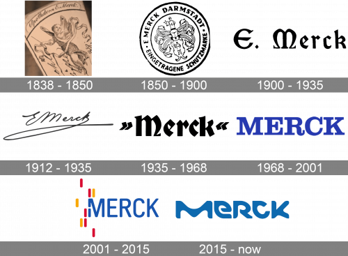
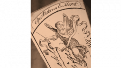
The first logos started being placed on the products of Merck in the 1830s. Those were very elegant and old-style emblems with a flying fairy, enclosed into a frame formed by waving ribbons. The image was accompanied by cursive lettering with the name of the company.
1850 – 1900
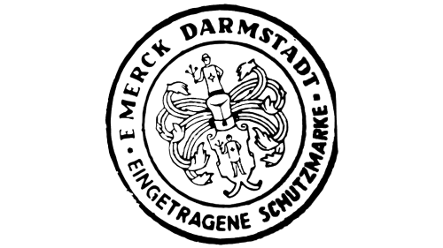
In 1850 Merck changed its visual identity concept to a strong heraldic seal in black-and-white. It was a roundel with a small crest, decorated by many elongated ribbons. On the crest, there was a contoured image of a person, and another person was drawn on the top part of the composition, above the ribbons. The name of the company was written in bold serif capitals around the circular perimeter of the badge.
1900 – 1935
The redesign of 1900 introduced a laconic yet very elegant emblem, which Merck has been using for 35 years. It was an “E. Merck” inscription in bold black title case letters of a fancy custom typeface, with the “M” resembling a letter of a Greek alphabet.
1912 – 1935
Along with the previous version of the badge, in 1912 the company started to use another logo — a copy of the company’s founder in thin black lines, written against a white background. It was a very simple and lightweight emblem, which reflected the Merck value of its roots and the legacy of the brand.
1935 – 1968
The redesign of 1935 emboldened the Merck logo from 1900 and removed the “E” initial from the composition. Now it was only the surname of the founder, enclosed between two bold quotation marks. All elements were drawn in tick solid black lines.
1968 – 2001
The first Merck logo executed in a blue color palette saw the light in 1968. It was an uppercase logotype in a bold elegant serif typeface, with the classic stable characters drawn in a bright and deep shade of blue. In the new color scheme, the badge started looking more vivid and progressive.
2001 – 2015
The Merck logo is a breakthrough in the pharmaceutical industry brands design. It is build on progressive elements and a balance of art and science.
The brand’s aim was not to be confused to the American Merck company and to stand out in a list of pharmaceutical leaders. The previous logo was very simple yet had some colorful elements in it.
Inspired by the Universe, the Merck logo is based on an ecosystem of elements: striking colors, expressive cells, energetic strings and experiential microbes that can be combined to celebrate the brand.
A clear wordmark lives alongside a constantly changeable ‘Vibrant M’, a key signifier of the brand, used to unite all of Merck’s businesses and signal the presence of vibrant science and technology.
The “M” is the main colorful element of the logo. It is being dressed in different biochemical textures, combining the brightest colors possible. It makes the logo eye-catching and edgy.
The custom typeface can be compared to nothing else. It is bold, it is bright, it is different. The name of the main font is Lato, and the “Vibrant M” has its own typeface, called “M font”. This is a simultaneously technical and organic typeface that allows Merck to tell its most colorful stories ever.
The Merck logo is a brave new expression for a company at the cutting edges of scientific discovery. By making the shift from a chemical and pharmaceutical company to one of vibrant science and technology, Merck now have the brand identity that allows them to show the world their true colors.
Using such a different and bright logo is a very risky move for a pharmaceutical company, but the brand achieved their goal — they will never be confused with another Merck, or any other brand in the world.
2015 – Today
The redesign of 2015 has shown Merck as not the oldest pharmaceutical company in the world, but as a super progressive one. Its new badge, composed of a stylized logotype in a smooth shade of blue, looks powerful and stylish, reflecting the company as a professional and innovative one. The uppercase lettering, set in a bold designer typeface with stable massive letters, looks unique, and the shade of blue, used for it adds a sense of reliability and safety.
Merck & Co Logo
The logo of Merck & Co is stable, powerful, and meaningful. It brilliantly represents both the sphere of the company’s activities and its professional qualities. The badge of the brand is composed of a graphical part in calm turquoise and white, followed by a dark gray uppercase lettering in a fancy custom sans-serif typeface with straight cuts of the lines’ sends and some sharp elements in the bars.
The memorable Merck & Co emblem is a geometric composition, with the horizontally stretched ellipsoid overlapped by two circles, placed vertically, one above another. The ellipsoid here stands for a capsule, while the circles — for two tablets. Three elements together make up a sleek and very stylish image.
Font and Color
The custom futuristic lettering from the primary Merck badge is set in the uppercase of a fancy designer typeface with heavy characters and unique shapes. There is no commercial analog for the font, used in this insignia, but it is something in between Groove Town Sans Regular, and Neo Phalanx Regular, but with the contours of the characters significantly modified.
As for the color palette of Merck’s visual identity, it is based on a calm medium-dark shade of blue, which evokes such feelings as confidence and professionalism and points to the most important qualities of the company responsibility, loyalty, and excellence.


