

![]() Sanofi Logo PNG
Sanofi Logo PNG
Sanofi is a French pharmaceutical company, was created after a merger of Elf’s Sanofi and L’Oreal’s Synthelabo. Sanofi’s three best-selling drugs are Lantus, an insulin injection, Lovenox, an anticoagulant, and Aubagio, the one-daily pill to treat a form of multiple sclerosis.
Meaning and history
Being one of the best-known pharmaceutical corporations in the world, Sanofi has always stayed loyal to its roots and legacy. Even after the merger with Synthelabo in 1999 and with Aventis in 2004, the company’s visual identity stayed tried to its original design concept. However, the current Sanofi logo is different from all the previous versions.
1973 – 1999
![]()
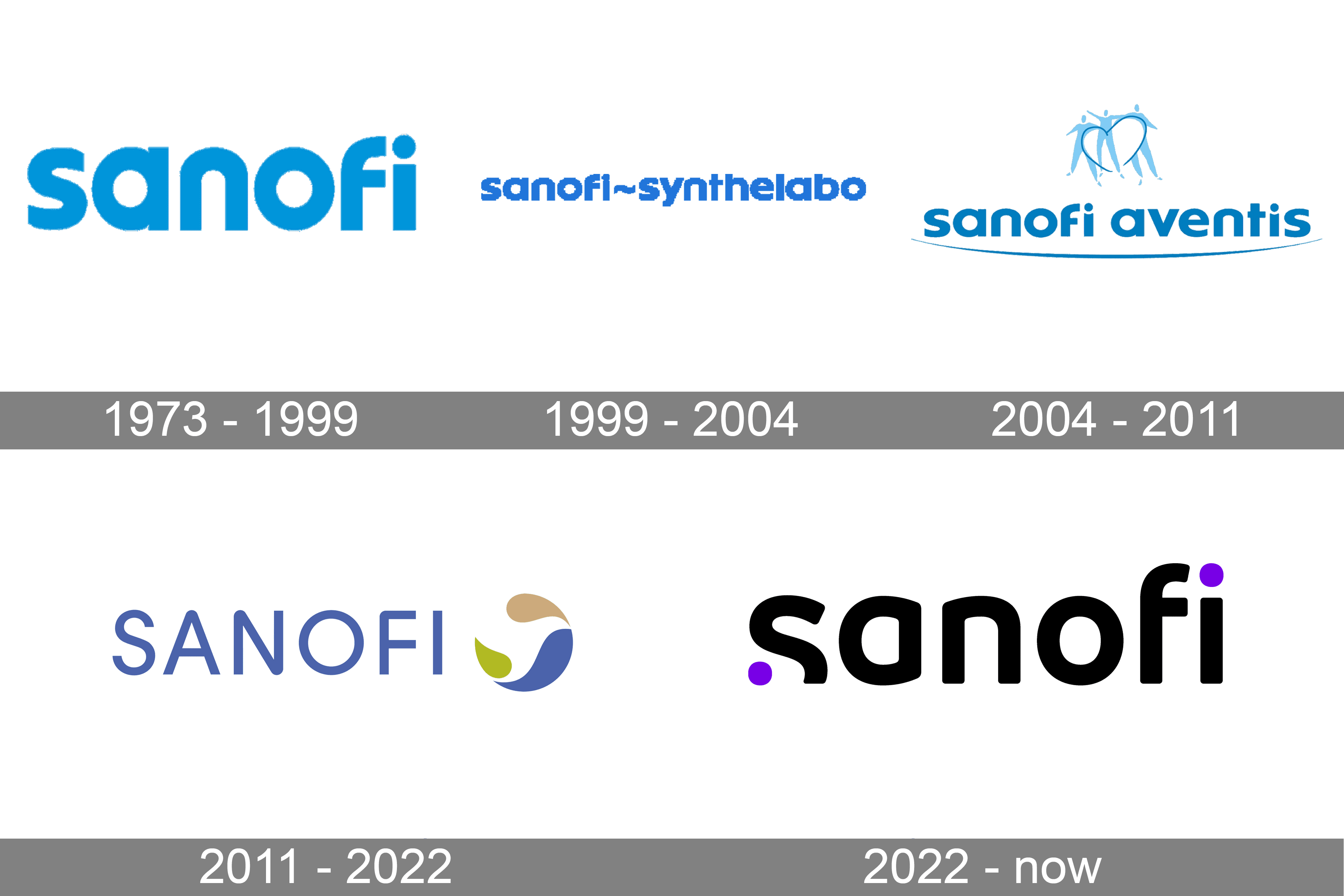
The very first Sanofi logo was created in 1973, with the establishment of the company. The logo featured a bold simple wordmark in light blue, placed on a white background. And nothing else.
The blue and white color combination is a symbol of professionalism and reliability, it also evokes a sense of high-quality and expertise and shows the company as loyal and transparent.
The original wordmark in the lowercase was executed in a custom sans-serif typeface with extra-bold lines. The font is pretty close to the Pump STD Medium, but with its “S” and “A” modernized — the “A” gained a straight the vertical bar, and the “S” — a more traditional contour.
1999 – 2004
![]()
In 1999 Sanofi went through a merger with Synthelabo and had to change its visual identity, in order to place its new name on the logo. The color palette remained the same, as it is a perfect combination for any health-related organization, showing the fundamental approach of the company and its trustworthiness.
The two parts of the wordmark were placed in one line with a curved line, replacing the “-“, which separates the two companies’ names.
All the lowercase letters of the Sanofi-Synthelabo wordmark are executed in a bold sans-serif typeface, which is similar to Futura Maxi STD Bold font, slightly extended and with its “F” modified and softened.
The inscription looks solid and neat, reflecting the company’s strength and stability and evoking a sense of a reliable and powerful brand.
2004 – 2011
![]()
In 2004 the new company, Sanofi Aventis, was formed. After the merger of two strong brands, the new logo was created, based on the traditional corporate color palette and style, but with an additional arched underline, resembling a wide smile and a tagline “L’essentiel c’est la sante” (which means “the main thing is health”) in a lighter shade of blue.
For the first four years, until 2009, the logo featured an emblem in its upper part, which was depicting three human figures in light blue with a thin heart silhouette in a darker shade.
The typeface of the inscription was slightly modernized but is still based on the Futura family font. The signature “F” remains the same, while the two letters “I” of the wordmark have their dots overlapping the vertical bars and forming two small smiles.
The tagline is written in an elegant serif typeface, which is similar to Fabrizio font, with distinct serifs and strong straight lines.
2011 – 2022
![]()
The company’s name was changed back to Sanofi and a new modern visual identity was designed in 2011. Using a completely different approach, the current Sanofi logo boasts a big remarkable emblem with a wordmark under it. The circular emblem depicts a stylized image of the bird, which appears in the negative space between three drop-like figures, each in its own color — beige, calm green and intense blue.
The new emblem got the name “The Bird of Hope” and represents the main company’s principle — bringing hope to people with its pharmaceutical products. All four colors of the brand’s visual identity represent four main forces — water, air, fire, and earth.
![]()
The new wordmark in all capitals is written in a modern sans-serif typeface, which is very similar to Ulm Grotesk Medium, and has its angles rounded, while the edges cuts of the letters are straight.
The slightly narrowed typeface looks contemporary yet modest and evokes a sense of the innovative and progressive character of the company, as well as its constant growth and professionalism.
2022 – now
![]()
The redesign of 2022 has introduced a completely modernized version of the Sanofi insignia; with the wordmark set in a stylized designer typeface. The lowercase inscription is now executed in a bold sans-serif font with softened lines and futuristic contours of the characters. Written in black, the inscription has two purple circles — in the beginning and in the end — which replace a part of the “S” and the dot above the “I”.
Review
Sanofi manufactures a wide variety of medications, including vaccines from rare diseases and simple everyday drugs to help people with stomach aches and insomnia. The company also specializes in the treatment of different types of diabetes and has a range of products, helping with some kinds of cancer, including leukemia and colorectal cancer.
The corporation is considered to be one of the most trusted and reputable pharmaceutical businesses in the world, with constant research and willingness to open new formulas and vaccines to treat various conditions.
The company has its producing facilities in India, and are fully controlled by the Aventis Pharma company, which is Sanofi’s Indian subsidiary.
The corporation has over 100 thousand employees across the globe and is at the top of the world’s best employers list. It is a powerful company, with a rich history and excellent reputation.


