McKesson is an American pharmaceutical company, the oldest and largest company in the nation, distributing and providing health information technology, medical supplies, and care tools.
Meaning and history
McKesson Corporation was founded by John McKesson and Charles Olcott in New York City in 1833. Initially, the company operated as a wholesaler of botanical drugs. Over the years, McKesson expanded its operations, diversifying into pharmaceuticals, medical supplies, and healthcare technology. In 1967, McKesson merged with Foremost Dairies, creating a diversified conglomerate.
One of McKesson’s significant achievements came in 2001 when it acquired HBO & Company (HBOC), a healthcare technology company, for $14.5 billion. This acquisition positioned McKesson as a major player in healthcare information technology, providing software solutions for hospitals and healthcare providers. Additionally, McKesson has consistently ranked among the top companies on the Fortune 500 list, reflecting its status as one of the largest corporations in the United States.
Today, McKesson continues to be a dominant force in the healthcare industry. It operates as a Fortune Global 500 company, with revenues exceeding tens of billions of dollars annually. The company’s commitment to delivering quality healthcare products and services remains unwavering as it navigates the evolving landscape of healthcare delivery and technology.
What is McKesson?
McKesson is a pivotal player in healthcare, offering pharmaceutical distribution, medical supplies, and innovative healthcare technology solutions. Its expansive reach spans across numerous countries, servicing various healthcare providers. The company’s legacy, dating back to 1833, underscores its deep-rooted expertise and commitment to advancing healthcare. Today, McKesson stands at the forefront of healthcare innovation, continuously striving to enhance patient care and streamline healthcare operations.
1983 – 1999
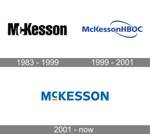
The first logo features the word “McKesson” in a bold, sans-serif typeface that conveys a sense of solidity and reliability. Set against a white background, the black lettering stands out with a straightforward and no-nonsense look, suggesting a company that values tradition and stability. This logo is evocative of an established, trust-inspiring corporation with a straightforward approach to its business.
1999 – 2001
The logo is more dynamic, with the company name “McKessonHBOC” presented in a vibrant blue color that signifies trust, efficiency, and professionalism. The font here is modern and more rounded, giving it a contemporary feel. A sweeping blue arc connects the “McKesson” part of the logo to the “HBOC,” implying a sense of connection and motion. The arc adds a creative flair, indicating innovation and a forward-thinking attitude. This design suggests a company that is evolving and expanding, integrating modern elements into its identity while maintaining its core focus.
2001 – Today
The McKesson logo is a great example of how a simple strict wordmark can look modern and stylish.
The brand’s logo is composed of its wordmark and the slogan beneath. The key role in the logo design takes the color palette. Its main color is common for the pharmaceutical industry design blue. But it has a small and bright accent, which changes everything – an orange line under the letter “C”.
This color accent makes the logo look fresher and contemporary, even though the typefaces used in the wordmark and slogan are both very classic — similar to Neue Frutiger Com Black and Neue Frutiger Com Italic, designed by Adrian Frutiger.


