![]() Monsters Inc. Logo PNG
Monsters Inc. Logo PNG
Monster Inc. is an animated movie, produced by Pixar in 2001. It’s one of the most popular and iconic products of this studio, with the sequel called Monster University being released in 2013. The plot follows two monster friends who work in a factory that harvests the screams of children – to gain these, they travel to the human dimension.
Meaning and History
![]()
The movie came out in 2001, and the primary design of the logotypes and other artistic elements was that they were usual shapes, but with random eyes and fangs. The whole premise of the movie is that monsters in it have all sorts of shapes with just basic eyes. The main emblem is just the letter ‘M’ with an eye in its center.
What is Monsters Inc?
Monsters Inc. is an animated movie, created by Pixar and released by Disney in 2001. The story is about two monster friends Sulley and Mike, who work in an energy company, called Monsters Inc. The energy in in this world is harvested from the screams of children.
2001
![]()
The original logo is a wordmark that spells the name of the brand in bold, light blue letters. The font was a pretty basic sans-serif with little room between the letters. All of them were also uppercase, although the ‘M’ in the front was a bit bigger. They placed an eye in its middle, which is a regular seed shape with a black dot in the middle.
2012
![]()
For the 3D animated movie, released by the franchise in 2012, the original Monsters Inc logo was slightly refined. First of all, the shade of blue got brighter, and the letters became more voluminous, with a light shadow behind the characters more visible now. Secondly, the “3D” line was added under the main wordmark, executed in the same color and style, but with the heavy blue “D” overlapped by a thin white cursive “D” from the iconic Disney logotype.
Font and color
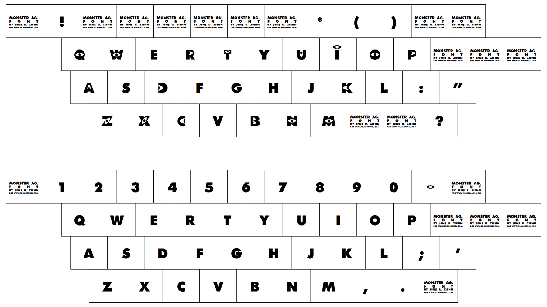
The heavy sand-serif lettering from the Monsters Inc official logo is set in an extra-bold typeface, which looks pretty close to such fonts as Futura TS Heavy and Guildford Pro Titling, but with the first capital “M” enlarged and extended.
As for the color palette of the Monsters Inc visual identity, it is based on a bright and vivid shade of blue, just the same hue as the one, used for the fur of one of the main cartoon’s characters, Sullivan. The blue palette is supported by white and black elements, making up an eye on the letter “M”.
Font