![]() Disney Channel Logo PNG
Disney Channel Logo PNG
Disney Channel is the name of the American tv-channel, which broadcasts cartoons and tv-series for kids and teenagers. The channel was launched in 1983 and is considered to be one of the most popular in the world’s kids entertainment segment.
Meaning and history
![]()
The visual identity of the famous kids’ channel is bright and very friendly. Based on the silhouette of Mickey Mouse, the most popular Disney character, it is instantly recognizable all over the globe and evokes a warm and kind feeling.
1983 – 1986
![]()
The very first logo for Disney Channel was designed in 1983 and features an image or a rounded tv-screen with a blue horizontal stripes pattern and a white Mickey silhouette in the middle. The wordmark in all capitals was placed under the emblem in the same sea-blue color and was executed in a smooth sans-serif typeface with rounded angles, which perfectly balanced the shape of the “screen”.
1986 – 1997
![]()
In 1986 the logo was first redesigned. The sea-blue color was changed to black, and the number of stripes reduced. Another big change was made to the wordmark, which now featured a custom “Disney” lettering in a fancy playful typeface, while all the other words of the inscription were written in a title case and executed in a traditional serif font.
1997 – 2002
![]()
A completely new version of the logo was created in 1997. Now the colorful Mickey Mouse was standing with his hands up, on the black and blue background, with a white “Disney” lettering in the middle. The “Channel” inscription was written in all capitals of the bold sans-serif typeface and placed under the emblem, featuring black color in order to make the whole picture balanced.
1999 – 2002
![]()
In 1999 Mickey Mouse was removed from the emblem, and the black tv with rounded ears was colored purple. This logo version stayed with the channel for only three years and is definitely the brightest and the most colorful emblem ever created for the Disney Channel.
2002 – 2014
![]()
The new era of the Disney Channel visual identity started in 2002. The company decided to go minimalist and laconic, keeping the main features — the unique “Disney” lettering and the Mickey Mouse contour.
![]()
The wordmark in black was now placed inside a blue frame, repeating the head and ears of the famous animated character. The new color palette made the logo look fresher and crispier, allowing placing it on various backgrounds.
2010 – 2014
![]()
In 2010, they took the uncut version of the previous logo and removed its lower half. The remaining picture was confined inside a square with rounded corners. That being said, the ears were still allowed to go beyond the figure’s borders.
2014 – 2017
![]()
In 2014 the head of Mickey Mouse was put into a wordmark, replacing the dot above the letter “I” in “Disney”. The wordmark now became the main and only element of the visual identity, pointing on the professionalism and expertise of the company and its huge experience in the entertainment industry.
It was a three-dimensional nameplate with gradient blue and white color palette, where the “Disney” part was slightly enlarged and placed above the “Channel” in all capitals.
2017 – 2019
![]()
The redesign of 2017 made the nameplate flat and strict. The contours have not changed, but the color palette got simplified to just one shade of blue and white.
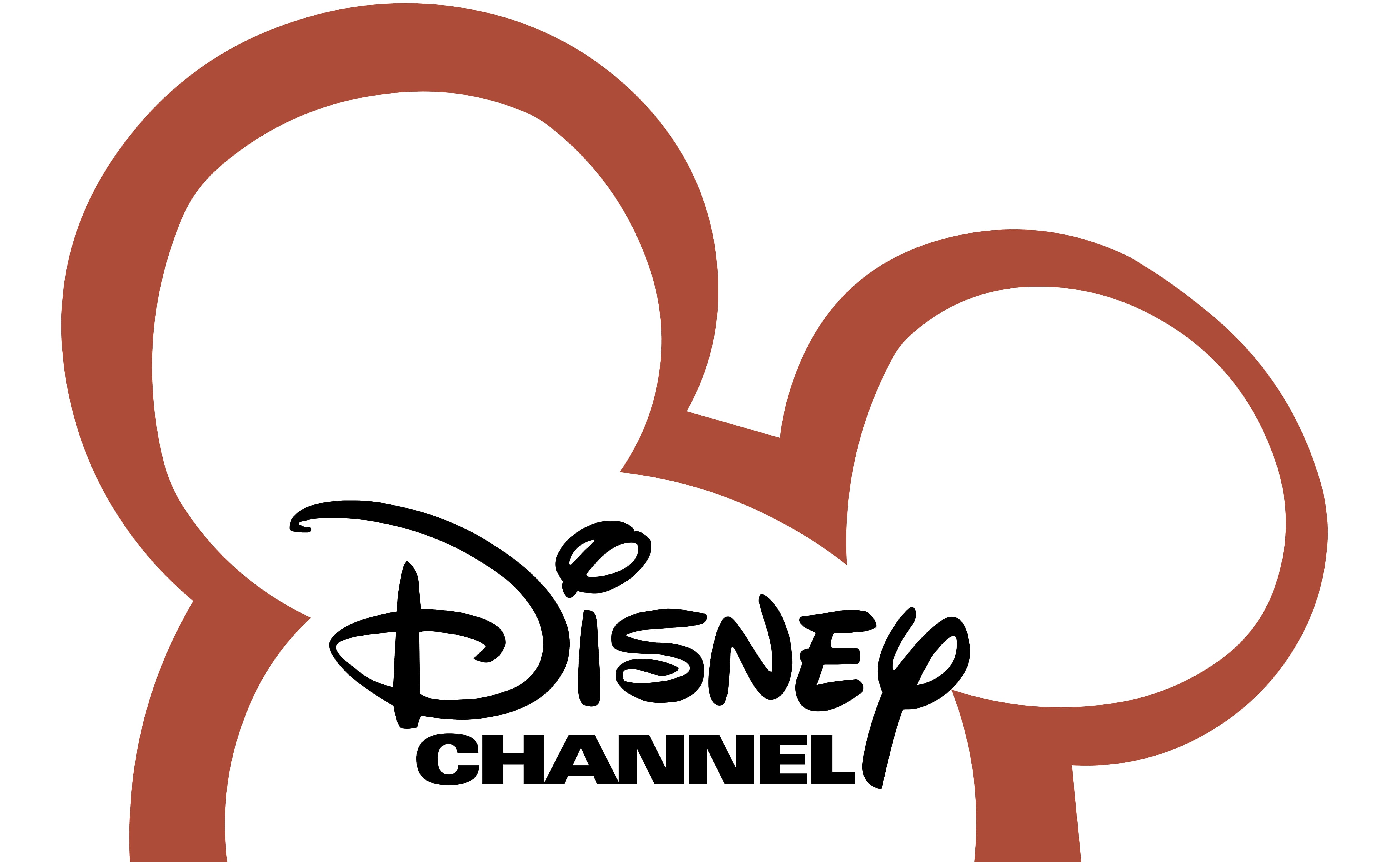
2019 – Today
![]()
In 2019 the channel got more shades of blue in its logo again. The contours were slightly modified and cleaned, and the sea-blue tone was added to the “Disney” part of the inscription, making it look more vivid and adding energy and friendliness to the whole image.
Font