

![]() Thomas & Friends Logo PNG
Thomas & Friends Logo PNG
Thomas & Friends is the name of an animated tv series, launched in the United Kingdom in the middle of the 1980s. One of the most popular educational series, today Thomas & Friends is loved by kids from all over the globe.
Meaning and history
![]()
Thomas & Friends has grown into a full-fledged franchise, since its launch in 1984 as a short animation series. Today there is a series of books, cartoons, toys, and even fashion items for kids, stylized with the logo of the funny steam train.
As for the series, its plot is built around the steam train, endowed with human qualities and individual character. Thomas the steam locomotive often gets into various troubles, but his faithful friends always come to his rescue.
The animation film was based on the series of books by two English writers, father, and son initially called The Railway Series. The first 26 stories about steam locomotives were written by the minister and railway enthusiast Wilbert Reeve Audrey from 1945 to 1972. In the same period, the company Pre-Cut Model Book Engine produced a series of books for modeling, which included four editions, dedicated to the main characters of the story. In 1967, the British manufacturer Meccano Ltd introduces the first play set with a clockwork steam locomotive.
In 1983, Wilbert Audrey’s son Christopher Audrey took up the baton. From under his pen come the next stories of The Railway Series. Just a few months after that the animated series was launched on British television.
What are Thomas & Friends?
Thomas & Friends is a famous British animated series, which tells a story of a stem train named Thomas, and his adventures. The first season of the series was released in 1984, and by today more than 580 episodes of the show have been aired.
In terms of visual identity, Thomas & Friends is pretty simple and conservative. The first several versions of the logo have been based on the original name of the animation, Thomas The Tank Engine & Friends, which was only changed in 1999. Although, in graphics and colors, the logo hasn’t changed much throughout the years.
1983 – 1990
![]()
The original Thomas & Friends logo, created in 1983, has stayed untouched for the first seven years. It was a three-leveled inscription in the narrowed uppercase of a geometric serif typeface, with the red characters outlined in black and placed against a white background. The lettering was enclosed into a cloud-shaped frame with black contours.
1990 – 1994
![]()
The redesign of 1990 slightly changed the shape of the contoured frame, and refined the silhouettes of the letters, making the red shade of the glyphs a bit more intense and bright. The badge started looking more stable and professional.
1994 – 2000
![]()
The badge was redesigned again in 1994, and again not much was changed. The red shade of the letters got more traditional and closer to scarlet-red, with more air added in between the glyphs, which made the logo look airy and friendly. The shape of the cloud was refined too, with the black contouring getting thinner and more delicate.
1999 – 2007
![]()
The name of the series was changed to Thomas & Friends in 1999, with the new logo designed in the same year. The inscription in the center of the badge became bolder and brighter, with the cloudy frame turning blue and getting thicker. The new logo was sharper and more stylish, due to an interesting typeface of the wordmark with elongated and pointed lines.
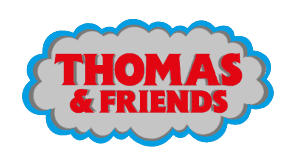
2008 – Today
![]()
The redesign of 2008 kept the shapes and contours of the previous badge, but added depth and volume to all elements, making the inscription three-dimensional and slightly glossy. As for the frame, it gained a new shade of blue, a bit darker and more eye-catching that the one on the badge from 1999.
Font and color
The bold and heavy uppercase lettering from the primary Thomas & Friends logo is set in a fancy serif typeface with thin and very short, yet sharp serifs, which add elegance and uniqueness to the bold main bars. The closest font to the one, used in this insignia, is, probably, Copperplate New Black Condensed, but with a slight modification of some contours.
As for the color palette of the Thomas & Friends visual identity, it is set in red and blue, with a plain white background, adding lightness and freshness to the badge. Red is here as a symbol of patroon and energy, while blue balances the brightness and adds a touch of tenderness and friendliness.


