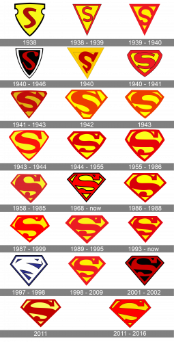
The Superman logo has been tweaked not less than 25 times throughout its 75-year history. However, the changes were mostly stylistic and did not affect the main visual metaphor. So, in spite of all the alterations, the emblem has basically always been what it is now: the letter “S” inside a shield.
Meaning and history
Most of the logo alterations took placed during the first years of its existence.
The story of Superman began long before 1938, when buddies Jerry Siegel and Joe Shuster, decided to create a new character who could turn the attitude to comics. They started creating comics at the age of 17 – for a local newspaper they came up with a little strip called Goober the Mighty. It was a kind of Tarzan parody, with Siegel in charge of the story and Shuster in charge of the artwork.
A year later, the friends opened their sci-fi magazine, Science Fiction, and in the third issue of The Reign of the Superman, the prototype of the character that is now known worldwide appeared in the story.
In the mid-1930s the friends made a second attempt – inspired by Norman Marsh’s Detective Dan comic strip, Siegel and Shuster wrote a new story about a new Superman.
The friends’ third attempt was more serious. The character became a positive hero, got a journalist alter ego, a brief backstory, and a recognizable costume, and debuted in Action Comics #1 in 1938.
Today, there is not a person who has never heard of a flying man in a red cape and blue suit, with a pentagonal shield emblem with the letter “S” in the center.
What is Superman?
Superman is the name of one of the world’s most famous superheroes. He was created by Joe Shuster and Jerry Siegel in 1938 and is considered to be the first ever comic superhero in history. Superman can fly and develop very high speed, he doesn’t need food, sleep, and even oxygen.
1938
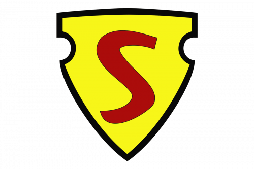
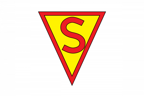
Although the first Superman serial was introduced in 1939, it would be fair to trace the history of the S-Shield earlier, to the 1938 Action Comics #1. Here, the Superman appears with a yellow shield, inside which a red “S” is placed. The shield has a bold black outline.
1938 – 1939
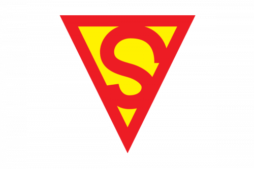
The logo was modified later that year. In fact, the shape now looked less like a shield, it was just an inverted triangle. The letter “S” grew bigger and plumper. Also, the proportions of the letter were changed: the upper part became larger.
1939 – 1940
The version of the logo that appeared in the first Superman film the following year featured the same inverted triangle, while the plump “S” was replaced by a leaner one.
March 1940 – 1946
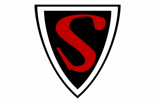
The Superman #4, which came on screen in 1940, had a logo with a completely different color scheme featuring black, red, and white. However, it existed for as little as two episodes and was replaced by the familiar combination of yellow and red.
September 1940
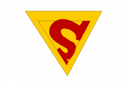
In September 1940 the yellow and red color palette was brought back to the Superman logo. It was almost the emblem from 1939, but with both the background and the framing in yellow, and the red “S” emboldened and redrawn in a massive geometric serif typeface. The triangular Superman shield started looking cool and bright again.
1940 – 1941
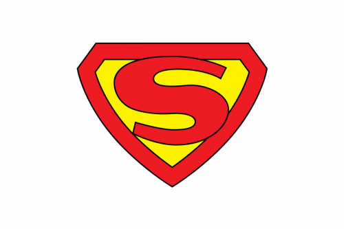
The diamond shield made its debut in 1940. It appeared in the 26th issue of Action Comics, looking very close to what it is now. The yellow shield, inside of which the “S” was placed, was surrounded by a red outline.
1941 – 1943
Since 1941, Superman’s chest logo has been modified more than 15 times. Most modifications, however, were hardly visible and included nothing more than slightly altered proportions or shades.
1942
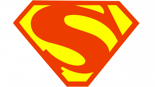
Basically, they took the same design and made the color palette much paler, and that’s it.
1943 – 1944
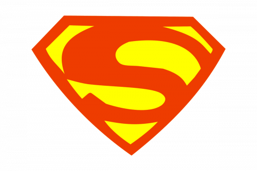
The redesign of 1943 introduced another badge, which has been in use for several months. It was executed in lighter shades of yellow and red, and the contours of the “S” were refined and emboldened. The crest itself was horizontally extended and the red framing became more massive and distinct.
1944
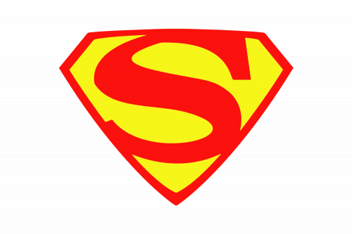
A bit later in the same year, the badge was refined again. Keeping the fresh color palette, it became more elegant due to the thinner lines and shapes of all the shield elements. The “S” became lighter, so more yellow was used for the emblem, hence the badge looked more eye-catching and energetic.
1944 – 1955
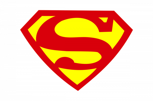
The colors of the Superman emblem have been refreshed again at the end of 1944. The shades became smoother, while the contours of the letter and the framing, on the contrary, got square and bold. It was the same style, yet the logo looked more confident and professional.
1955 – 1986
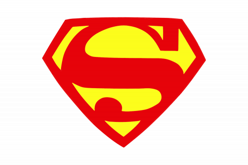
The contours of the “S” got modernized again in 1955. The signifier now started looking super modern and fancy with an elegantly curved and emboldened tail and a sharp rectangular serif on the upper part. As for the red frame, it featured medium thickness, so the “S” got more distinctive.
1958 – 1985
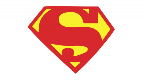
It’s another example of designers taking the existing logo (the previous one) and just bleaching it.
1968 – Today
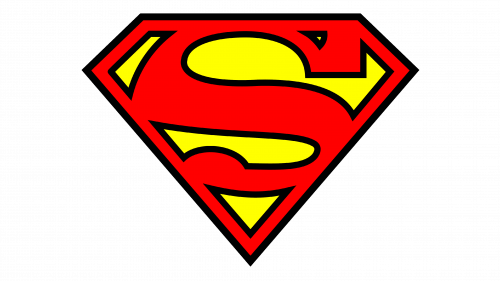
The black outline appeared on the Superman emblem in 1968, and this is the badge we can all see today. Probably, it is the most famous insignia of all, composed of calm yet bright red letter “S” with geometric serif on top and rounded tail on the bottom, and red frame, and the intense yellow background of a pentagonal Diamond-like crest.
1986 – 1993
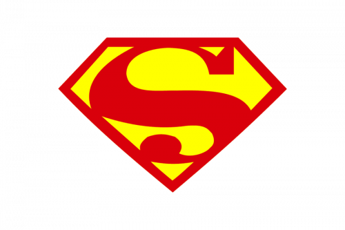
For the logo used from 1986 to 1993, the black outline was removed and the color palette got back to the version from the 1960s. It was pretty much the same shield, but with the lines refined and cleaned. The tail was shorted yet bolder than on all the previous badges.
1987 – 1999
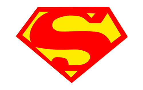
Compared to the previous emblem, they introduced some minor changed in regards to how the letter is positioned. Other than that, and also a slightly brighter color palette, not much changed.
1989 – 1995
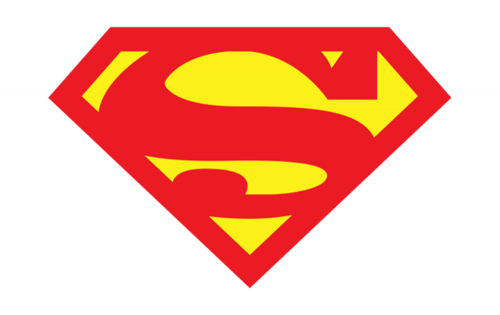
In 1989, they made the emblem pale again, but also squeezed this one and made it wider.
1993 – now
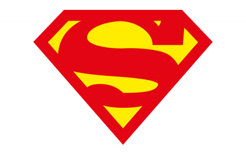
Once more, some minor changes were introduced into the letter ‘S’ here, but the main change happened to coloring – which became brighter once more.
1997 – 1998
The following version, which appeared in The Electric Blue movie (1997) made a step forward in terms of legibility. However, the letter “S” was still hardly discernible for anyone who was not in the know. It also featured a completely new color combination (blue and white).
The changes in the color scheme, as well as the shape of the emblem, were connected with the new Superman costumes and powers. However, they made the icon less recognizable, which was certainly a drawback. Probably that was one of the reasons why The Animated Series, which appeared in 2000, returned to the traditional, instantly identifiable yellow-and-red shield.
1998 – 2009
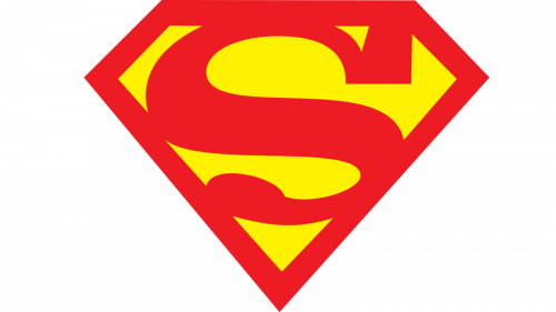
The 1998 logo isn’t much different from the pre-electric design, except it’s once again paler by comparison and slightly different in terms of letter positioning.
2001 – 2002
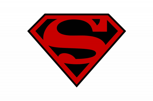
The dramatic black and red color palette from 1996 came back to the Superman logo in 2001. This time it was an iconic crest with all the elements featuring the classic shapes and style, the pentagonal framing, and the bold serif “S” in red, placed on a plain black background of the emblem.
2011
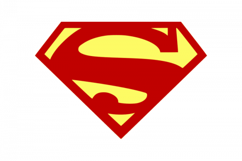
The redesign of 2011 made the contours of the Superman badge cleaner and sharper, and its color palette — brighter and more delightful. The background of the triangular crest gained a very light, almost cream, yellow shade, while the iconic “S” and the framing were still set in dark red, close to burgundy.
2011 – 2016
The redesign of 2011 made the contours of the Superman badge cleaner and sharper, and its color palette — brighter and more delightful. The background of the triangular crest gained a very light, almost cream, yellow shade, while the iconic “S” and the framing were still set in dark red, close to burgundy.
The size
The proportions of the shield and the letter, as well as the overall size of the logo, were changed quite a few times. Probably one of the largest (if not the largest) version can be seen on the Dean Cain costume in The New Adventures of Superman. One of the smallest emblems can be seen in the Superman Returns movie, which came on screen in 2006.
Batman vs Superman logo
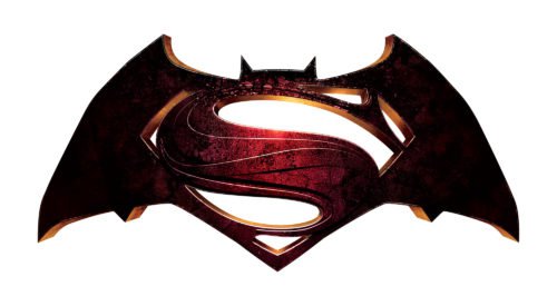
The Batman vs Superman: Dawn of Justice film released in 2016 features an interesting tweak of the original logo. Here, we can see the emblems of the two superheroes placed one over the other. The black bat symbol becomes the background, against which the “S” character appears. The logo was unveiled two years before the movie came on screen, in 2014.
What does the letter “S” stand for Batman?
The meaning of the “S” seems simple: it is just the initial of the main hero’s name. However, there are additional meanings. For instance, Jor-El wore the letter as a family crest. Also, there is a legend that it is a modified Native American symbol representing a snake and symbolizing healing powers. One more story says that the Superman emblem is actually the Kryptonian symbol for “hope”. Other explanations claim that the letter stands for slogans like “Stopping Crimes” or “Saving Lives”.
Font
The letter “S” in the Superman logo does not feature any of the existing typefaces. It was created by designers with the only purpose of being used in the Superman chest shield. The shape of the letter has gone through numerous amendments. The earliest version, which was unveiled in 1938, reads very cleanly, yet it does not look unique. That was why the designers went on experimenting with the character until they created the shape that appeared in The Adventures of Superman film in 1952. In most of the films that followed they just enhanced the design with the help of slight modifications.
Color
The iconic combination of yellow and red is featured in most versions of the Superman logo. However, they are not always the same shades: in some versions the colors go brighter and acquire an almost electrical quality, while in other versions they look less energetic.
From the point of view of Superman’s legend, red reminds the red sun of the Krypton, where the hero comes from, while yellow is the color of Sol (the sun). So, the combination of red and yellow means that Superman has a connection to his native planet, yet his powers are activated by the yellow sun of our planet.
Is the Superman logo a diamond?
The Superman logo was first introduced in 1938 and was executed in a shape of a shield, which has gained a more geometric form throughout the years, turning into a pentagon, resembling a Diamond.
Can I use the Superman logo?
The Superman logo is a registered trademark, so just like in the case with all other copyrighted emblems, you need to request permission from the owners of the trademark to use the official Superman badge for your purposes.


