

![]() Billie Eilish Logo PNG
Billie Eilish Logo PNG
Billie Eilish is a famous American pop-singer, who was born in Los Angeles in 2001. The songwriter became famous all over the globe after the release of her debut album in 2017, but the first Billie Eilish song was introduced online in 2015 and made the world’s largest recording labels pay attention to the rising pop star.
Meaning and history
![]()
The visual identity of the American singer is composed of two independent parts — the graphical logo, which was introduced in 2016,l and stays unchanged, and the wordmark, which is being redesigned with the release of every new album of Billie Eilish.
2016 – Today
![]()
The most famous emblem was created by Billie Eilish in 2016 and is known as Blohsh. It is a gender-neutral stick-figure of a human, which is slightly slanted and has its abstract head moved to the left, on the diagonal shoulder line. The Blohsh is usually drawn in yellow or acid-green colors, which represent the rebellious spirit of the singer and her strong energy.
2016 – 2018
![]()
In the same 2016, a text-based logo was created for Billie Eilish. It was a bold and strict logotype in a sans-serif typeface, with both parts of the singer’s name placed close to each other. The black inscription had no ornaments or hidden details, it was just clean and powerful.
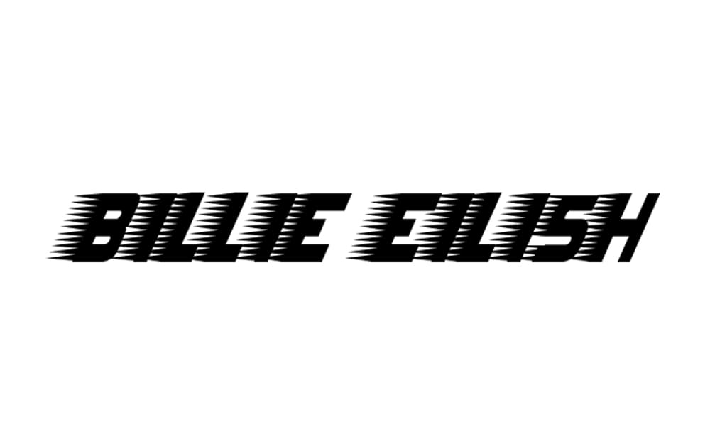
2018 – 2019
![]()
The redesign of 2018 introduced a new style of the logotype, making it more geometric and voluminous. The new inscription in black and white was placed on a black rectangle, looking a bit aggressive and rebellious. The two-colored letters were italicized and outlined in black and white, which added elegance and style to the massive shapes.
2019 – 2021
![]()
The monochrome color palette was kept after the logo redesign of 2019, but the white of the lettering gained a light gray shade, which softened the contrast between the logotype and its black background. The new style of the wordmark looked like handwriting, with its uneven capitals in thick rounded lines. The first letters in “Billie” are significantly bigger than all the others which usually happens when someone writes on plain paper — the signs get smaller and smaller as the line goes to the right.
2021 – Today
![]()
In 2021, Billie reimagined her style and image. Her long-time acidic appearance changed to mostly blonde and yellow colors, while her clothing also became more elegant and soft. That also reflected on her logo. The singer’s name turned into a collection of cursive, hand-written letters of the color gold.
2022 – 2023
![]()
With the elegance of a handwritten note from centuries past, the second design gracefully spells out “Billie Eilish” in sweeping cursive strokes. The typeface is reminiscent of vintage handwritten letters, with its free-flowing form and decorative capitals, suggesting a sense of artistry and sophistication. The white-on-black color scheme amplifies the logo’s allure, echoing sentiments of nostalgia while staying rooted in modern appeal.
2023
![]()
Evoking strength and clarity, the third logo portrays “Billie Eilish” in a commanding font that is both contemporary and reminiscent of historic inscriptions. The characters, with their bold stance and meticulous detailing, resonate with a sense of purpose and intention. The stark contrast between the black typography and white backdrop emphasizes its profound simplicity, embodying Billie’s knack for profound yet straightforward musical narratives.
2023
![]()
Set against a stark backdrop, the presented logo exhibits a delightful fusion of retro whimsy and contemporary flair. At first glance, “Billie Eilish” stands out in a pronounced, bubblegum pink hue, an unexpected yet invigorating color choice that speaks to the artist’s penchant for breaking norms and embracing individuality.
The typography of the logo is where the magic truly happens. Each letter is crafted with meticulous care, blending voluptuous curves with structured linear elements. The first “B” and the “E” in “Eilish” are adorned with exaggerated swirls, reminiscent of 60s pop culture designs. Such flourishes add a touch of playful exuberance to the design. On the other hand, the straight-edged, almost architectural construct of some letters, such as the ‘I’ and ‘H’, infuses a modern sensibility, creating an intriguing juxtaposition.
Overall, the logo is an emblematic representation of Billie’s musical journey – an ode to the past while being firmly rooted in the present. It encapsulates the duality of her artistry: the nostalgia of bygone eras combined with the progressive spirit of today’s pop music. Through its color and design, the logo resonates with a sense of vibrant youthfulness and timeless elegance, making it instantly recognizable and deeply evocative of the artist it represents.
2023 – Today
![]()
Drawing upon elements from medieval typefaces, the initial logo presents “Billie Eilish” in an unmistakably gothic typography. Each character in the design seems to tell a story, with sharp angularities and elongated forms reminiscent of cathedral architecture. The dramatic use of bold black against a pristine white background gives the logo a hauntingly ethereal quality, capturing the essence of enigma and depth often found in Billie’s music.
Font and color
The current Billie Eilish logotype is handwritten, though it looks pretty close to such available fonts as ReadMyHand Pro and Basquiat Irregular Wide, with their smooth uneven contours, drawn in double lines.
As for the previous logotypes, they were executed in more traditional fonts: the capitals of the first wordmark were set in Neue Helvetica family font, while the second one used a sans-serif, which was similar to LHF Convects Full type.
The monochrome color palette of the Billie Eilish text-based logos is a reflection of the special style and temper of the pop-star, while her bright Blohsh emblem represents another side of the coin — energy, dynamics, and delight.


