

![]() Ghostbusters Logo PNG
Ghostbusters Logo PNG
Ghostbusters is the name of a famous American franchise, which was introduced in 1984 by Dan Aykroyd and Harold Ramis. The plot of the series and comics is based on a story of a team of scientists, fighting ghosts in the homes of New York citizens. After the release of the first movie, Ghostbusters became incredibly popu-lar all over the globe. The sequel was introduced in 2016.
Meaning and history
![]()
The visual identity of the famous franchise is still based on the image, created for Ghostbusters in the middle of the 1980s. Though with each new release — whether it’s a movie, a sequel, or an animation, the logo gets a little stylized to suit the new surroundings and backgrounds.
What is Ghostbusters?
Ghostbusters is the name of a popular media franchise, which was introduced in the United States in the middle of the 1980s. The franchisees created by Dan Aykroyd and Harold Ramos follow the plot of a group of people, who fight the ghost all over New York City.
1984 – Today
![]()
The Ghostbusters logo is composed of a drawing with a fun playful ghost coming out from the red circle of a Prohibition road sign. The image is usually placed direct-ly on a black or any other dark background, but sometimes is put into a logotype, replacing the letter “O”. In this case, the lettering is executed in a bold classic type-face with thick lines can and uses black color for its letters. The white ghost gets a thin black outline to be more visible on a white background.
![]()
2021 – Today
![]()
The redesign of 2021 has refined the iconic Ghostbusters badge from the 1980s, with a lot of respect for all the original elements. The new logo features a more stable and full-shapes serif font, with the shade of the emblem, replacing the letter “O”, becoming deeper and darker. These slight refinements made the badge look more modern and confident.
Font and Color
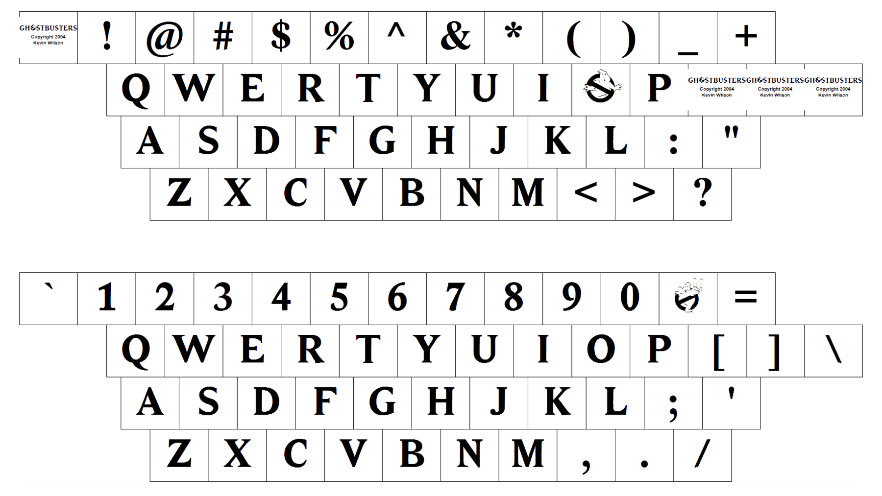 The voluminous uppercase lettering from the primary Ghostbusters badge is set in a heavy modern sans-serif typeface with slightly flared ends of the bars. The closest fonts to the one, used in this insignia, are, probably, NS Mudolf Sans, or Antique Olive Discaps Medium, but with the co-tours of the characters slightly modified and the letters shadowed.
As for the color palette of the Ghostbusters’ visual identity, it perfectly reflects the plot and the essence of the franchise, with the white to gray gradients, standing for the ghosts, and red in the prohibition sign, for danger and power. The thin black contours of the elements make the Ghostbusters logo visible on any background, the same does the delicate black shadow of the uppercase letters.


