

![]() Mississippi Braves Logo PNG
Mississippi Braves Logo PNG
The logo of the Mississippi Braves is heavily based on that of their parent club, the Atlanta Braves. And yet, the emblem of minor league team possesses a unique identity.
![]()
Meaning and history
![]()
The M-Braves started playing in 1984 as the Greenville Braves. In 2005, they relocated to Pearl, Mississippi (a suburb of Jackson) and adopted their current name and logo. Today, they compete in the Southern League.
Primary symbol
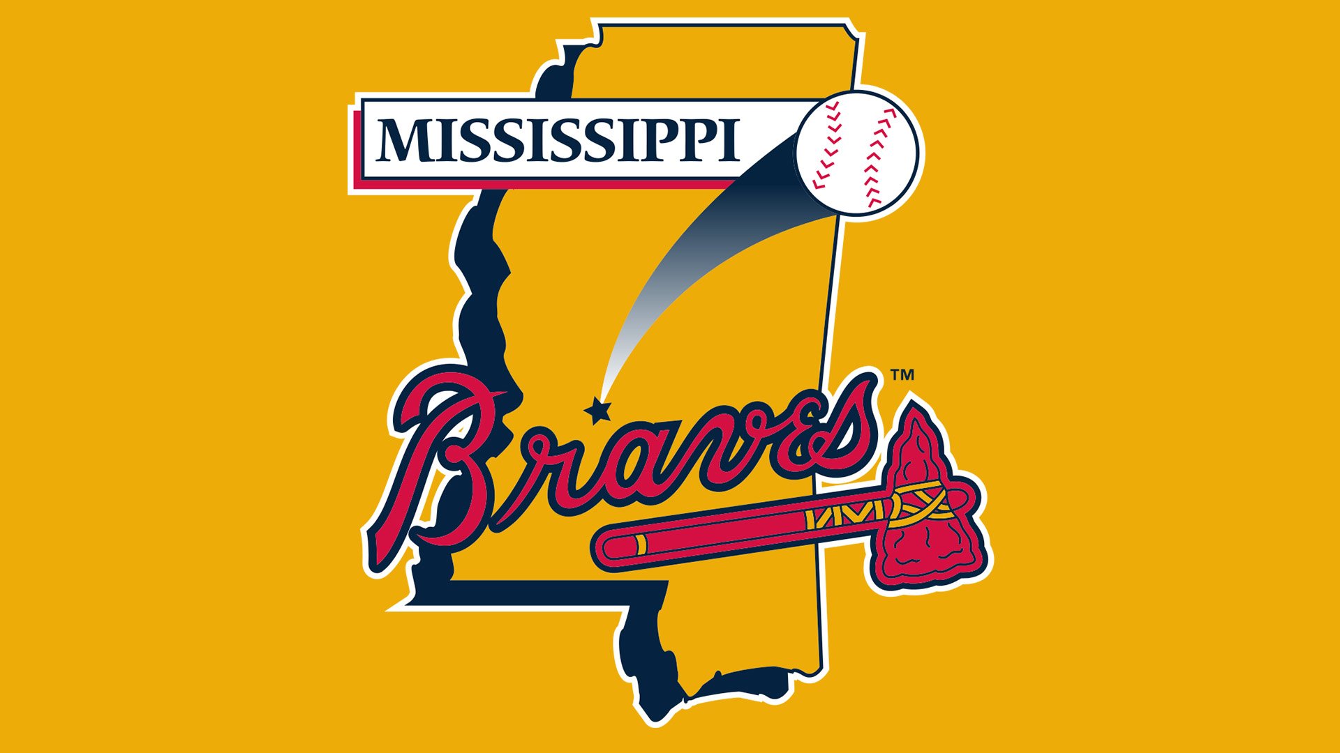
The Mississippi Braves logo uses the same visual core as the emblem of the Atlanta Braves. Similar to the parent team’s emblem, there’s a red tomahawk with gold and dark blue elements and a scripted word “Braves” above. In case of minor league team, the design is placed over the outline of the state of Mississippi. We can also see a star pointing at the club’s hometown on the map and a white baseball.
Alternative emblems
The same red tomahawk appears on the cap logos. Here, it can be seen together with a large letter “M” in white. There’s also a wordmark insignia, where only the tomahawk and the scripted “Braves” are used.
Colors
![]()
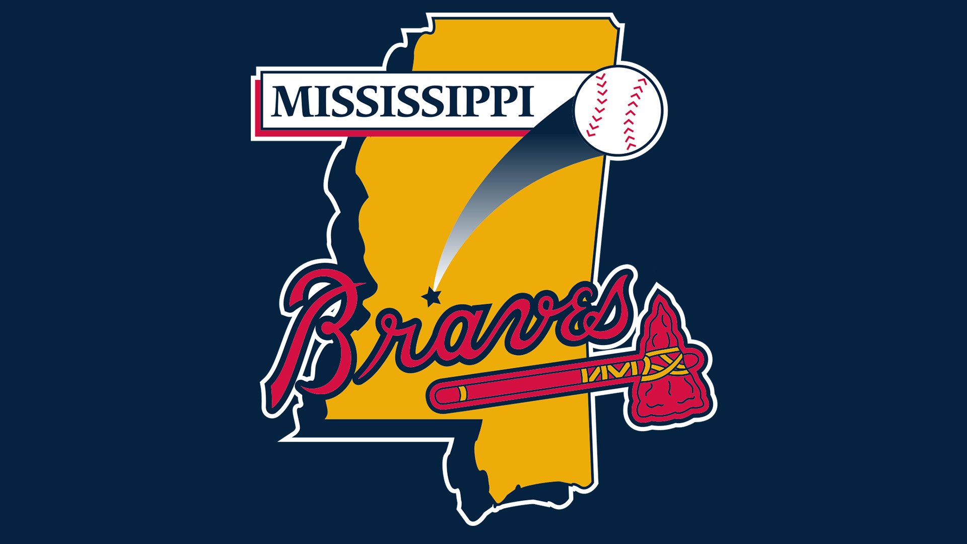
While borrowing navy blue, scarlet red, gold, and white from the parent team’s emblem, the Mississippi Braves logo also adds black and several lighter shades of blue.


