

![]() Metallica Logo PNG
Metallica Logo PNG
In 1981 Lars Ulrich, a drummer, placed an ad in a Los Angeles newspaper, claiming that he’s looking for musicians to form a band that would compete with such legends as Diamond Head and Iron Maiden. The ad worked. That was how Lars Ulrich met James Hetfield and how the story of one of the most successful modern bands started.
Meaning and history
![]()
Though the famous music band has had four different logos throughout its history, it has always been associated with the first version, which was slightly modified in 2008 and became the main logotype again. The monochrome color palette was sometimes switched to red and black, as a representation of passion for music and the band’s energy, or accompanied by electric blue flashlights, representing the nature and character of the music icon.
What is Metallica?
Metallica is the legendary American heavy metal band, which was formed in 1981. By today the band, consisting of James Hetfield, Lars Ulrich, Kirk Hammett, and Robert Trujillo, has released ten studio albums and several tracks, which are not only known all over the globe but have their places on the top lines of the rock music history.
1983 — 1996
![]()
The famous wordmark with elongated and sharpened lines of first and last letters was designed by the band’s guitarist, James Hetfield. The inscription was first introduced in the cover of the “Kill ‘Em All” album and stayed with the band for more than ten years, is a great symbol of their style and approach to music.
As for other letters of the nameplate, they were all capitalized and executed in an ExtraBold sans-serif typeface with traditional strict lines, except for letter “A”, which had its left bar inclined, so the right part of the “T” bar was cut diagonally, harmonizing the sharp flashlights of “M” and the last “A”.
1996 — 2003
![]()
The logo was redesigned in 1996 with the idea to make it more minimalist and modern. The flashlights were removed, and the inscription became stricter and simpler. It was now executed in a condensed sans-serif typeface, which is very similar to Plain Nouveau JNL, but with two elements, which made the nameplate unique.
The tails of “M” and the last “A” were slightly elongated, resembling the previous version, and adding individuality and sharpness to the band’s visual identity.
It was a very modern and stylish logo design, which brilliantly represented the character of the band and their progressive approach, yet also showed how the group values its roots and traditions.
2003 — 2008
![]()
The Metallica logo version from 2003 is the most ornate of all the designs, ever created for the band. The bold black inscription in sans-serif had a white raw outline with an uneven black shadow, resembling a flame. The first and the last letters of the inscription had their Nara elongated again, and they created the kind of a sharp framing for the nameplate, adding a sense of strength, courage and reflecting the unique style of the music-band.
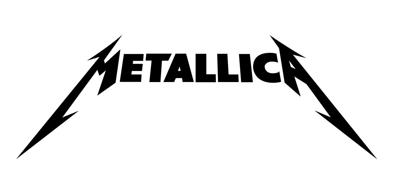
2008 — Today
![]()
In 2008 the band decides to come back to the original version of the logo, created by James Hetfield. The nameplate is being refined and modified by the Turner Duckworth design bureau.
The Metallica logo we all know today is a bold black inscription in all capital letters with the elongated and spread to both sides vertical lines of “M” and “A”. Symbolizing flashlights and reflecting the character of the iconic band, their lines make the simple logo instantly recognizable across the world.
The sharp Metallica logo became synonymous with rock music and is one of the most remarkable examples of the metal bands’ visual identity design in history.
Death Magnetic symbol
Prior to the release of the Death Magnetic album (2008) the Metallica logo was given a facelift. For this job, the band commissioned Turner Duckworth, a London and San Francisco-based design agency known for its collaboration with Coca-Cola and Amazon. The new emblem lookes very similar to the original one, and yet, if you take a closer look, you may notice a couple of differences.
Who created the emblem?
Many sources mention James Hetfield, Metallica’s co-founder, the band’s lead vocalist, rhythm guitarist, and main songwriter, as the author of its logo. In addition to the classic emblem, he is also considered the author of the more recent ones, as well as the ninja star and the scary guy logos. However, some sources point out that Hetfield actually was responsible for the very concept of the emblems, while all the rest was left for professional designers.
Font
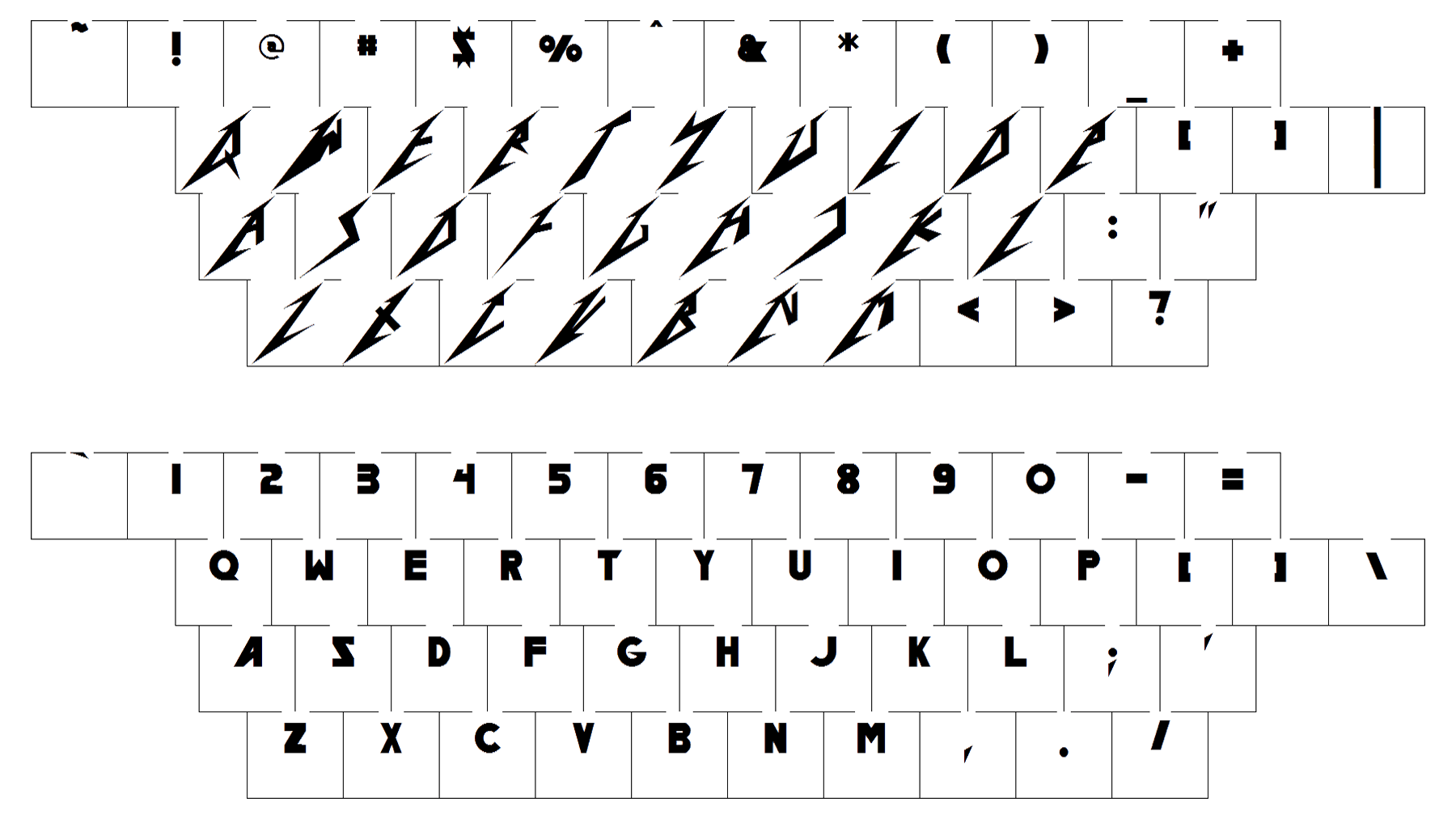
The classic Metallica logo features a customized sans-serif font. Every character is somewhat unusual, yet the most characteristic letters are the first and the last ones. Their shape resembles lightings. In this way, designers emphasized the wild emotions that Metallica’s music radiates. The “T” character also doesn’t look like an average “T” in a book, as the right part of the horizontal bar is longer than the left one. The type is called “Pastor of Muppets”, its author is Ray Larabie.
Color
![]()
Taking into consideration the type of the music Metallica plays, black seems an absolutely natural color choice. In many cases the logo is enhanced by silver and maroon nuances.


