Avicii is the stage name of Tim Bergling, a late Swedish DJ, musician, and songwriter. The interplay of the triangle-based “A” and “V” always stayed the focal point of the Avicii logo. However, the way the logo looked was modified more than once.
Meaning and history
Tim Bergling, known by his stage name Avicii, was born September 8, 1989, in Stockholm.
Bergling’s musical career began with a remix of a theme from the video game Lazy Jones. A little later he recorded his own track Lazy Lace, which was released by Strike Recordings. Who later became known under the stage name Avicii/Avicii, the DJ also used the pseudonyms Tim Berg and Tom Hangs as well as Jovicii and Ashwin in his early days. In April 2008, after winning the Pete Tong Award on his own Fast Trax program, Avicii released the track Manman on his label, followed by contracts with At Night Management and Vicious Grooves. Avicii rose to fame in 2010 with singles My Feelings for You, Seek Bromance, Blessed and Levels.
Avicii made his first big tour in 2010. The DJ successfully played on American and European dancefloors, often performing in tandem with GJ Tiesto.
In 2016, the artist announced that he was discontinuing live performances and travel, but promised to continue making music. On August 10, 2017, Avicii interrupted his sabbatical and released the mini-album AVĪCI (01), consisting of six tracks.
On April 20, 2018, the artist’s spokeswoman reported that he was found dead in the Omani city of Muscat.
Who is Avicii?
Avicii is the pseudonym of the young Swedish DJ Tim Berling, who committed suicide in 2018. During his short career he wrote a huge number of world hits with various musicians. Avicii published his first tracks on the Internet, where he also found his first wave of popularity.
2008
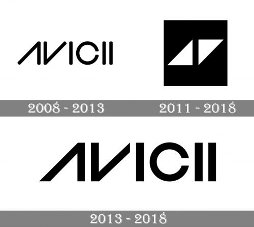
Bergling was born in 1989 and started making music at the age of 16. Following several songs posted on electronic music forums, he released “Seek Bromance” in 2010, which made him truly popular – the song reached the top 20 in quite a few countries. By this moment, he was already performing using a logo that looked very much like the latest one.
This logo featured the word “Avicii” in an all-caps sans serif type. Its most notable feature was that the first two letters, the “A” and “V,” looked the same, except the rotation. It was possible because the authors of the image dropped the middle bar in the “A.”
Moreover, in a way, these letters reminded the “play” button, which added some meaning by creating a link with music.
Another visual effect that made the design unique and appealing was the rhythm created by the repeating “I’s.” In fact, these letters also looked like part of the board of any device used for playing music.
According to Bergling, his name meant “the lowest level of Buddhist hell.” Yet, we can suppose that not only the meaning but also the way the name looked played an important part in his choice.
2011
This is when Bergling’s best-known emblem was introduced. On the one hand, it was a purely graphic logo. There were two white isosceles triangles on the black background. The triangles were identical but positioned in a different way, which made them look like two parts of a parallelepiped separated by a gap.
In addition to the sleek and stylish look, the emblem had a meaning, which was easily deciphered by anyone familiar with the name of the musician. The two triangles symbolized the first two letters of his moniker and also represented the “play” button (or other buttons used for moving through a piece of music).
While this emblem was sometimes used on its own, it was also often paired with the lettering “Avicii.” The lettering was added to explain the logo to those who were not familiar with the musician.
2013
The original Avicii logo had quite soft corners, which did not fit the sharp triangular emblem. So, the musician opted for a wordmark with more dramatic ends, which better merged with the “AV” emblem.
Font and Color
The stylish minimalistic lettering from the last official logo of Avicenna is set in a modern geometric sans-serif typeface with the horizontal bar of the “A” removed, and its contour slanted to the right. The closest fonts to the one, used in this insignia, are, probably, Incompleta Regular or Italic, or Widy Regular Italic, with some significant modifications of the characters’ contours.
As for the color palette of the Avicii visual identity, it is set in monochrome, with plain black as the only shade. In this palette the cool modern badge looks even more distinctive and strong.


