

![]() Pink Floyd Logo PNG
Pink Floyd Logo PNG
Pink Floyd had a string of logos, as the band refreshed its visual identity every time a new album was released. Each emblem expresses the band’s unique DNA in its own way.
Meaning and history
![]()
Pink Floyd is a legend of contemporary music history and its logo is as iconic as the compositions of the band, known all over the world. And each of the three versions of the logo, created for Pink Floyd throughout the years can be called a piece of art.
1967
![]()
The Pink Floyd logo, which was designed in 1967, looked simple yet bold and bright. It was handwritten lettering in light yellow color, with a black outline, placed on a colorful background (it could be any, actually). All of the letters in the logotype were written in the uppercase, except for the “I”, which was set in the lowercase and had its dot as the main attention catcher of the composition.
1973
![]()
The original Pink Floyd emblem, created by Storm Thorgerson in 1973, was composed of a white triangular outline placed on a black background, a rainbow coming into it from the right, and a thin white line on the left. It was a graphical representation of the ray of light, entering the glass prism. This emblem is one of the most popular music badges of all time, which is not only beautifully designed and executed but also represents the Pink Floyd live concerts and their work with lightning.
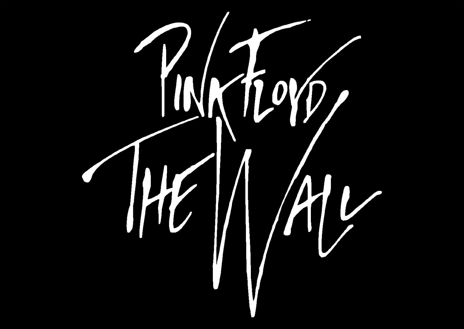
1979
![]()
Another emblem was created for the band in 1979, and this time it was a minimalist monochrome badge with a handwritten nameplate in white, placed on a black background. The lettering on the emblem featured thin elongated lines and “jumping” positioning of the symbols relative to the horizontal line. The simplicity of the color scheme and lack of details was compensated by unique contours and lines of the logotype, which looked modern and elegant.
1985 — Today
![]()
An abstract stylized badge was introduced by Pink Floyd in 1985. It was a rounded emblem in monochrome, depicting a unique monogram with the letter “F” turned upside-down. Two letters made up a boat-like image with their la leek distinct lines, which gave this badge a “Boatman” nickname.
![]()
Author of symbol
 Storm Elvin Thorgerson, who created the album cover for the album “The Dark Side of the Moon,” was a UK graphic designer specializing in music album covers. Also, he was known as a music video director. Apart from the Pink Floyd symbol for “The Dark Side of the Moon,” he created the cover for its follow-up, “Wish You Were Here.”
The Division Bell symbol

Shortly before the release of the Division Bell album, a very interesting logo was created. The symbol nicknamed Boatman can be interpreted as a large “P” and an “F” turned upside down. However, there is also a symbolic meaning: the emblem is supposed to represent a man rowing a canoe.
The Dark Side of the Moon emblem
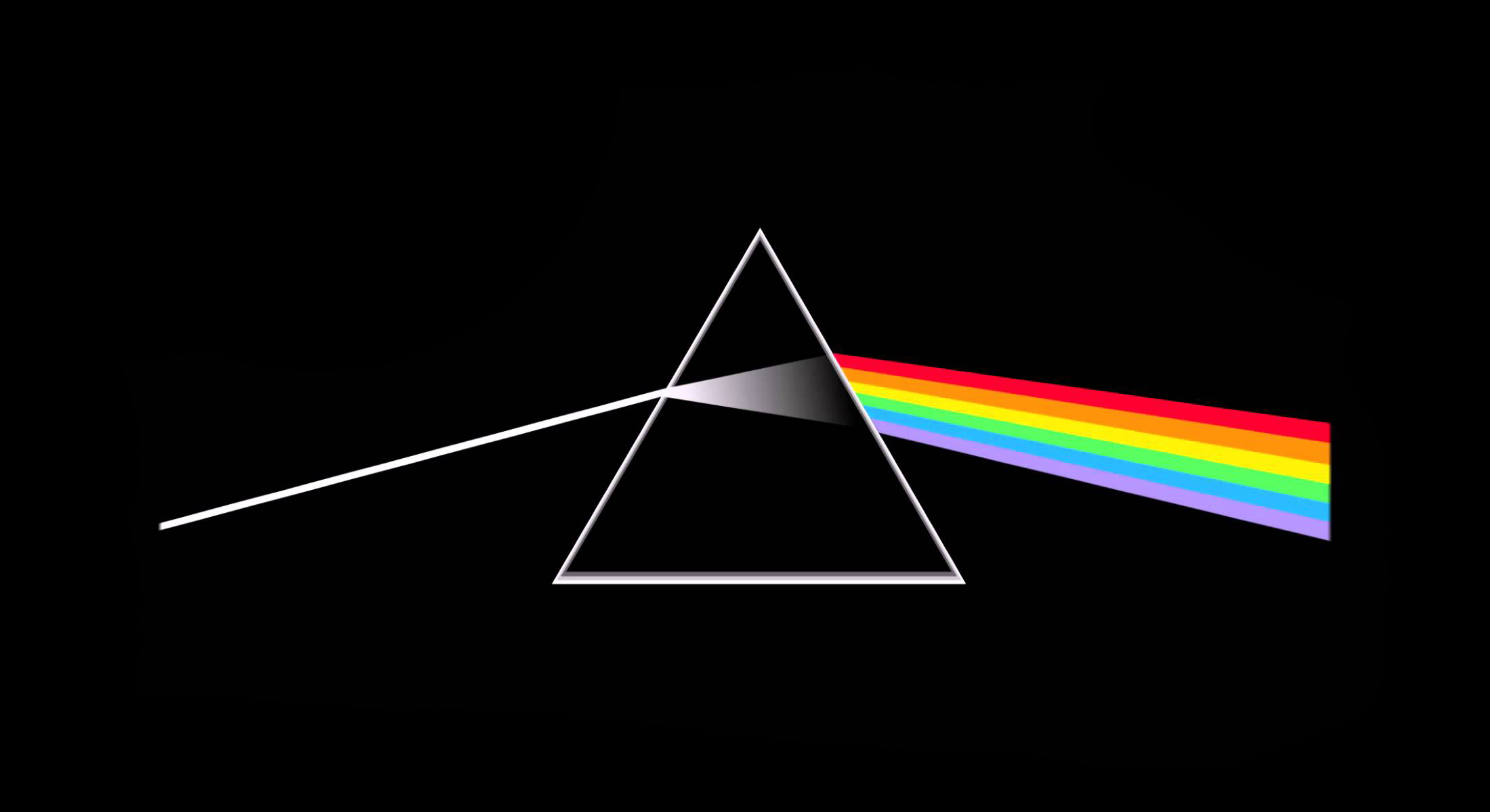
The image depicted light passing through a prism. Storm Thorgerson, who designed this Pink Floyd logo, pointed out that he wanted to create a link with Pink Floyd’s live shows, well-known for their lighting, and also to include such ideas as ambition and madness, which were characteristic to Roger Waters’s lyrics.
Font

There are not less than three versions of the Pink Floyd insignia, each having a unique custom typeface.
Color
![]()
Colors most often used in the Pink Floyd logo include black, white, and pink.


