Kaiyi is a Chinese brand owned by a company with rich experience in the automotive industry. The production of Kaiyi cars is carried out in modern factories equipped with the latest technology and following high-quality standards. The Kaiyi manufacturing company brings together a team of highly skilled professionals who work on every aspect of production, from design and engineering to assembly and quality control. This allows them to achieve outstanding results and confidently make a name for themselves on the world stage.
Meaning and history
Kaiyi Automobile was founded in January 2014 as a subsidiary brand of Chery, which produces affordable modern cars. The company’s first SUV was the X3 in 2016, followed by the Kaiyi E5 mid-size C-Class sedan in 2020. The company’s production facilities are located in Yibin, China.
In China, this brand has always been known under the name 凯翼 (Kai Yi), but the international name is not so simple. For a long time, the name Cowin was in use. But after the brand relaunch in 2020, it was changed to Kaiyi. In fact, marketers simply retained the Chinese name, transliterating it.
Kaiyi was established in 2014 as a joint project between Chery and two state-owned investment funds. In 2017, the investment funds withdrew from the joint project and Chery decided to restructure. The company moved to Yibin City, Sichuan Province. In 2019, they built the Kaiyi production center, and the brand rebranded in 2022.
Based on advanced technology and innovative solutions, Kaiui is committed to providing customers with affordable and quality vehicles. Sleek design, high build quality, and application of advanced technologies make Kaiui cars attractive to many customers. The company actively researches and implements new developments in the field of automobile production, which allows it to produce modern and reliable cars at attractive prices.
What is Kaiyi?
Kaiyi is the name of an independent Chinese auto brand founded in 2014. Chery HQ owns 49% of Kaiyi, but the remaining 51% is held by the Yibin provincial government and Wuliangye Group, one of China’s largest beverage producers.
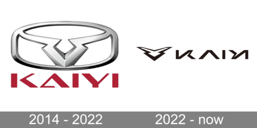
In terms of visual identity, Kaiyi is very sharp and brutal. And even though the rebranding of the company was quite radical, the new logo still keeps the spirit of the Cowin visual identity, reinterpreting it more progressively.
2014 – 2022
The Cowin logo, used by the company for the first eight years of its existence, was composed of a three-dimensional emblem and a red lettering, placed on a plain black background. The emblem of the brand featured an abstract geometric figure, resembling a Taurus head, inscribed into a rounded rectangular frame. As for the wordmark, it was set in the uppercase of a modern sans-serif typeface. The square characters of the inscription had small distinctive features, such as pointed ends of some bars.
2022 – Today
After the global rebranding, the new Kaiyi logo was introduced in 2022. The Cowin emblem got sharper and is now placed on a plain white background with no additional framing. The geometric symbol has now its contour closed, which makes it look more complete and thought-out. As for the lettering, its typeface was completely changed, and the color switched from red to black. The new font looks super futuristic and sleek.
Font and color
The stylish designer lettering from the Kaiyi primary logo is set in the uppercase of a geometric sans-serif typeface with custom elements in “Y” and both “I”s, and a removed horizontal bar of the “A”. The closest basic font to the one, used in this insignia, is, probably, Bank Gothic Medium, but with many significant modifications.
As for the color palette of the Kaiyi visual identity, it is based on the combination of glossy silver and black elements, set on a solid white background. This scheme works as a sign of excellence, professionalism, and confidence, the qualities Kaiyi tends to transmit into all their vehicles.


