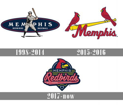
Since 1998, when the Memphis Redbirds joined the Pacific Coast League, they have had at least three logos. Two of them create a distinctive visual link with the St. Louis Cardinals, which seems perfectly natural as the Redbirds are the Cardinal’s Triple-A affiliate.
Meaning and history
The Memphis Redbirds baseball club was established in 1998 in Tennessee and has never changed its name, since it has always been the farm team of the St. Louis Cardinals. This stability in partnership worked well for the Redbirds, as they showed themselves very confident in the leagues they played in.
For the first 22 years of the Redbirds’ history, they were members of the Pacific Coast League, where the team managed to win the league championship four times. In the professional portfolio of Memphis Redbirds, there is also one Class Title and five Conference ones.
In 2021 the Minor League Baseball team was invited to join the International League, however, they have kept their constant affiliation with the St. Louis Cardinals.
1998 — 2014
 The Memphis Redbirds logo unveiled in 1998 depicts a baseball player holding a bat in his hand and ready to strike a blow. The text “Memphis Redbirds Baseball” in white is placed inside a dark blue ellipse at the background.
2015 — 2016
 The 2015 logo copied the style of the St. Louis Cardinals one, yet added a unique touch. Not only the text was different, but the number of birds, too: the designer provided a friend for the lonely Cardinals’ bird.
2017 — Today
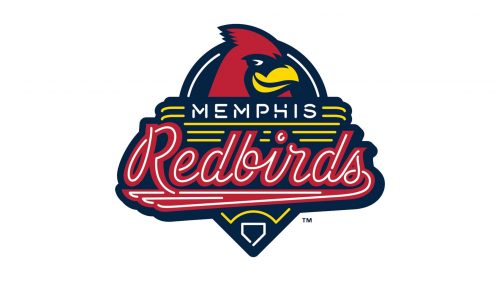 Two years later, the team made one more step towards a unique brand identity. Again, the emblem depicts the club’s mascot, Rockey the Redbird, which looks very much like the creature from the parent team’s logo. But now, there’s only the bird’s head. The part of the design that can be seen below has been inspired by the musical history of Memphis and reflects the neon-lit Beale Street.
Colors
The four-color palette of the Memphis Redbirds logo was borrowed from the parent team’s logo and features red, dark blue, yellow, and white.


