Matador is a multinational car tire company based in Púchov, Slovakia. It sells its products in more than 80 countries worldwide.
Meaning and history
Matador originated on the territory of the former Austro-Hungarian Empire. Today the Slovak company Matador is considered one of the oldest tire manufacturers in Europe, along with Continental, Dunlop, Pirelli, and Michelin.
The history of Matador began on September 7, 1905. That was the time when seven businessmen had registered together the company Matador – Gummi und Balata Werke.
In March 1906, a new Matador factory was built in Petržalka, the most densely populated district of Bratislava. The first products that were created in these plants were hoses and rubber belts. In 1911 the company changed its name to Matador Bratislava.
In 1925 the company began the experimental production of automobile tires. It became a pioneer in this industry and took the lead for six years, remaining the only tire manufacturer in the newly formed country of Czechoslovakia. In the 1930s, Matador tires were installed on all cars made in Central Europe.
After World War II, the company was nationalized, and in 1946 it was fully transformed into a state-owned enterprise. After the end of World War II, the company was nationalized, and in 1946 it was completely transformed into a state-owned enterprise. In 1991, the company was transformed into a joint stock company, and in 1992-1994 it was privatized.
In 1995 two subsidiaries were established: Matador Machinery and Matador Omskshina, and three years later the Slovakian manufacturer began to cooperate with the Continental group, which resulted in the creation of the joint venture Continental Matador for the production of truck tires in Puchov.
What is Matador?
Matador is the name of a reputable European manufacturer of tires, which was established at the beginning of the 1900s, and for a significant part of its history was serving the counties ofEastern Europe. Today Matador is a brand, owned by the global Continental concern.
Before 2005
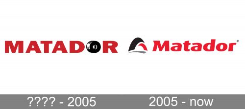
First, let us discuss the Matador logo used by the company before 2005. While the palette and the overall style are pretty similar to the current one, there are quite a few differences.
The name of the brand features a simple bold sans serif type. All the glyphs are capitalized. To create a link with the company’s specialization, the designers have replaced the “O” with a tire. It is black, white, and grey, and it has some depth.
Also, you can come across another old version, where the “O” was not replaced with a tire. It was just a bold red glyph. In this version, the type was bolder than in the “Tire O” version.
2005 – Today
The new Matador logo was introduced to mark the company’s one-hundredth anniversary. It uses the heritage bright red color, which helps to establish a connection with the company’s legacy. While the tire theme is still present in the logo, it has grown by far more abstract. In fact, one can hardly guess it is a tire unless they know it. The “tire” (or half the tire, to be precise) is made up of three curves – a black, a grey, and a red one. It is placed to the left of the company’s name.
The word “Matador” now has only one capital letter, the initial. The type has been italicized and adopted a more dynamic shape. It is also more unique in comparison with the previous one.
Font and Color
The smooth extra-bold lettering from the primary Matador badge is set in the title case of a modern sans-serif font with heavy characters featuring arched lines and straight cuts. The closest typefaces to the one, used in this insignia, are probably, New Epoch Bold Italic, or FF Dax Pro Extra Bold, but with some minor modifications of the contours.
As for the color palette of the Matador visual identity, it is based on a combination of red, gray, black, and white, confident and strong colors, which are usually associated with professionalism, quality, and stability.


