

![]() Dunlop Logo PNG
Dunlop Logo PNG
Dunlop is a British brand of tires and sportswear, which was established in 1889 by John Dunlop. Today it is one of the most popular labels of tires across the globe, which operates on all the continents.
Meaning and history
![]()
Dunlop was founded as a rubber goods manufacturer and started designing and producing of sportswear in 1910. The brand’s famous logo has always been a significant part of its philosophy and approach. Created in 1957, it is still in use today, as something important for the brand, its heritage.
The Dunlop logo is composed of a wordmark and an emblem on its left. The wordmark in all-caps is executed in a bold and italicized serif typeface, which is similar to Renault font. It looks traditional and elegant, at the same time the thickness and the black color of the lettering make it look strong and modern.
What is Dunlop?
Dunlop is one of the world’s first manufacturers of automobile tires, which was established at the end of the 19th century in Ireland. Today the company offers more than 200 types of tires for different vehicles and is owned by two tire giants, Sumitomo of Japan and Goodyear of the United States.
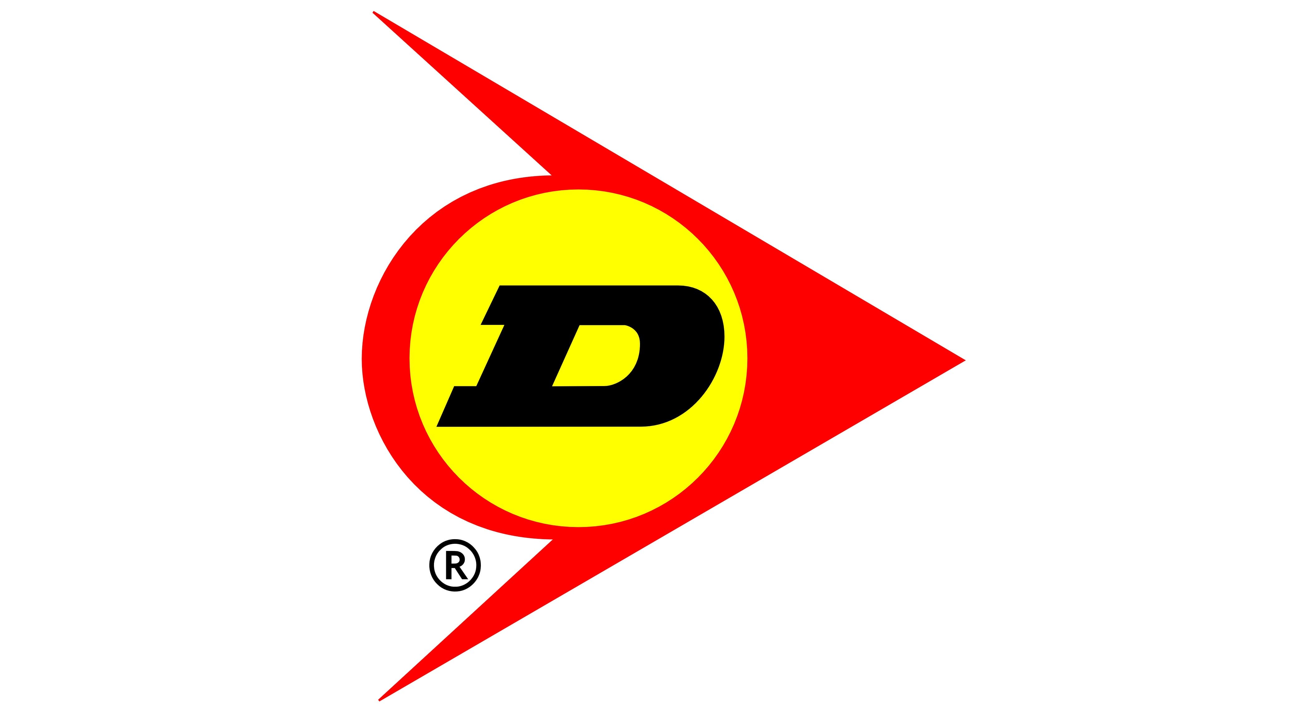
The Dunlop emblem is known as a “Flying D” and features a stylized image of an arrow with a circle inside, where the first brand’s “D” is placed.
The emblem symbolizes the company’s progress and movement, it shows Dunlop as an innovative brand, which is dynamic and full of energy. The traditional black and red color palette of the brand sometimes alternates with yellow or monochrome color schemes.
The Dunlop logo is an example of a timeless and constant visual identity, which doesn’t need any additions and shows the best of its brand.
Font and color
The bold and heavy italicized lettering from the primary Dunlop logo is set in a geometric serif font with square serifs and thick lines of the glyphs. The closest fonts to the one, used for this insignia, are, probably, Teterboro Oblique JNL and Wurlitzer Pro Bold Italic.
As for the color palette of the Du lip visual identity, it is set in yellow and red for the emblem and grounded by the plain black lettering. The scheme of the graphical part evokes a sense of motion and energy, while black adds professionalism and stability to this powerful and confident badge.


