Deliveroo is the name of a British company, which was established in 2013 and specialized in food delivery. Today the company, founded by Will Shu, operates not only in the United Kingdom but internationally, having more than 30 thousand self-employed couriers across the globe.
Meaning and history
The company, which name was formed by two words, “Delivery” and “Kangaroo”, uses the animal image as the main theme of its visual identity since the foundation. The bright and unusual color palette of the logo was also set in the very beginning.
2013 – 2016
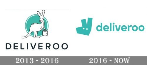
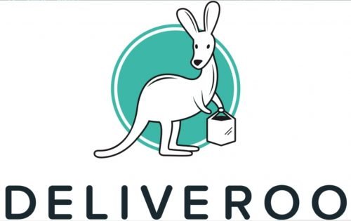
The very first Deliveroo logo was introduced in 1013 and featured a friendly and playful emblem with a delicate wordmark under it. The emblem was composed of a white kangaroo with a black outline, standing with a basket in its hand, and a rounded turquoise background in a double white and turquoise outline. The wordmark in all capitals was written in a bold and neat rounded sans-serif with slightly extended letter shapes and a lot of space between the symbols.
The dark gray color of the inscription was balanced by the contour of the animal and the bag in its hands stood for the company’s purpose and services the application provides.
2016 – Today
The redesign of 2016 simplified the color palette of the Deliveroo logo to turquoise in white, which looks fresh and crispy. The kangaroo image was also minimized and redrawn in a modern and abstract way. Now it is only the animal’s head with straight lines and angles. It is executed in solid turquoise having only two white details — solid spots as the kanga’s eyes.
The inscription is now in the lowercase and uses a new sans-serif typeface with smoother lines in order to balance the sharp geometric emblem.
Font and color
The typeface of the Deliveroo logo is based on one of the following sans-serifs: Ageo Bold, Tans-Heavy, or FF Mark W1G Bold. It looks sleek and fancy, though the bright turquoise color palette makes it friendly and welcoming.
The unusual for logos color combination shows the creative approach and individuality of the company, pointing to its trustworthiness, reliability, and customers as the main value. It looks bright, energetic, and dynamic, making the whole logo recognizable and eye-catching.


