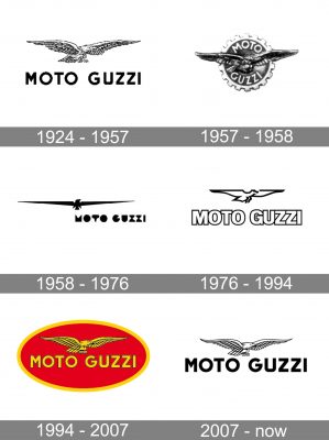
The Italian motorcycle manufacturer Moto Guzzi has modified its emblem almost ten times. Despite all the alterations, the Moto Guzzi logo has been always dominated by a flying eagle, which has reminded of a sad page from the brand’s history.
Meaning and history
Back in the 1910s, three men from the Italian Air Corp decided to create a motorcycle company after World War I is over. These men were two aircraft pilots and their mechanic. Their vision was the following: Giorgio Parodi, who came from a family of wealthy ship-owners, would bring the money necessary for the project, Carlo Guzzi would design the motorbikes, while Giovanni Ravelli, who was already known as a pilot and motorcycle racer, was to promote the vehicles.
Unfortunately, Giovanni Ravelli died in an aircraft crash several days after WWI ended. Although their friend was no more with them, Guzzi and Parodi commemorated him in the form of the eagle in the logo of their company.
The brand itself started in 1921 from a shop in the Province of Como. Their earliest motorbike featured a rhombus housing the letters “GP” (the initials of Guzzi and Parodi).
1924
The iconic eagle logo was unveiled. It looked almost exactly like the current one. You could see an eagle flying above the words “Moto Guzzi” given in a pretty austere sans serif typeface. One of the distinctive features of the type was the “U” with its squarish bottom.
The following series of updates concerned mainly the typeface. For instance, a postcard from 1944 features a lighter type where the initials are larger than the other letters. A version of the logo that appeared only a year later already was based on a heavier serif type. In 1951, a lighter sans serif type was adopted. This version is given in a different palette combining lighter and darker shades of a warm green hue.
1957
The Moto Guzzi logo went through a complete overhaul. The bird is now positioned inside a notched wheel. The words of the company’s name are placed above and below the eagle and form two arches.
1958
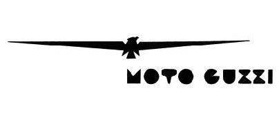
The so-called “Del Gambalunga” emblem appeared. While the eagle was preserved, it now looked different. The emblem’s unusual style made some people suppose that it was inspired by the Fascist symbolism.
1976
A totally new version appeared. Both the bird and the writing grew cleaner and easier to grasp.
1994
The original realistic eagle with plenty of feathers reappeared on the new logo. The text also looked very similar to the company’s earliest logo. Yet, this time, it was placed inside an ellipse and colored red and yellow.
2007
The Metalli Lindberg graphic agency developed a 3D version of the medallion.
Current version
Eventually, the company got rid of the ellipse. As a result, the present Moto Guzzi logo looks almost identical to the original one. It can be given either in white with a black outline or in red.


