The Iowa Cubs belong to the Pacific Coast League and have the status of the Triple-A minor affiliate of the Chicago Cubs. The franchise started its history in 1969 as the Iowa Oaks. They became an affiliate of the Chicago Cubs and received the current name in 1981.
Meaning and history
Everything about the Iowa Cubs club is associated with its Major League Baseball affiliate, the legendary Chicago Cubs, which to date have won three World Series Titles. The Triple-A affiliates from the International League have not reached the same success yet, however, they try and sometimes win. Iowa Cubs have just one League title, taken in 1993, and one Conference title from 2004. In the Division lineup, the Cubs are more lucky — from 1973 to 2024 they have taken eight prizes there.
Before joining the International League, Iowa Cubs were members of the American Association (1969 — 1997), and the Pacific Coast League (1998 — 2020). And no, the Cubs have not always been the Cubs. The club was established in 1969 as the Iowa Oaks, and before signing an agreement with the Chicago Cubs, they had affiliations with Oakland Athletics, Chicago White Sox, and Houston Astros.
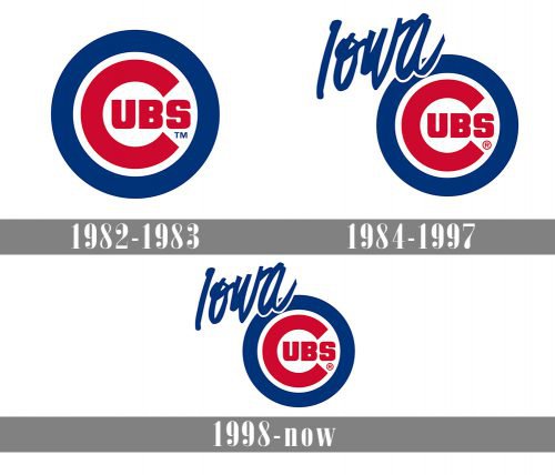
The primary logo of the Iowa Cubs has been exceptionally consistent since 1982. The emblem, which has been heavily based on that of the Chicago Cubs from Major League Baseball, has stayed virtually unchanged with only a minor element added to it.
1982 — 1983
 During the 1982/83 playing season, the I-Cubs used the logo of their parent team. It featured the word “Cubs” in red inside a dark blue ring. The letter “C,” which was larger than all the other letters, held the “ubs” text inside.
1984 — 1997
The logo, created for Iowa Cubs in 1984, stayed with the club for more than a decade. It was the same badge, designed in 1982, but with an elevated color palette and additional lettering. When the blue shade of the visual identity remained almost unchanged, the red became brighter and more intense. The lines of the Ted elements inside the blue and white circular Iowa Cubs badge got refined and cleaned too. The handwritten blue “Iowa” in cursive was added to the top left part of the logo, making the whole composition look stylish and modern.
1998 — Today
The redesign of 1998 softened the shade of blue on the Iowa Cubs’ visual identity. All of the elements on the logo remained the same, but with a new tone, the whole badge started looking more professional and confident, evoking a sense of stability and protection.
Colors
The Iowa Cubs logo follows the emblem of its parent team not only in terms of the overall structure and shape but also in terms of the color palette. It includes only three colors: dark blue, red, and white.
What are Iowa Cubs?
Iowa Cubs is the name of a baseball club from Iowa State, which was established in 1969. Today the club competes in Minor League Baseball and is managed by Marty Pevey.


