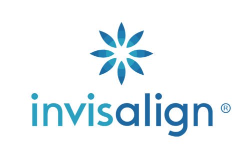
The Invisalign logo radiates a joyous, happy mood. It actually looks as if it was created to make you smile. Taking into consideration Invisalign is a method of teeth straightening, the mood fits perfectly.
Meaning and history
The earliest logotype comprised only the wordmark in a bold, solid lowercase typeface resembling Myriad Pro-Black Semi Ext. In some cases, a visual effect was applied to the wordmark, as if the sun was shining through it.
Flower emblem
The visual center of the current emblem is a stylized blue flower. Due to the use of the gradation technique, the flower looks as though there is a source of light behind it.
Wordmark symbol
The wordmark is divided into two parts by using two shades of blue. In this way, the designers probably tried to make the word easier to read and comprehend.The text “Invisalign” is given in a lighter shade of blue, while the text “align” is darker.
Font
The rounded lowercase sans serif type looks clear and perfectly legible. This is an important characteristic for the overall customer perception of the wordmark, as the name of the product itself is rather long and could present some difficulty if it was given in a more intricate typeface.
Color
The color palette is arguably the highlight ofthe Invisalign logo. It combines three shades of blue, all of which resemble the color of the sky at different times of the day.


