

![]() St. Jude Logo PNG
St. Jude Logo PNG
St. Jude Children’s Research Hospital was established in 1962 by entertainer Danny Thomas. Since then, the organization has been working as apediatric treatment and research facility.
Meaning and history
![]()
In 1962 in the United States only 4% of cases of childhood blood cancer were successfully treated; in 2008, 94% of children were cured. This was made possible by the work of St. Jude Children’s Research Hospital, founded by famous American actor Danny Thomas.
Young Danny Thomas began his career during the Great Depression in the United States. Those were the hard times for the whole country, and for an actor, it was almost impossible to find a job. When Thomas had only 7 dollars left in his pocket, he prayed to St. Jude Fadeus, the patron saint of the desperate, and asked him to show him the right path in life. The young actor promised that he would erect a temple in honor of the saint if a way out was found.
Just a couple of days later Thomas was called first to one fancy club, then to another, then to Hollywood, and in a short time, he was overtaken by success, fame, and money.
Danny a Thomas was a man of his word, so in the late 1950s,he decided to build a children’s cancer hospital. It took seven years to raise funds for the construction. In 1962, St. Jude Children’s Research Hospital received its first patients.
St. Jude is now the only hospital in the U.S. that deals only with pediatric cancer and conducts related research.It costs more than 2 million USD a day to run the hospital. This money is not allocated by the state but is raised by the public organization ALSAC, which was also founded by Danny Thomas five years before the hospital opened, in 1957.
What is St. Jude?
St. Jude is the name of an American children’s hospital, which was established in 1962 in Memphis, Tennessee, and is focused on oncological kid’s diseases. The hospital was founded by Danny Thomas, a famous American actor, and philanthropist.
1958, 1973 – 2006
![]()
The main emblem of the first logo depicted a child’s silhouette drawn in orange with several white rays emanating from their head (the background itself was grey). Below, the organization’s name ‘St. Jude Children’s Research Hospital’ was written in orange, capital letters.
1962 – 1973
![]()
The 1962 design is an oval emblem that uses only black and white colors. Inside of it, there is the common image used by the organization: five hands holding one another by the palm. It symbolizes common good, and it can be found in different compositions on other logotypes of the hospital.
1994 – 2006
![]()
In the 1994 version, the design was the same, except the emblem moved to the middle, the orange was replaced with red (throughout the logo), and the font changed to a slimmer, serif letters with lowercase, as well as uppercase.
2002 – 2018
![]()
Over its more than half-a-century history, St. Jude has gained quite a few victories. Before the research hospital appeared, only 4 children diagnosed acute lymphoblastic leukemia out of 100 survived. Now, the survival rate is 94%.
2018 – Today
![]()
The 2018 design largely reuses the previous logotype. The emblem and the name bit largely appear unchanged, save for the colors: the emblem featuring a child is now a crimson red color associated with healthcare, while the name is light green. The other bits changed more.
The two bottom lines of text switched sides. The ‘ALSAC Danny Thomas, Founder’ is now at the bottom, written in grey, simple letters with a single red dot after ‘ALSAC’. The ‘Finding Cures’ bit is above it, written in bigger red letters – both lowercase and uppercase, unlike the fully uppercase ‘ALSAC’ piece.
They’ve also started to commonly use the emblem alone (so, without the text at all), although they typically make it even darker when used separately.
Symbol
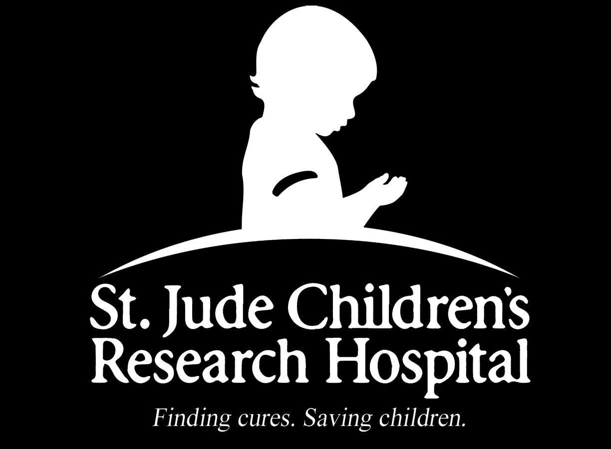
The visual center of the St. Jude logo is a child making a prayer. Next to the child, there is the full name of the research hospital, as well as the name of the founder.
Medical emblem

St. Jude Medicalis a company specializing in manufacturing cardiovascular medical devicesand neurostimulation devices to treat chronic pain. Its logotype was developed by Stealing Share. The turned square placed inside a structure of squares is supposed to symbolizethe ability tocontrol risk.
Font
![]()
The highly legible sans serif typeface seen in the St. Jude logo has a traditional look and does not even try to break the mould, which seems perfectly appropriate for the type of organizationSt. Jude is.
Color
![]()
The dark red color of the emblem is the color of blood, it presumably symbolizes life and health. The lettering is black, while the background is white. In some cases, accents in other colors are also acceptable (golden, grey), while red, white, and black always dominate the palette.


