The Great Lakes Loons are the Low Class-A affiliate of the Major League Baseball franchise the Los Angeles Dodgers. The franchise was established in Springfield, Illinois, in 1982. It’s gone through several names, including the Battle Creek Golden Kazoos, before adopting the current one in 2007 upon relocating to Midland.
Meaning and history
2007 — 2015
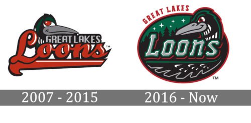
 The loon on the original symbol was facing to the right. Below its head, there was the lettering “Loons” in a red script.
2016 — Today
The current Great Lakes Loons logo was developed by Brandiose. While the loon remains the main element of the emblem, it’s now more refined and realistic. The bird facing to the left has a menacing look. On the background, there’re firs and stars.
Colors
The brightest colors are Kelly green and red, while black, grey, and white are used as secondary colors.


