Dropbox is a cloud storage program, which was created in 2007 in the United States. The software was made to store and synchronize files. Today the Dropbox application is one of the most popular in data stores and has its versions in 17 languages.
Meaning and history
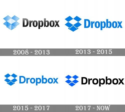
The Dropbox logo, which he definitely become iconic by today, was first introduced in 2008 but it was more of a scratch of the version the whole world knows now. Though the idea and color palette of the emblem were modified throughout the years, the original concept is still there and is not going away.
2008 — 2013
The original emblem of Dropbox, created in 2008, was composed of pretty detailed gradient blue open box images placed in the left from a compact and solid black wordmark in a title-case. The light shades of blue added a sense of freshness and creativity, while the bold slightly narrowed letters of the wordmark represented professionalism and seriousness. The first emblem of the software was executed in a 3D manner, with the box drawn very detailed.
2013 — 2015
The redesign of 2013 redrawn the emblem of the software, making it more geometric and abstract. The color palette of the logo was also switched, with the gradient blue replaced by a solid intense shade, representing power and reliability. The new emblem repeated the open-box contours of the previous version, but Wes composed of flat rhomboid figures, adding style and progressiveness to the image. Though the basis of the box was enlarged and looked out of the four rhombus composition, placed above it. The lettering on this emblem used the same blue color as the icon.
2015 — 2017
The emblem got slightly smaller and the lettering got enlarged in 2015. The typeface of the inscription was replaced by another sans-serif with more rounded shapes of the letters and more space inside and between them. The blue of the Dropbox visual identity became one shade lighter.
2017 — Today
The redesign of 2017 made the iconic emblem more abstract and strong, by redrawing the bottom part of the box as another rhombus. The new image is composed of five blue and one white figure which are identical in their sizes. As for the wordmarks, it is written in the same sans-serif typeface as on the previous logo, but this time the brand uses classic black color for it.
Font and color
The simple yet solid and confident Dropbox logotype in black title case is executed in a traditional and sleek sans-serif typeface, which is very similar to Neue Helvetica family fonts. The lettering looks professional and timeless.
The bright blue and black elements, combined with white, look bright and memorable on the Dropbox logo. They represent the software’s excellence, professionalism, and reliability, showing its expertise and confidence.


