SketchUp is a software, created by the Last Software company for use in 3D modeling and sculpting. The program was released in 2000 and today it is available in 10 languages and has users all over the world.
Meaning and history
SketchUp, a renowned 3D modeling software company, was founded in 2000 by Brad Schell and Joe Esch. Initially developed as a general-purpose 3D content creation tool, SketchUp gained significant recognition for its user-friendly interface and wide application in architectural, interior design, film, and video game design. Throughout its history, SketchUp has achieved notable milestones. In 2006, it was acquired by Google, marking a significant step in its expansion and recognition. Under Google’s wing, SketchUp introduced various features like integration with Google Earth and 3D Warehouse, enhancing its usability and appeal. Another leap in its journey occurred in 2012 when Trimble Inc. acquired SketchUp from Google, pushing its boundaries further into the realms of construction and project management.
In its current position, SketchUp stands as a leading figure in the 3D modeling software industry. Its evolution from a simple modeling tool to a comprehensive suite for a range of professionals exemplifies its adaptability and enduring relevance. Today, SketchUp is widely used for educational purposes, offering robust tools and resources for students and educators, signifying its commitment to fostering creativity and skill development in 3D modeling.
What is SketchUp?
SketchUp is a versatile 3D modeling software company, acclaimed for its user-friendly interface and diverse application in design, architecture, and entertainment industries.
2002 – 2006
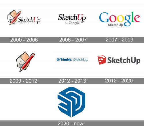
The first logo for the famous software was introduced in 2000 and stayed with SketchUp for six years. It was a simple badge composed of an elegant serif lettering in black and red set on the right from a graphical emblem, boasting an image of a house, crossed by a red pencil. The inscription has a thin shadow, which added some volume to the composition.
2006 – 2007
The redesign of 2006 removed the graphical part from the SketchUp logo and strengthened the lines on the letters in the inscription. The “Google” tagline was added to the software’s visual identity, executed in a corporate font but black color.
2007 – 2009
In 2007 the “Google” logotype becomes the main part of the logo, being drawn in its iconic blue, red, green, and yellow color palette and having a small and delicate gray “Sketchup” tagline written under it in the title case of a modest traditional sans-serif typeface. This badge was in use by the software for two years.
2009 – 2012
In 2009 SketchUp comes back to its original version of the logo, but with the lettering removed. The contours of the house and a pencil were refined and emboldened, and the color palette brightened up a bit. It looked simple yet fully reflected the essence and purpose of the software. This badge stayed with SketchUp for three more years.
2012 – 2013
In 2012 the concept of the logo was completely changed and the color palette turned blue on white. The new composition included an abstract bold geometric emblem set on the left from a two-styled logotype with the “Trimble” in bold sans-serif letters, followed by the “SketchUp” in a lightweight modern font.
2012 – 2020
The SketchUp logo is bright and modern and it perfectly reflects the software’s purpose and functions — a 3D modeling.
The logo is composed of a wordmark with an emblem on its left. The lettering of the wordmark is executed in a bold modern sans-serif typeface with an elongated tail of the letter “K” and the diagonal cuts of the letter lines.
The dark gray color of the nameplate is sometimes switched to black, which creates a good contrast with the software’s red and white emblem.
The SketchUp emblem is an image of a solid red cube, which has three segments cut out of it. The edges form three stairs, with their upper parts colored in white.
The SketchUp logo is simple yet looks powerful and confident. The red, white and black color palette of the software’s visual identity is a reflection of progress and passion, it evokes a sense of creativity and the professionalism of the program.
2020 – Today
The redesign of 2020 minimalists and modernized the SketchUp visual identity, using just a single icon for its logo. The abstract blue symbol executed in thick lines of blue and white is drawn in a three-dimensional manner and looks contemporary and strong.


