Photoshop is a computer program, used for graphics creation and edition. Starting in 1988, Photoshop has been the most used graphical software in the world, both by amateurs and professionals.
Meaning and history
Photoshop has been the world’s leader in graphic design programming for over 30 years and its visual identity history is as rich as the possibilities of the famous editor.
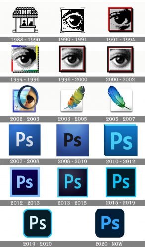
Photoshop redesigned their logo once they got an update for the program, so there were around 15 versions of the PS emblem created.
1988 – 1990

The very first logo for Photoshop was introduced in 1988, and featured a monochrome pixel icon with a contour of a house, having a roof as the brightest element of the image.
1990 – 1991

In 1990 the icon was redesigned, introducing the first version of the legendary “Eye” series. The emblem featured a monochrome pixel image of an eye, enclosed into a square frame.
1991 – 1994

The emblem from 1991 got a bold red frame and redrew the eye with more details and gradient gray shades. The logo was used for three years and released with Version 2 of the Photoshop editor.
1994 – 1996
The framing was changed to multicolored in 1994. The gray square was accompanied by bright blue, yellow, green, and red touches around its perimeter, and looked eye-catching and stylish.
1996 – 2000

For the fourth and fifth Photoshop versions, another logo was introduced in 1996. It was still the same monochrome eye, but drawn in a more confident and modern way, and with the frame emboldened and executed in the black, red, and white palette.
2000 – 2002

The emblem for the Photoshop Version 6, released in 2000, almost repeated the previous one but had its lines refined, thus a more confident a professional look of the whole image. The color palette of the frame remained unchanged.
2002 – 2003
The new bright and colorful design was introduced by the software in 2002. It was still an eye but enclosed in a circle, which stood for a magnifying glass and executed in beige and brown palette with a sky-blue background. This was the last logo of the “Eye” era.
2003 – 2005

The feather concept of the logo design came to the Photoshop visual identity in 2003. For Version 8 of the software the feather, placed on a white square, was executed in gradient green, blue and orange shades, and looked very tender and chic.
2005 – 2007
With the redesign of 2005, the feather changed its color palette to a more intense blue, with a touch of green. The new combination was a celebration of art and beauty, and brilliantly reflected the essence of the software.
2007 – 2008

In 2007 the brand started using a more minimalist and strict badge. It was a calm blue square with a white “Ps” lettering on it. There was a slight gradient, which added vitality and dynamics to the emblem.
2008 – 2010
For Version 11, released in 2008, the white lettering was replaced with a black one, and it made the contours of its Sans-serif letters look wides and more solid. As for the main color, the blue became lighter and gained more dearie than shades, creating a matte surface of the badge.
2010 – 2012

The redesign of the Photoshop logo in 2010 brought a bright and vivid emblem, which had a “book” shape and featured a combination of calm and bright blue colors. The lettering on this emblem got enlarged and refined, gaining bolder lines.
2012 – 2013

In 2012 the logo was redesigned again, and the dark blue fatal square got a thick sky-blue framing, balanced by a bold Sans-serif lettering in the same color. It was an emblem, built around a strong color contrast and evoking a sense of professionalism and expertise.
2013 – 2015
The redesign in 2013 made the lines of the logo thinner and the colors — brighter. The new delicate frame of the dark blue square featured a bright turquoise shade, which was also used for the Sans-serif “Ps” lettering, written with lighter lines.
2015 – 2019
The lettering and the frame became a bit bolder in 2015, and a new shade of light blue was used for them. As for the color of the square itself, it was switched to black, adding a sense of luxury and style to the composition.
2019 – 2020
 The redesign of 2019 softened the angles of the square and introduced a new color palette of the Photoshop logo. Now it was a black background with a white Sans-serif monogram on it, enclosed in a thin bright turquoise frame.
2020 – Today
 In 2020 the frame was completely removed from the logo, keeping the blue “Ps” inscription as the only element in a dark blue square. The angles of the emblem are still rounded, and the lines of the letters became thicker and softer.


