App Store is an Apple platform for getting mobile applications on iOS devices. It was launched in 2008 with only 500 apps available and today it has over two million various applications in all the possible categories.
Meaning and history
App Store (the name is derived from “Application Store”, which literally explains the purpose of this online service) was first introduced in 2008. Apple was the first company to create an application store for its devices. At the time of its opening, there were about 500 applications available to download in the App Store.
The service started developing with incredible speed, and six years after its creation it already had more than 900 thousand applications in its portfolio. A year after the creation of the App Store, the number of downloads exceeded 1 billion. Today, the number of applications downloaded from the App Store is close to 80 billion.
What is App Store?
App Store is Apple’s online app store for branded mobile and desktop devices (PCs, laptops, tablets, smartphones, and TV stations). It is a section of the broader iTunes Store, which stores audio, video, and game content. The service was created in 2008.
2008 – 2013
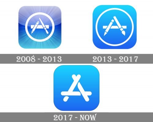
The very first logo for App Store was introduced in 2008 and stayed with the software for five years. In was the iconic white combination of brush and pencil with the ruler, forming the letter “A” and enclosed into a circular frame. The emblem was placed on light blue gradient background with rounded angles. The blue color of the iconic square featured a texture resembling numerous rays coming out of the middle.
2013 – 2017
The App Store visual identity was always based on one and the same color palette and the letter “A”. But until 2017, the iconic App Store “A” was composed of a pencil and a paintbrush with the ruler as a horizontal bar of the letter.
This artistic symbol was a reflection of a wide variety of content, available in the Apple Store and was one of the most recognizable app icons ever.
2017 – Today
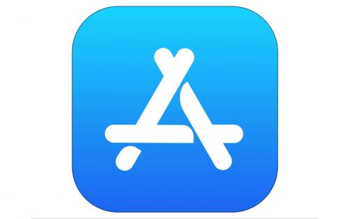
The redesign of 2017 came with the release of iOS 11. The light blue and white color palette remains untouched, while the letter “A” is simplified and modernized.
The new sleek letter “A” repeats the contour of the previous version, but in smooth rounded lines. It looks more confident and elegant, giving more space for imagination and creativity.
The rounded ends of the letter bar perfectly balance the rounded angles of a blue square, which looks friendly and welcoming in the used color. The white “A” shows loyalty and trustworthiness, as well as evokes a sense of security and reliability.
Icon
Not much changed in the App Store icon throughout the years. But the mood and confidence have become visible a lot more. The recognizable blue and white icon, composed of a blue square with rounded angles, enclosed into a thin, almost invisible black outline, and a bold white stylized letter “A” in the middle, has undergone two major redesigns.
Today the icon represents the most minimalist and simple of all the App Store designs. The bold smooth “A” is formed by three overlapping bars, which earlier were represented by three elements — a ruler, a pencil, and a brush. The designers simplified the lines, making them straight and rounding their ends.
The blue and white color palette is also a legacy of the very first app logo, but its gradient became smoother and brighter, with fewer shades, yet more power.
Font and color
The visual identity of the App Store has no lettering in it, so there is no font to be discussed. However, the color palette of its badge is bright and juicy, and fully replaced all the missing elements of the logo. The combination of delightful blue and white looks fresh and cool, representingprogressiveness and innovations, reliability, and safety.


