

![]() Good Morning America Logo PNG
Good Morning America Logo PNG
Good Morning America, or GMA for short, is a television news program that has aired on ABC since November 1975. The show was conceived to compete with NBC’s Today Show and is now the most-watched morning show in terms of total viewers. The format of Good Morning America includes news, interviews, weather, and separate sections: “Pop News” and “Play of the Day”.
Meaning and history
![]()
A morning show is a format of a television program that combines informational and entertainment content. Most morning shows belong to the category of infotainment and are broadcast live or recorded shortly before the broadcast. The emergence of the format dates back to 1950 when the American channel WPTZ launched the first morning show Three to Get Ready. However, the program was aired only for two years.
In 1952, the first national morning show Today appeared in the United States on the NBC network. It had a more pronounced informational orientation, and its structure did not differ much from the modern standard of such shows. In 1954 the CBS network, CBS Mornings, created its own morning shows, and on November 3, 1975, the third national American morning show, which exists to this day, Good Morning America of the ABC television network was aired. The title of the show was taken from the song City of New Orleans by Steve Goodman, an American folk songwriter and performer.
The program now seriously competes with Today and ranks second among U.S. morning shows, although the gap is not too big – about 6.5 million viewers at its peak for Today and 5.5 million for Good Morning America. In addition, the program is a Daytime Emmy Award winner. The main hosts are Robin Roberts and George Stephanopoulos.
What is Good Morning America?
Good Morning America is the name of one of the oldest and most popular morning television shows in the United States. The program has been aired since 1975 in a daily format, from 7.00 to 9.00 a.m., and on weekends the program lasts only one hour.
In terms of visual identity, Good Morning America is one of those rare cases where the very first logo created is a head above all subsequent ones. However, the new era of the TV show’s insignia design, which started in the 2000s, has also introduced quite a modern and trendy image.
1975 – 1987
![]()
The original Good Morning America logo was designed in 1975 and stayed with the show for the first decade of its history. It was a super stylish pop-art badge, with the three-leveled black lettering in a modern geometric sans-serif typeface, with the composition of three solid overlapping circles in yellow, orange, and red replacing the first “O”s in the first two lines.
1987 – 1989
![]()
The redesign of 1987 has created a gradient three-dimensional composition, consisting of the lettering in two styles, and a contoured map of the United States, drawn with gradient neon cords against a deep blue background. The upper part of the inscription was set in a title case cursive font, while the uppercase “America” was written in a stable geometric sans-serif.
1989 – 1994
![]()
In 1989 the logo of the TV program was changed again, keeping the glossy gradients and three-dimensional shapes of the characters, but changing the composition and style of the inscription. Both levels of the wordmark were now executed in the uppercase of bold and elegant serif typefaces, with the top line in a smaller size, colored in orange shades, and the enlarged “America” — in pinkish ones.
1994 – 1996
![]()
In 1994 the lettering from the official logo of the Good Morning America show was rewritten in a flat style, but keeping the style of the inscription. However, the contours of the characters got narrower. The top level of the composition was now colored a light yellow, while the bottom one — in bright blue. The background got a new geometric checkered pattern — in blue, red, yellow, and dark green shades.
1996 – 1999
![]()
The design concept of the Good Morning America visual identity was dramatically changed in 1996. The gradient purple lettering in two lines was placed against a plain light lilac background with no graphical additions or patterns. The upper line of the wordmark was executed in the uppercase of an elegant serif font, while the bottom level was written in the lowercase, with bolder bars of the characters. The levels were separated by a thin geometric line in the same purple color.
1999 – 2002
![]()
Quite a minimalistic version of the Good Morning America logo was introduced by the designers in 1999. It was a laconic solid black lettering written against a simple white background. The name of the program was executed in a modern sans-serif typeface, with the emboldened “Good Morning” in small caps, and the enlarged “America” in the lowercase. On the right from the lettering, there was a solid black roundel with the white “abc” insignia.
2002 – 2006
![]()
The black-and-white ABC roundel stayed in its place, but got a bit smaller, and was now overlapping the bold yellow capital “A” from the “America” part of the program’s name. Both parts of the wordmark were set in yellow, with the capital characters in a geometric sans-serif typeface, and the removed separation line.
2006 – 2010
![]()
The redesign of 2006 has introduced another laconic version of the Good Morning America visual identity. Now the name of the show was written in three levels — each in the same geometric sand-serif style and a deep shade of yellow, with just a size difference. The top two lines of the inscription were a bit smaller than the bottom “America” one. The whole badge was underlined by a thick arched stroke, in the same shade.
2010 – 2013
![]()
In 2010 the Good Morning America logotype was rewritten in a three-dimensional manner, with glossy yellow gradients added to the bodies of the characters and the underlining stroke. Another change, made during the same redesign was in adding The ABC icon to the composition — it was also three-dimensional and glossy, placed on the left from the main lettering, just like on several previous logos.
2013 – 2015
![]()
The changes, made to the Good Morning America logo in 2013 were all about the “ABC” part of the composition. The black roundel with the white lowercase abbreviation was slightly enlarged, and gained a matte surface, with fewer white gradients, but a blurred yellow light was added to the bottom part of the medallion. The style of the inscription remained untouched.
2015 – 2019
![]()
In 2015 the logo, used by the famous TV program from 2006 to 2010 came back, but this time it was accompanied by the ABC signifier, the black roundel with the white inscription on it. The roundel featured exactly the same style as on the previous version, but got larger, balancing the massive uppercase characters of the yellow “Good Morning America” logotype.
2019 – 2021
![]()
The composition and color palette of the Good Morning America logo was significantly changed in 2019. The sizing and typeface of the main inscription remained the same, but now it was colored in a deep shade of blue and placed on a solid yellow roundel, accompanied by the glossy black-and-white ABC medallion at the very bottom.
2021 – 2022
![]()
The redesign of 2021 was just about the ABC emblem, which is placed under the uppercase “America” on a yellow background. The insignia was redrawn in flat shades, and the lowercase characters got smaller yet bolder, which has made the ABC roundel look more modern and actual.
2022 – Today
![]()
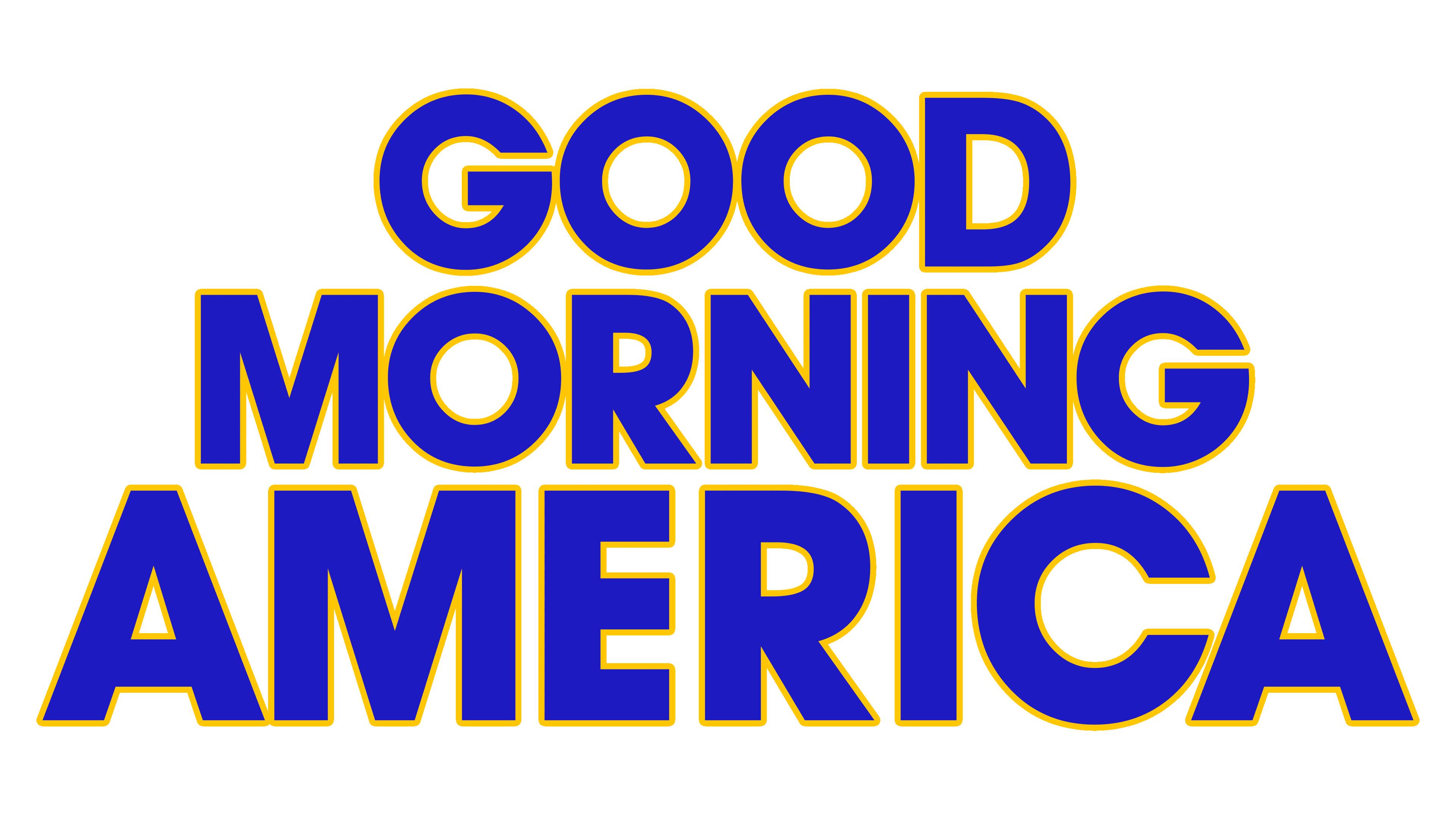
In 2022 the logo of the Good Morning America TV show was changed again. The yellow roundel with the blue inscription was now not the only element of the badge, but a part of the composition, as it got placed in the center of a gradient blue image with thin white orbits around it. The ABC insignia was completely removed from the badge. Also, the shade of blue from the wordmark intensified and brightened up, becoming closer to purple.
Font and color
The bold uppercase lettering from the Good Morning America logo is set in a distinctive geometric sans-serif typeface, which looks pretty close to such commercial fonts as ITC Avant Garde Gothicreg Paneuropean, or Intervoguetrade with minor modifications of the contours.
As for the color palette of the Good Morning America visual identity, it is based on the combination of solid yellow and gradient shades of blue, which together make up a vivid and eye-catching image, full of energy and positive mood, which suits best for a morning show to start the day with.


