PBS Kids is the of the label, under which most of the kids’ content tv programs are being released in the United States. The brand was created in 1993, and in 1997 it created a separate network, which was only active for a couple of years and relaunched at the beginning of 2017.
Meaning and history
The kids content provider, PBS Kids, available across America and several African countries, has had a lot of ups and downs throughout its relatively short history. It was closed, relaunched, changed its format, and finally, has made it to the complete rebirth in 2017.
1993 – 1999
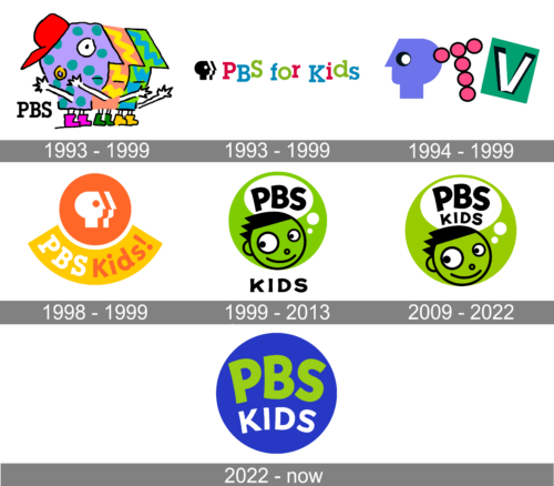
The very first visual identity designs were introduced in 1993. Those were two logos, a primary and secondary one, which were used by the network for six years. The first badge was based on the image, created in 1984 by Gene Mackles.
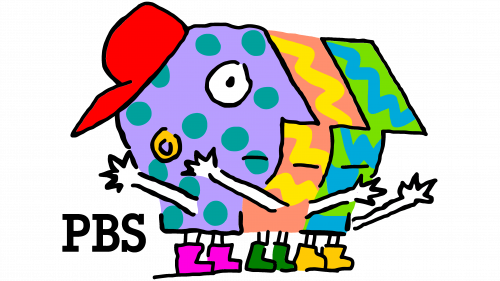
Primary
The first Primary badge of PBS Kids featured a cool and friendly image of three boys in bright purple orange and green color palette. They were standing in one line, facing to the right, with the silhouettes overlapping each other. The bold black “PBS” inscription in a strong serif typeface, Lubalin Graph Demi, was placed on the left from the graphical emblem, adding a touch of seriousness and professionalism. The logo was designed by Chris Pullman and Gene Mackles.
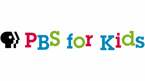
Secondary
The secondary PNS Kids logo featured a stricter style, with the black and white three-profiles emblem followed by a multicolor inscription with jumping letters. Each letter of the wordmark was set in one of three colors — pink, blue or green. And although they all were set in one horizontal space, none of the neighboring symbols made a straight line.
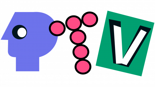
1994 – 1999
The redesign of 1994 was run after the name change of the channel to PTV. That was an interesting badge, consisting of three elements, forming a stylized name of the channel. The “P” was represented by the iconic head in profile, which this time was facing to the left. It was executed in solid purple with black and white dots making up an eye. The next letter, “T”, was formed by six pink dots, outlined in medium-thick black. And the “V” was executed in white, outlined in black, and placed on a plain green square, which was slightly slanted to the left.
1998 – 1999
The PBS Kids’ name returned at the end of 1997, and in a month the new logo was introduced. The badge was executed in a new fresh orange and white color palette, with the iconic three-profiles emblem set on a solid orange circle on top of the logo, with the strict yellow badge arched under it from the center. The white and orange inscription with the channel’s name was placed on a yellow background, and executed in a bold typeface, with “PBS” featuring serifs on the ends of its’ lines.
1999 – 2013
In 1999 the PBS Kids logo was redesigned by Lee Hunt Associates design bureau. It was a bright green circular badge with two variants of image and lettering in the black and white color palette on it. The graphics depicted a caricature portrait of a boy or a girl, with the white dialogue cloud above the head, containing the “PBS” lettering in black. The “Kids” in the uppercase was set under the green badge, executed in a modern sans-serif typeface.
2009 – 2022
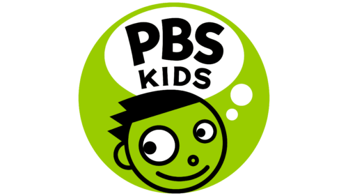
The redesign of 2008 was held by Primal Screen agency, and only refined the previous badge, bringing just minor changes to it. The color palette remained untouched, as well as the contours of the portraits. The only thing here was about the size — the kids’ heads became smaller, as there was a need in enlarging the white bubble. The “Kids” part of the inscription was moved from under the medallion to the whole thought bubble and was now placed under the “PBS” lettering, in smaller capitals.
2022 – Today
Font and color
The custom sans-serif typeface, designed for the kids’ network in 1999 by Lee Hunt Associates, is called PBS Kids Headline and is based on one of the modern smooth and bold fonts with sleek lines and pointed angles. The closest commercial typeface to the one used in the logo is High amount Regular or Gayeng Regular.
As for the color palette of the PBS Kids logo, it consists of a bright and light shade of green, the color standing for growth, life, and progress, as well as developing energy, white, a reflection of purity and transparency, black was here for the contrast and as a graphical representation of professionalism and dedication.


