CBS broadcasting Inc. (Columbia Broadcasting System) is a major American TV network. It has been around since 1927 and started as a radio network.
What is the symbol of the CBS corporation?
The symbol of CBS Corporation, known as the Eyemark, is a stylized geometric image of a human eye, executed in three solid elements in black and white. The iconic symbol was created in 1951 by William Golden, who got inspired by the painting of the famous artist Rene Magritte, The False Mirror. After the introduction of the logo, CBS got the nickname The Eye Network.
Meaning and history
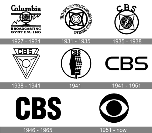
The CBS visual identity has been strong and stylish since the very beginning of the company’s history. Its iconic monochrome logo the whole world knows today was introduced in 1951, is only the third version, created for the brand, and perfectly reflecting its purpose and character.
1927 – 1931
The very first logo for the Columbia Broadcasting System company was introduced in 1927 and stayed active for four years. It was a hand-drawn emblem in black, with the image of an old circular radio receiver, diagonally crossed by a zig-zag line. The drawing was enclosed between double horizontal lines, separating it from the two parts of the company’s name, written in bold black lines above and beyond the emblem. The upper “Columbia” was set in the title case of a bold serif font, while the “Broadcasting System Inc” at the bottom was written in the uppercase of a wider and more stable typeface.
1931 – 1935
In 1931 the logo of the company was redrawn in a very modern way. The emblem now featured a circle with four triangles placed around smaller circles in the center. Each element was drawn in thick and clean lines. The roundel was enclosed into an open ring of heavy uppercase lettering with the name of the company, where each white character was outlined in thick black, apart from the “U”, which had its outline significantly thinner than the other letters.
1935 – 1938
The redesign of 1935 has shortened the “Columbia Broadcasting System” lettering to CBS, switched the typeface to another modern sans-serif, and placed the three enlarged black capitals on top of the roundel with the central part redrawn in more details and with more elements. This version of the logo stayed with the company for another three years.
1938 – 1941
In 1938 the CBS logo underwent another redesign, with the circle replaced by a triangle pointing down. The lettering was still placed above the main element, but now it was enclosed into a trapezoid frame, attached to the base of the triangle. The central part of the badge featured a circular ring with three thick black lines, cut into small parallelograms, coming from it to the three angles of the crest.
1941
For just one year, at the beginning of1941, CBS created a new version of the badge, with the lettering getting inside the circular frame, and being placed above the abstract black drawing, composed of a solid part, and the one, formed by several black squares.
1941 – 1951
The very first logo for CBS was designed at the beginning of the 1949s and featured just a black wordmark on a white background, but it’s the typeface, spacing and style looked distinct and very modern. The smooth lines of the letters ended with the straight strong cuts, which added an edgy and progressive look to a simple composition. The typeface of the original logo for CBS was pretty close to the extended version of the Handel Gothic Light font.
1946 – 1965

The emblem, which was created for the TV-network in 1947, featured three-dimensional lettering in gray, placed in an oval light-spot on a black background. The inscription was outlined in black and had a wide dark shadow, which added volume and lightness to the logo, making the wordmark look strong and confident. The typeface of the lettering was changed to a more massive and traditional sans-serif, with the symbols placed very close to each other.
1951 – Today
In 1951 the iconic circular CBS eye-logo was designed by William Golden. It is a bold black circle with a white eye-shape figure and a smaller black circle in the middle. The emblem was inspired by the Pennsylvania Dutch hex sign.
Usually, the badge is used on its own, but sometimes it is accompanied by lettering, placed in its right. The capitalized inscription in black is executed in a clean and strong sans-serif typeface, which is very close to such fonts as Madani Arabic Semi Bold and TT Norms Pro Bold.
Inspiration behind the News logo
William “Bill” Golden, who created the original CBS News logo, was the company’s creative director. The “eye” idea struck him while he was driving through Pennsylvania Dutch country. There, he saw Shaker barns with hex emblems on them. These emblems looking very much like the human eye were supposed to scare off evil spirits.
Sports Logo
The CBS sports division has its own logo – the division’s name plus the human eye. The name is written in dark blue caps inside a light-blue quadrangle, which, in turn, is placed inside a dark-blue quadrangle. The light-blue eye symbol is located on the left. This logo was introduced in 2016.
Radio Logo
This one features the iconic dark blue eye symbol and the division name written in the company’s signature typerface.
Symbol
The symbol explains the stage of media technology progress, which has enabled the momentous transition from hearing news and programs to viewing them.
Shape
The CBS logo is the abbreviated name of the company followed by the famous CBS eye symbol.
Colors
The black color of the CBS logo’s symbols stands for elegance, integrity, perseverance, and excellence.
Font
The font demonstrates smooth and elegant transitions from thick to thin and creates a feel that combines classics with modernity.
What is the CBS logo?
The iconic CBS logo, also known as the Eyemark, is used by the company since 1951. The badge is executed in the black and white color palette, using a minimalistic style and bold clean elements, making up an abstract Eye. The logo is composed of a large solid black circle with a white horizontally-stretched oval with its ends pointed, and a smaller black circle in the very center.
Who started CBS?
CBS was established in 1927 as the Columbia Broadcasting System. The founder of the company was Arthur Judson. Judson established United Independent Broadcasters, which was rebranded into Columbia Phonographic Broadcasting System, and sold to Isaac and Leon Levy in 1928.
What does CBS stand for?
The CBS abbreviation stands for Columbia Broadcasting System, the name, which started to be used by the company in 1928 after the CPBS (Columbia Phonographic Broadcasting System) was acquired by the Levy brothers.
Who started CBS in 1927?
The corporation, known today as CBS, was founded in 1927 by Arthur Leon Judson, under the name United Independent Broadcasters, as an association of radio broadcasters. Less than a year after the company’s establishment, it was sold to the Levy Brothers.


