The electric car, which was called Geely GE11 during the development stage, was unveiled at a special event in April 2019. It turned out that Geely Auto-created, not just another electric car, but also another brand — Geometry. The sedan was named Geometry A.
Meaning and history
Chinese company Geely, which owns brands Volvo, Polestar, and Lotus, announced the launch of a global brand Geometry, under which premium electric cars will be sold at the end of 2018.
Geely Auto Group’s first all-electric Geometry brand and its first Geometry A model were unveiled in Singapore in spring 2019.The new brand is named after a section of mathematics that appeared more than two thousand years ago and describes our world as people see it. For the Chinese market, the name of the brand was changed to Geely Jihe, as “Jihe” is Chinese for “Geometry”.
Geometry is an opportunity for Geely to implement itself in a new segment of the automotive market by applying its latest developments and innovations.
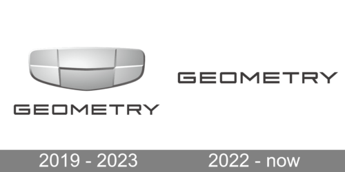
2019 – 2023
The visual identity of the new Geely label is fully based on the corporate logo of the Chinese corporation, though has some modifications, which perfectly reflect the character and essence of the innovative brand.
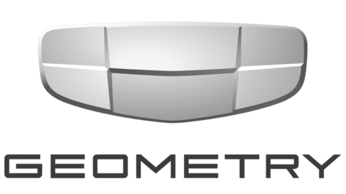
The Geometry logo boasts a combination of the redrawn iconic Geely emblem set above the strict yet sleek lettering, which is usually written in Latin letters, but sometimes is accompanied by the line in Chinese. The inscription is set in the uppercase of a custom sans-serif typeface and uses a dark gray shade for its lines.
As for the emblem, the brand adopted the iconic extended Geely badge but made it minimalist and contemporary. It is a silver plate with six segments in two shades of gray, placed in a chess order, and having light silver frags bulging, while the dark ones are flat.
Though the color palette and lines of the logo are very simple and not bright, the Geometry A badge still looks strong and stylish, showing the progressive approach of the brand and its futuristic character.
2022 – now
The updated logo represents the brand’s strive to follow modern trends. It removed a rather outdated metallic silver element above the name. The name of the brand is all that is left. It is done using a geometric, sans-serif font and black color, which further enhance the minimalistic, stylish, and modern appearance. The fact that the company did not introduce anything new allowed the brand image to stay recognizable. This is especially important for young brands that are just forming their visual identity and acknowledgment.
Font and Color
The modern uppercase lettering from the primary badge of Geometry is set in an extended sans-serif typeface with futuristic straight contours of the characters and cuts of the lines. The closest fonts to the one, used in this insignia, are, probably, Aggie Normal, Sci Fi Bronze Regular, or Scion 650 R Bold, but with some contours modified.
As for the color palette of the Geometry visual identity, it is based on a combination of two shades of gray and white, with the emblem set in gradients, and the lettering part in a dark gray hue. The Geometry palette looks professional and expensive, evoking a sense of timeless elegance and precision.


