Polestar is the name of an automaking brand, which was established in 1996 and owned by Volvo. The brand specializes in the design and production of electric vehicles can including high-performance racing cars. Another product the Swedish company is known for is its electric engines.
Meaning and history
The visual identity of a luxury Swedish automotive brand has undergone one major redesign in 2017, after using its previous emblem for more than twenty years. This change was a celebration of the new era for the company, and showed the progressiveness and focus on innovations of Polestar. The new minimalist badge is very laconic yet extremely trendy and sharp, evoking a sense of style and precision.
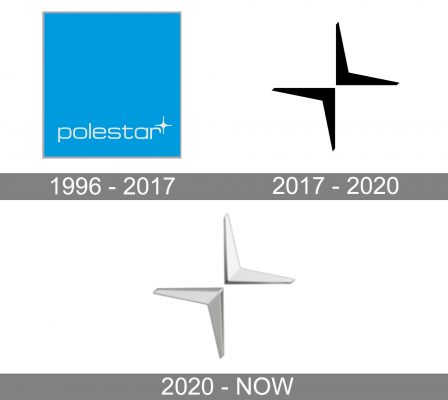
1996 – 2017
The very first logo for Polestar was composed of a solid bright blue square in a thin delicate light gray outline. The white lowercase inscription was placed along the bottom side of the square and accompanied by a small white four-pointed star placed slightly above it, in the right. The lines of the letters and the star were thin and fine, evoking a sense of freshness and even cold, especially on the ice-blue background. The white star looked more like a snowflake, with small solid dots on the ends of its lines.
2017 – 2020
The redesign of 2017 changed the concept of the Polestar visual identity, making it edgy, modern, and sharp. The new emblem was depicted without any background or lettering. It was a stylized polar star, composed of two black arrowheads, placed diagonally and pointing to the center. The bottom element was directed upright, while the upper one was facing to the bottom left corner. The two elements of the emblem also resembled two birds and evoke a sense of freedom and comfort.
2020 – Today
In 2020 the Polestar logo was refreshed again. The structure and style remained untouched, while the color palette was switched to two shades of gray. One half of each element was colored in light gray, while the second half — in its darker shade, and this way the logo became more dynamic and light, brilliantly representing the essence of the brand and its purpose.
Font and color
Though the official version of the Polestar visual identity does not have any lettering on ITC the logotype is still used by the brand depending on the needs. It is the lowercase inscription in a thin sans-serif typeface, which looks pretty similar to the one from the original logo of the brand. The Polestar wordmark is written in a lightweight font, which is very close to Eurostile MN Extended and Microgramma Std Medium Extended.
The silver-gray color palette of the Polestar visual identity is fresh and cold, resembling polar nights and their crispiness. When placed on the car, the badge is executed in glossy metal, which makes the geometric logo look even sharper and more modern than it looks in its paper version.


