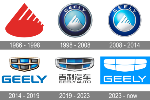
Geely is a young and very progressive Chinese automotive brand, which follows the trends, and is among the pioneers in implementing new technologies in the production of their vehicles. The visual identity of the brand also changes quite a lot, reflecting all the major stages of the company’s development and growth. The further — the simpler and the more stylish the Geely badge gets.
Meaning and history
The name of the brand, Geely, can be translated from Chinese as “lucky”. This suits the company, as it is one of the most successful car manufacturers in the region.
Before its acquisition by Volvo, Geely was owned by Ford Group. After becoming a part of the Swedish high-end cars manufacturing company, the brand started positioning itself on a higher level as well. And it’s current visual identity looks sleek and luxurious, unlike its previous version, designed in 2003.
What is Geely?
Geely is one of the leading Chinese corporations in the automobile market. The company, established at the end of the 20th century has shown incredible growth and today it produces cars not only under the Geely brand, but also owns a few other successful marques.
1986 – 1998
The first logo is an abstract representation, predominantly in red against a black background, which carries a strong visual impact due to the color’s association with energy, passion, and power. It features a shape that could be interpreted as a stylized “G” laid on its side, reminiscent of a wing or a dynamic swoosh, conveying a sense of movement and speed. This is reinforced by the ascending bars that diminish in size, creating a perspective that suggests acceleration and growth. The boldness of the form, with its thick lines and solid fill, indicates strength and confidence. The design’s simplicity makes it versatile and memorable, intended to ensure clear recognition across various media and distances.
1998 – 2008
The logo presents a more detailed and metallic design, featuring the brand name “GEELY” in capital letters at the top. The lettering is surrounded by a circular band, possibly signifying global reach and wholeness. At the center of this ring lies a stylized object resembling both a shield and a wing, which symbolize protection and freedom. The gradient from light to dark blue within the central emblem evokes reliability and depth, while the silver tones give a modern, technological edge. The symmetrical design suggests balance and precision, qualities desirable in the automotive industry. The circular frame provides a contained and complete look, representing unity and commitment to quality.
2008 – 2014
The Geely logo created in 2008 features a circular emblem, composed of two tones of blue with a silver-white wordmark around the upper part perimeter. The triangular symbol is placed in the center of the circle, on its light-blue part. It symbolizes the mountains of China, where the brand was born, and the company’s growth.
The blue color palette of the Geely logo reflects the brand as professional and stable and stay with the company in the next visual identity design concept.
2014 – 2019
The Geely logo was completely redesigned in 2014. The only thing left from the previous version is the color scheme and rounded angles of the typeface.
The Geely logo from 2014 is composed of a wordmark in all-caps executed in a bright blue color with a new emblem above it.
The Geely emblem resembles a flattened shield, which is composed of six precious stones of black and blue colors, that are divided by golden frames.
It is a luxurious symbol, aiming to show the brand’s values of quality and design, as well as its influence on the market.
2019 – 2023
The Geely logo, created in 2019, is fully based on the previous version, which was only elevated and slightly modernized. The iconic crest with diamonds has been slightly extended horizontally, so we’re the diamonds themselves. The color of the inner elements got some matte shades, and the framing went from gold to silver. The lettering under the emblem was also rewritten — two dark gray lines with the enlarged Chinese logotype set above the smaller “Geely Auto” in capitals.
2023 – Today
The redesign of 2023 has introduced a flat and graphically simplified version of the famous Geely badge. Although it doesn’t mean the badge of the company became ordinary and boring, on the contrary, the clean lines and the refreshed color palette have elevated the look of the iconic horizontally-stretched crest. Now the crest is formed by six flat black fragments, which are placed at a slight distance from each other, against a gradient background in bright blue shades. The uppercase lettering, placed under the emblem, is executed in a medium-weight sans-serif font, borrowing from the previous version of the logo.


