For much of the history of Detroit Diesel Corporation (DDC), its logo has featured a double arrow. This does not mean that the design has remained unchanged: you can notice modifications in both the palette and shape.
Meaning and history
 Detroit Diesel is an American manufacturer of automotive, stationary, and industrial diesel engines, axles, and transmissions. Since its founding in 1938, Detroit Diesel has produced more than 5 million units, of which at least 1 million are still in operation.
The company was born as a division of General Motors focused exclusively on diesel equipment development. In 1938 General Motors decided to compete in the new market, as during that time Diesel engines were on the wave of popularity.The company was seriously concerned with the creation of its division, aimed at working with these types of equipment, and this is how Detroit Diesel was born.
In 1965, Detroit Diesel went independent, and in 1970, it entered a new stage of development, merging with gas turbine developer Allison Division. In 1987, the company revolutionized the market with a series of power units with an electronic control system (DDEC), which helped to reduce oil and fuel consumption and automate the engines.
Today, Detroit Diesel is known all over the world. This is primarily due to the high quality of its products. The company strives to cover as many areas as possible and to give the market an excellent level of technology, not forgetting the constant striving for innovation.
What is Detroit Diesel?
Detroit Diesel is the name of an American manufacturer of Diesel engines, which was established in 1938 in Detroit, Michigan. The company is owned by Daimler Truck AG, the world’s largest company in the commercial vehicle production segment. Detroit Diesel is still headquartered in Michigan.
1970 – 1988
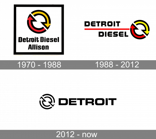
The Detroit Diesel badge, designed in 1970, featured a simple yet bright concept with the emblem, set above the two-leveled lettering and enclosed into a thick black square frame. The Detroit Diesel emblem was composed of two arrows — in yellow and red — forming a circle. Both arrows were outlined in black, supporting the color of the bold sans-serif title case lettering under it.
1988 – 2012
Before the current logo, the company used several other versions where yellow and red were added to the black-and-white color scheme.
In one version, the double arrow was positioned above the words “Detroit Diesel” placed in two lines and separated from each other by a horizontal red bar.
In another version, the arrows were placed inside a black ring housing the name of the brand. Also, we can mention an old Detroit Diesel logo where, vice versa, the lettering “Detroit Diesel” could be seen inside the ring made up by the two arrows.
2012 – Today
In the current Detroit Diesel logo, the double arrow has the white filling and black outline. Each of the arrows forms a semi-circle, so together they form a ring.
To the right, there is the word “Detroit” in a sans serif type. The letters are pretty flat. They are based on a rectangular shape, although they have rounded corners. While the type is bold enough to provide decent legibility, it does not look heavy.
The primary version is flat. You can also come across a 3D version, where the background is black, while the letters feature several shades of silver adding some depth.
Font and Color
The “Detroit” inscription from the primary badge of the Detroit Diesel primary badge is set in the uppercase of a stable and masculine sans-serif typeface with geometric contours of the characters. The closest fonts to the one, used in this insignia, are; probably, Microgramma Pro Bold Extended, Unison Pro Bold, or Eurostile MN Extended Bold.
As for the color palette of the Detroit Diesel visual identity, it is based on a powerful and brutal plain black color, with a simple white background. The monochrome scheme stands for strength and reliability and evokes a sense of stability, trustworthiness, and excellence.


