Frito-Lay is a famous company, owning a few smack-brands which are famous across the globe. The brand, established in 1961, is a food subsidiary of PepsiCo since 1965. The most popular label of Frito-Lay is Lay’s, Cheetos and Doritos.
Meaning and history
Frito-Lay is a division of PepsiCo Corporation, which is specialized in the production of salty snacks, such as corn flakes and potato chips. The most famous brands produced by Frito-Lay are Lay’s, Doritos, Fritos, Cheetos, Ruffles, and Rold Gold. Today these names are known all over the globe, and it feels like the company manufacturer of these labels has been on the market forever. However, it only appeared at the beginning of the 1930s.
The story of Frito-lay goes back to 1932 when Herman Lay opened his snack shop in Nashville, Tennessee. The business was developing fast enough, so in 1938 Lay decides to purchase the Barrett Food Company’s chip-making firms, creating H.W. Lay Lingo & Company.In 1961, the company merged with Frito, founded by Derrick Lothert, and this is how Frito-Lay was born.
In 1965 the newly formed Frito-Lay Inc. was bought by PepsiCo Corporation and made into its subsidiary company. The first logo of the company was also created only in 1965, and it was a sign of a modern approach to business and a progressive vision of marketing.
Today Frito-Lay is one of the world’s largest and most reputable names in the production of salty snakes, and its chips and crackers can be found on the shelves of supermarkets all over the world.
What is Frito-Lay?
Frito-Lay is the name of a PepsiCo food subsidiary, which was established in the United States at the beginning of the 1960s, and acquired by the global giant in 1965. The brand is known for various snack and chips labels, which are distributed all over the world.
1961 – 1987
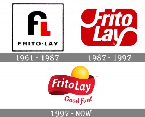
Frito-Lay has not very intense, but very interesting logo evolution history. The first visual identity design was created in 1961 and looked minimalist and modern. Composed of two letters, “F” and “L” and the nameplate under it, the logo was executed in black and red, with a white background. It was a stylish and progressive work.
1987 – 1997
In 1987 the company created a new logo, which was completely different from the first one. The red rectangular with rounded corners and smooth sans-serif typeface with elongated and curved lines of “F” and “Y” was elegant and bright.
1997 – Present
The logo we know now was designed in 1997 by San Francisco based Landor Associates bureau. A three-dimensional yellow ball, symbolizing the sun and a famous round yellow chip, is located beyond the wide red ribbon with a white wordmark on it.
The bold clear typeface of the lettering has playful lines and creates a happy and friendly feeling. The tagline “Good Fun!” Written in red is placed under the emblem and adds warmth and passion to the brand’s characteristics.
Font and Color
The smooth and elegant title case lettering on the primary badge of Frito-Lay is set in a bold sans-serif typeface with softened and slightly curved lines of the characters. The closest fonts to the one, used in this insignia, are, probably, Sharik Sans Bold Italic, or Accia Flare Bold Italic, but with most contours modified.
As for the color palette of the Frito-Lay visual identity, it is based on bright and juicy colors, such as red and yellow, with white for the letters and the background. The red here is a symbol of passion and warmth, while yellow adds a touch of joy, happiness, and energy, and white stands for the reliability and trustworthiness of the brand.


