Doritos is a brand of tortilla-chips, manufactured by Frito-Lay. The label was introduced in 1964 and by 1972 it had several variations of taste. Frito-Lay is a good-production subsidiary of PepsiCo.
Meaning and history
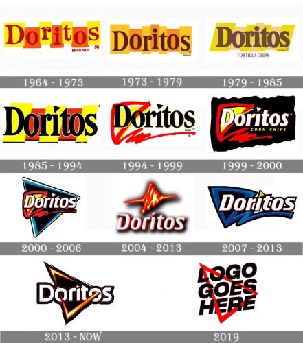
One of the most famous tortilla-chips brands in the world has always had its visual identity bright and eye-catching. The history of its logo design can be split into two periods — the square one, which started in 1964, and the triangular one — started in 1994.
1964 – 1973
The Doritos logo created in 1964 was executed in yellow and red and boasted a playful geometric banner, composed of four yellow and three red rectangles with were jumping above the line. The lettering was placed over the rectangles and boasted a fancy serif font with bold curved lines and distinct massive serifs.
1973 – 1979
The logo for Doritos, designed in 1973, featured a bright yellow and orange composition with brown inscription. The background was composed of vertical rectangles in two colors, which all were executed in different sizes and glued to each other. Each of the letters of the wordmark was placed in its own rectangle. The lettering in the title case was executed in a delicate yet bold serif typeface.
1979 – 1985
With the redesign of 1979, the first and last rectangles of the logo got inclined, and the lettering became bolder. The color palette was also changed — yellow became a bit darker, while the orange was replaced by a light cream shade. As for the brow, it gained a calmer and more “chocolate” tone. The “Tortilla Chips” tagline is written in all capitals under the logo.
1985 – 1994
The triangle first appears on the Doritos logo in 1985, but only as a small additional detail — it replaced the dot above the letter “I”. As for the whole badge, it still featured a serif inscription with the letters placed on rectangles, which this time is executed in yellow and red with some black accents. The wordmark is also colored black and gets a thin white outline.
1994 – 1999
The redesign of 1994 brought an iconic triangular image to the Doritos logo. Now the black serif inscription with a triangular spot above “I” was outlined in yellow and accompanied by a red and embellished emblem on the left. The emblem featured a solid yellow shape, repeating the shape of the famous chips, and thick red contouring, also triangular, which had a bold red line coming out of its peak at the bottom, underlining the whole wordmark.
1999 – 2000
In 1999 the color palette of the logo was switched: the whole image was now placed on a black background, with the wordmark turning white. Another big change of 1999 was a yellow “Corn Chips” tagline placed between the main inscription and a thick red underline, which became slightly shorter.
2000 – 2006
The black background gets a triangular shape and a blue outline in 2000. The tagline is removed, and the wordmark is being refined, gaining a red outline and thinner lines, which add a more modern and stylish look to the image.
2004 – 2013
In 2004 another logo for the iconic Chips brand was created, but this version was only in use across North America. The three-dimensional wordmark in gradient white and gray boasted a red outline and black shadow and was complemented by a stylized emblem above it. The emblem featured a triangle in fire-patterned lines, which were elongated to the left and to the right.
2007 – 2013
The logo, introduced in 2007, had all the contours modernized and thickened. The triangle got a bold blue outline, and the inscription — a modern italicized sans-serif typeface, which looked professional and solid. The geometrical dot above the “I” was now colored yellow.
2013 – Today
The Doritos logo we all can see today was designed in 2013 and comprised a white sans-serif inscription with a double black and red outline, enclosed in a triangular frame, which is executed in gradient orange, red, and yellow, representing flame. The emblem looks strong and remarkable, showing the progressive character of the brand and its confidence.
2019
An experimental logo version was designed in 2019 for the brand’s social media campaign. It featured a red triangle, placed on a white background, and the bold black inscription “Logo Goes Here” in an extra-bold sans-serif typeface.


